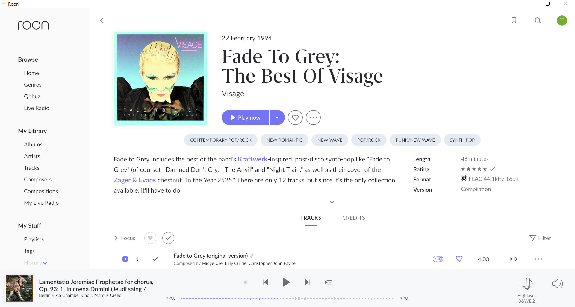
I prefer the light theme. But I don’t understand why there is a difference in presentation between pop and classical albums.
This is what Visage, Fade to Grey looks like:
But this is what a Classical album looks like
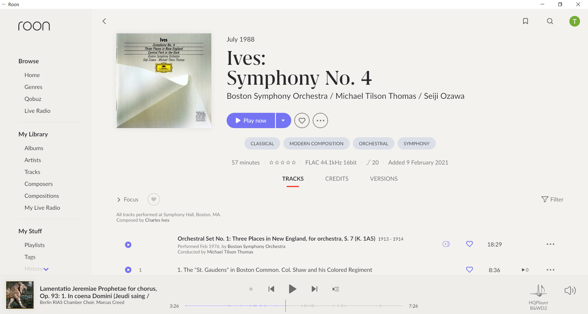
Why the difference? I am trying to be objective so I accept there is an aesthetic of 1.8 I just don’t get. But there are objective standards for pretty much anything in the digital world and that includes accessibility and contrast of UI’s. It may be a bit unfair as roon is not a web application but the Classical version of the web page does not actually meet minimum web accessibility contrast standards: