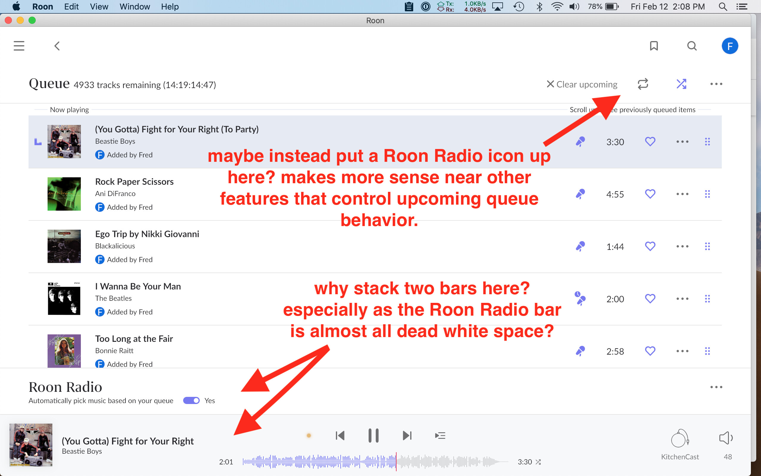
I thought I’d share some thoughts about little interface issues that could use some polish in 1.8. First up, the odd double stacking of control bars in the Queue view, with the Roon Radio bar (mostly empty white space) stacked on top of the regular control bar. The Roon Radio bar seems like a weird use of space (again, mostly nonfunctional white space), separated from all the other controls. Seems more logical to put Roon Radio controls in the upper right, along with the other queue controls (shuffle, repeat, clear upcoming).