New 1.8 score some good points but not only
Positive
- Stability looks fine, iPhone UI is better
- Browse is fine
- Home and genre tabs are more focused, but who cares about “recent listening”, top artists and top albums of the last days ???
- Qobuz tab is clear
- Album view and focus filters are fine. Scroll down is much better than previous scroll right
Negative
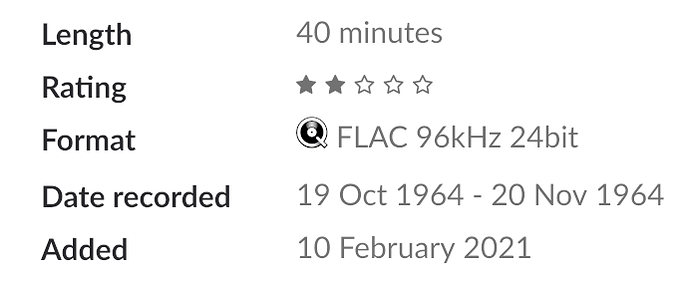
- Date added has disappeared
- Stars (AMG rock & jazz) and recommendation on new album are gone : real pity, add it again ASAP please
- Artists : I don’t like the circles. Waste of space and unfocused, but I don’t use it
- Composers : same remark but I use it for Classical. Could be much better in the style of Genres
What I miss
I had hoped to find an “alarm” or differed play to launch listening when I wake up. I’ll continue to use the Sonos function in my kitchen…
PS: Lifetime subscription, Hegel 360 AMP with IMF 8O speakers + Sonos in different rooms. I really enjoy Roon + Qobuz.
