I was using “Discover” quite a lot on 1.7 and now find that I have to scroll way down to find it on 1.8. Any chance of adding it back into the Browse menu ?
5 Likes
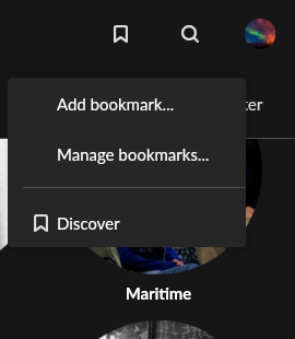
You could add a bookmark when you’re on the discover page.
Sure, it won’t put it back in the side bar but in the menu on top which is still better than having to scroll down on the home screen…I guess.
3 Likes
This was one of my most used function on 1.7 also. I hope it will be restored to the main menu on left side.
2 Likes
Thanks for the bookmark suggestion. It will do for now.
I agree that it is a pity and a backward step to bury Discover several scrolls down the Home Screen.
As an alternative to putting it back in the side menu, or making a bookmark, would it not be better to allow users to customize the Home Screen, and control the order of sections in it. I would put Discover at or near the top. I have no interest in a screenful of statistics, recent artists, or genres for me, so I would push them down to the bottom, or turn them off. The Discover-like sections - I have “collaborators” and “Performing the music of Jaco Pastorius” arguably belong inside Discover too, though just some freedom to move them would be great.
6 Likes
I support this suggestion!
2 Likes
Thanks for the support guys.
1 Like
I agree and found my way here thinking the feature might been removed from 1.8, which would be a shame. I do worry that the fact it is now sort of hidden away and referred to as “classic” might indicate a future deprecation; I hope I’m wrong. It is a great feature and I use it all the time!
2 Likes
Weird to see the feature so buried in the UI now, Discover seemed to come up quite often in reviews and selling points for Roon. I figured they would want to improve it further and push it to the forefront.
1 Like
I too was a frequent Discover user, and am sorely disheartened to see it stuffed unceremoniously below a vast swath of UI that I don’t want or care about. That I can’t rearrange the UI tiles to my liking is a further insult.
Usage analytics? That’s really the thrilling, can’t-miss UX feature that Roon customers are demanding, over and above Discovery? After three years as a customer, every release that arrives feels further out of touch. Disappointing.
1 Like
I recently discovered Discover and now I feel at home in Roon and in touch with my music again.
Please put a button for Discover up in front.
2 Likes
Yes I’m in trial phase and concerned that discover, one of the features that’d convince me to go paid, has been so buried. When things are buried they often then vanish. Discover is such a great feature, it deserves to be right up front.
3 Likes