I’d like to suggest a slight tweak to the layout of the album page.
Currently, the layout changes depending upon whether or not there is “bumph”.
Without bumph, there is a lovely clean line of relevant data across the top.
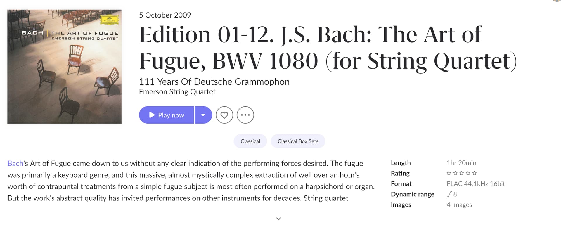
With bumph, the important stuff gets shoved off to the side & you can only see all of it if you tip the arrow below the bumph.
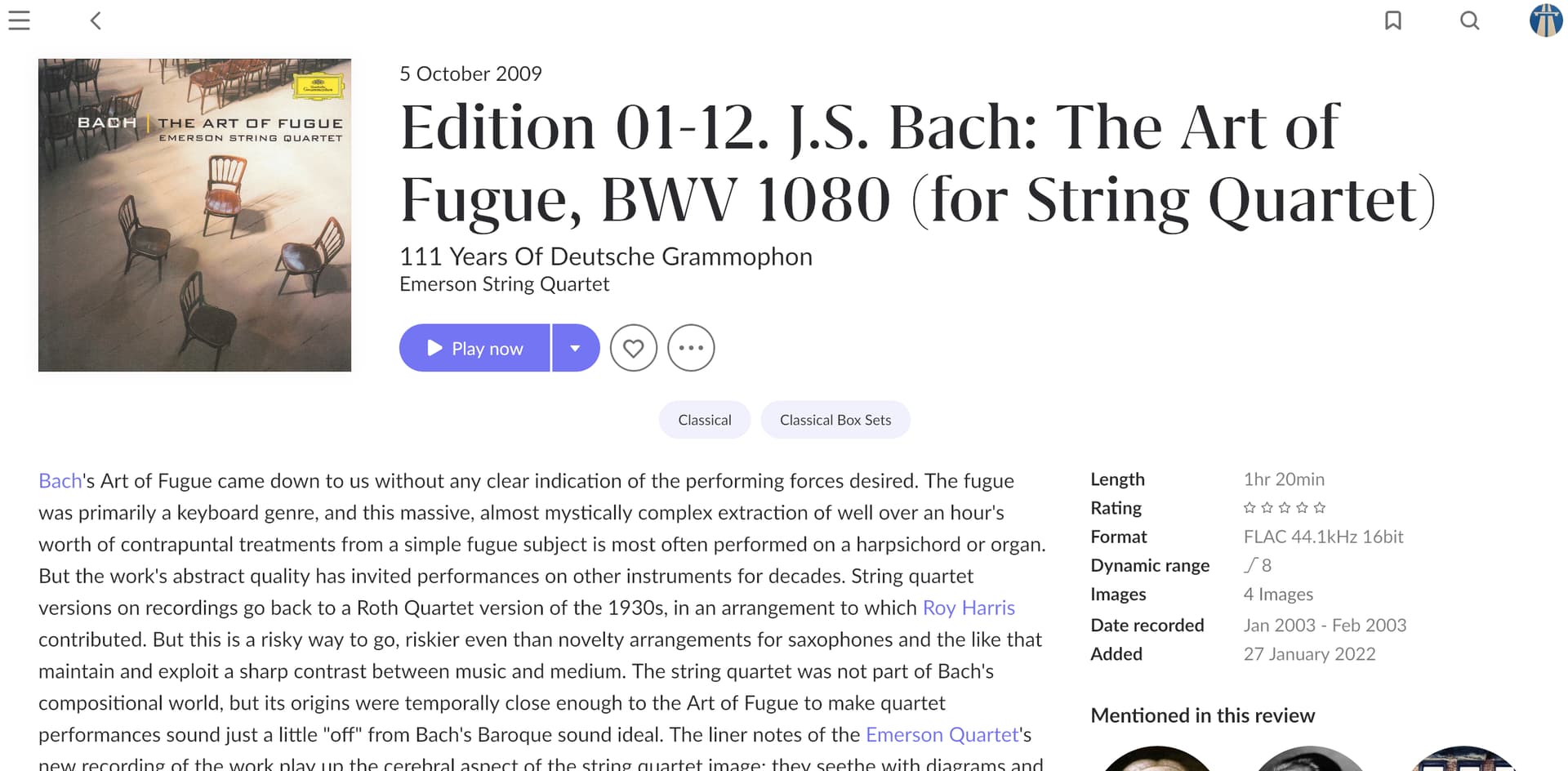
It would seem to me that the layout could be adjusted so that the important information stays where it is in one line across the top & the “bumph & mentions” stuff can be revealed below when there is an arrow there to do so.
That way, a user could see at a glance the stuff that’s most important & read on should they wish to do so.