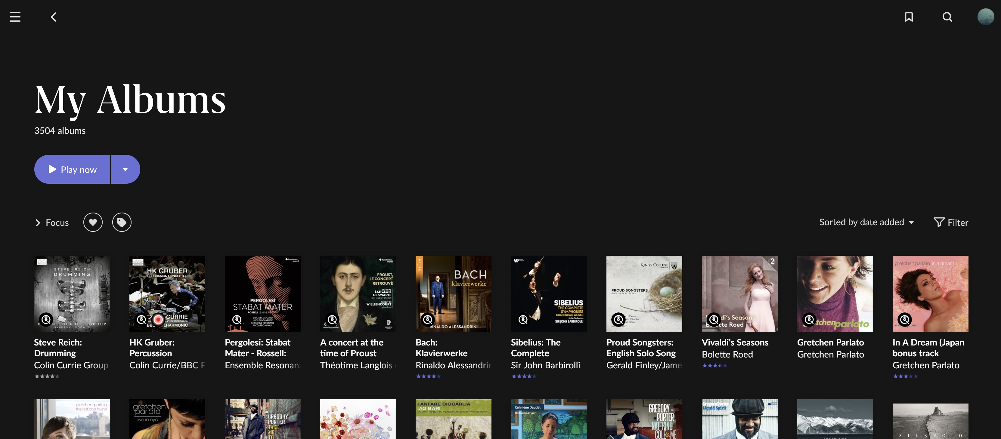
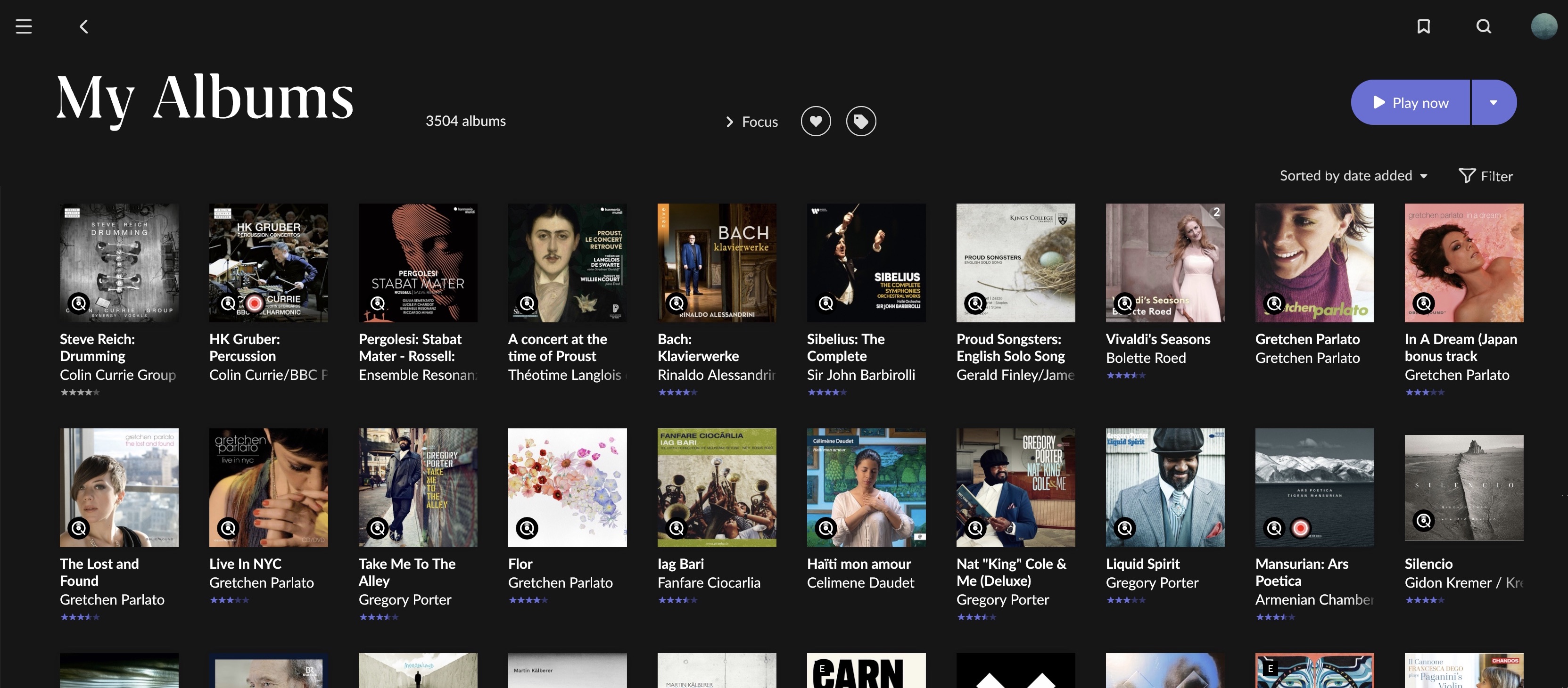
Roon 1.8 simply wastes too much screen space all over the place. Too little information can be presented at once, which means more scrolling and more clicking and horrible user experience. Museum design is not leaving a ton of white space. Pleasure of exploring is important, but this is a tool that people uses everyday, so productivity is key.
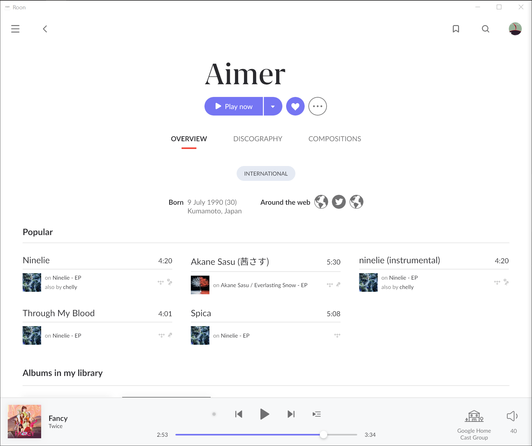
5 popular tracks is all I get in a single screen. And each track takes humongous space for no reason. I could a larger set of recently listened tracks before, and I was even able to see some albums.
For artists with photo, artists’ review is all I can see. I don’t read that thing again everyday.
То что увеличился размер шрифта и размер обложек для меня ,наоборот, это большой плюс. На самом деле сложно понравится всем. Всегда будут недовольные. Другое дело , что roon , даёт мало возможностей подстроить интерфейс под свои запросы и это действительно проблема. Я не англоговорящий пользователь и я не имею возможности перевести метаданные ,которые сейчас абсолютно для меня бесполезны.
I am absolutely fine with the font and font size of 1.8. It looks gorgeous to me. I don’t think it increased significantly for me. My problem is all about margin size and unable to use my screen estate wisely.
I agree. Customization is very important, can solve a lot of problems and make a lot of people happy. (ie add a scaling setting for you
I’m also interested why it’s not possible to get rid of the ‘Popular’ section. I never use it, don’t want it there. I’m mostly interested in albums from my library…
I hated it. And the recently listened section and quick link to all tracks were replaced by that useless thing. And I found both of them pretty useful.
For a sophisticated piece of software, I really don’t understand why anyone would use a phone to use Roon, other than the occasional convenience. It does feel like it is being tailored more and more towards phone control.
Roon thought they could/should come up with something for the Instagram kids.
They gave up library management and clutter the available space with Top, Popular, Best Ever, Notable. For good measure they added hordes of useless statistics, graphs, Meaningless Radiostations and Genres you never listen to and god knows what.
This is my biggest gripe about 1.8 - the tremendous waste of screen real-estate. I wish there was a way to display more than a few albums on the screen at a time.
Yes, I know it’s in fashion to create GUIs with tons of wasted space, but it’s actually a poor design paradigm that I wish would to the way of failed tech from our past like Webcrawler and MySpace.
On the album page, it’s worse. There’s wasted space, smaller text (except for the massive album title), smaller icons for everything, and a removed sidebar.
In other words, everything is smaller and there’s empty space everywhere.
So I personally love the spacing on my remotes (which are all ios), but I installed on my Win10 machine with 32” monitor to see firsthand what everyone was talking about.
I personally don’t find the album browse experience too sparse - but totally understand why some would prefer more density. I just scroll with my middle button as I do on web pages now that it’s vertical so it doesn’t trouble me. But I do get it. If it’s user configurable, that could solve it in certain settings but is likely to result in a slightly more disjointed experience (since I doubt it can be made consistent everywhere), and might make it harder for devs to roll out future UI enhancements if they have multiple formats.
On album pages / queue / playlists I agree that it does feel too sparse in widescreen. I can imagine a solution where lists are responsively split into more columns when there is enough real estate to do so… so instead of 6 tracks, I could get 12 split across two columns… but that is often hard to read for sequential lists (eyes have to zigzag), and it gets worse if the number of columns varies with a session/window size. It adds a different cognitive and perceptual load.
Another better solution might be when there is a very wide screen that the track list lives in a separate column off to the right of the album information. That feels like it could be a good solve, but this kind of responsive design is really tricky to pull off.
I guess my ask for folks who don’t like the way it is in widescreen is to brainstorm design solutions that are still consistent with the paradigms that 1.8 has rolled out (consistency, vertical scrolling, etc). Not saying you should fix software, but I hear your frustration, and I’m trying to think what we could concretely suggest that might be feasible / in keeping with the visual and UI approach but which would solve some of the concrete frustrations. Roon has a lot of talented people, but I know they get good ideas here.
It seems there are three issues here, and I personally think Roon should be responsible for fixing two of them.
Roon has used space as a design element. That gives the openness many of use like. There are those that view space as something needs to be filled with stuff. Roon isn’t going to do that until the whole design changes.
There seems to be an issue with large blocks of space on either side of the Roon information on wide format monitors. I suppose there will be winners and losers when Roon starts making things better for tablet and mobile users. But this just seems like something that got missed and should be fixed. It is related to the third point.
If you have a very wide monitor and Roon spans the width, there should be a similar ‘feel of space’ for the wider screen. It shouldn’t look sparse like Linus’s Christmas Tree.
I can understand wanting to roll the new design out to get it in people’s hands quickly. But it just seems wrong to have something seem ‘broke’ as a consequence of the new format.
For the moment, like all fashion trends it will change. The question is how quickly. Given that there is functional pressure, I would say sooner rather than later.
That is the issue for me and the album screen. Pagination.
Previously, each click refrshed the entire screen. Let’s say 30 albums at a time. Now with continuous scroll, I have to make 3 wheel clicks to get the same refresh.
Browsing the same 300 albums goes from 10 clicks to 30 wheel pushes.
Yes, you’re right about “modern” apps and their waste of screen real-estate. I work in the software biz, and the difference these days between consumer- and business-facing GUIs is huge. So many consumer GUIs are 60% wasted whitespace, where business is probably more like 10%.
Fact of the matter is that I want to accomplish as much as I can with as little clicking/scrolling/manipulating as I can.
I detest iTunes, but at least it presented the album covers in a more efficient way.