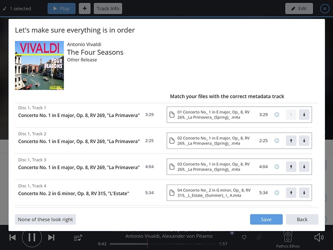
on a monitor the interface is ok, but on a smaller iPad screen a lot of space seems wasted so it doesn’t give an efficient overview. It shows about four trackswhich is not much with some albums having 20+
Also, instead of the up/down buttons maybe you could use the iOS style drag/drop list sorting? Now it switches tracks so often a track that was right is moved to the wrong spot and it just seems very unintuitive.
The track shifting page has always felt like the clumsiest part of Roon to me. I have found myself shifting things that were shifted because I shifted something else, and wondering if there wasn’t a better way. Drag n drop for sure.
+1 for Drag 'n Drop. As in hold the track a little longer to lift it from the list, then while sliding it freely to position it anywhere and let go for confirmation.
+1 for improving this part of roon.
I would also like to have a way to select a track on the right, and explicitly set a track number for matching on the left. For example, if track 25 on the right really goes with track 2 on the left, dragging it there will be difficult at best. Would be nice to be able to just say ‘this is track 2’ and have everything else shift down accordingly to match the track directly with track 2
Agree. Drag n drop would resolve a few frustrations.
6 YEARS LATER…again. Mods please close all the old threads.


