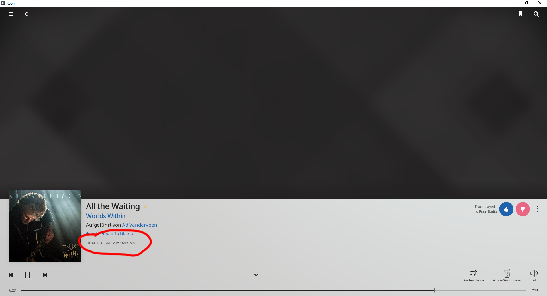
How can I disable the format information on the Now Playing screen?
I want to see infos about the music not about the files.
1 Like
Not possible right now, but feel free to open a feature request on this.
Also, @support is really for when things are not working properly – feel free to flag me or Brian with product questions and we’ll answer when we can, but the tag is really for when something is broken and assistance is needed.
In any event, thanks for the feedback here @AE67.
Thanks for the response
Thanks Mike!
It is a feature many have been waiting for.
Thanks for looking into this. I installed the Android software update this morning and thought I was losing my mind when I couldn’t display the album are as I had always done. Hopefully that can be brought back as a user configurable option.
1 Like
I support this request. Please make it also possible so show only the album art too.
3 Likes
Now that I’ve spend more time with the ‘Now Playing’ screen, I’m not going to mince words, I HATE this design and should 100% be redesigned. I Use this on my iPad and think if the bottom area was the whole page (items size adjusted) and just incorporate the navigation icons for lyrics, bios, credits, etc. to take you to a full screen page on that content with just a top corner arrow to take you back to ‘Now Playing’ screen. I can put together a mock-up in photoshop if you’d like. @brian.
8 Likes
Yes! This is just not right. Please tell me they put the cover art now playing screen back. This is atrocious.
2 Likes
It’s horrific. I haven’t been a fan of the “display” look on the web or chromecast devices. Then, they take that and replace the classic “now playing” screen which just showed the full album cover in all it’s beauty. It’s beyond disappointing.
4 Likes
While I like the layout of the new Now Playing screen there are some issues:
- The next song in the queue should be shown
- Why default to static lyrics with huge font for the main display?, showing the lyrics is only interesting if its synced to the music
- If there is no artist image available, Roon should display a default high res image of something like instruments, a stadium, etc, the blurry grey lines looks like a complete afterthought
4 Likes
Wow, add my name to the list of users who hate the ‘now playing’ screen. UGLY!
Also in the queue screen, I was so hopeful the screen space for Roon Radio would be gone and a simple button used. Have a banner like add for a simple function is obviously an attempt by Roon to lure people into trying Radio. Roon must think its ctritcal to their long term viability.
I’m a lifetime subscriber.
5 Likes
Let me guess. You off-shored the UI work and the person managing the off-shore development team got to check off one of their objectives - “New UI done”.
The grey banner in the Now Playing is UGLY. The grey color scheme does not fit in, it sticks out like a sore thumb. The banner takes up too much space and reduces the usable real estate from the elements above it. What is with the dinky little album art in the banner? That could just be an icon.
Please give users the option to go back to the old UI and add the ability to have large album art. This part of the UI should be user configurable.
11 Likes
Thanks for adding this to the roadmap. the fact that you are always listening, is one of the reasons I’m a lifetime Subscriber.
I thought I’d take this opportunity to express my thoughts on the ‘Now Playing’ screen.
I’ve always seen this screen as the view of Roon that you use when you are not interacting with it.
If I’m interacting with Roon, I’m generally using other views. Then I go back to the ‘Now Playing’ Screen and sit back to listen.
As such I want it to show me what’s playing - Track Name, Artists and large artwork - in an easy to see and read format.
I’m not sure that I want an ‘Album View’ in the now playing screen though. I don’t see how an ‘Album’ comes into it.
You are playing a successions of tracks from a queue you have created, either by adding individual tracks, a playlist, or , indeed, a whole album.
But what you are ‘Now Playing’ is a track - I want to see what that track is. Not the Album or Artists.
Sure, It’s nice to be able to see what those are, and to click through to more information, but want the track information displayed.
I’ve spent a lot of time getting the track information as I like it and embedded tags in the audio file, and I have ‘Prefer Info from file tags’ selected in preferences.
I would like it if the ‘Now Playing’ Screen used those tags. Specifically …
The embedded artwork. For compilation and greatest Hits albums, I have the individual Single artwork for each track. It would be great its that was displayed (as it is on most other media players)
The artist name. Roon seems to ignore this and uses (I Think) ‘Primary Artists Links’ - not sure where it gets this.
But this means that, for instance, for the album 'Armed Forces; it displays - ‘Performed by Elvis Costello, Elvis Costello & The Attractions, Elvis Costello And The Attractions’. Which just looks silly, as well as using up lots of screen real estate.
For compilation albums it sometimes lists every artist on that album.
I’m sure I can manually edit all this in Roon, but that’s a lot of work - which I have already done in my file tags.
It doesn’t do this when displaying the track in a playlist, where I’m guessing it’s treating the info as track rather than album based - hence my point that the ‘Now Playing’ screen should not be Album based.
I understand that other people use Roon in different ways to me, and I think that making the ‘Now Playing’ screen configurable is a great way of addressing different use cases. But, I know from other threads that there are other people who use artwork like I do.
2 Likes
At least find a picture that doesn’t make Bob James appear as if he were looking into your soul.
“Do you like my music?” “Well, DO YOU?!”
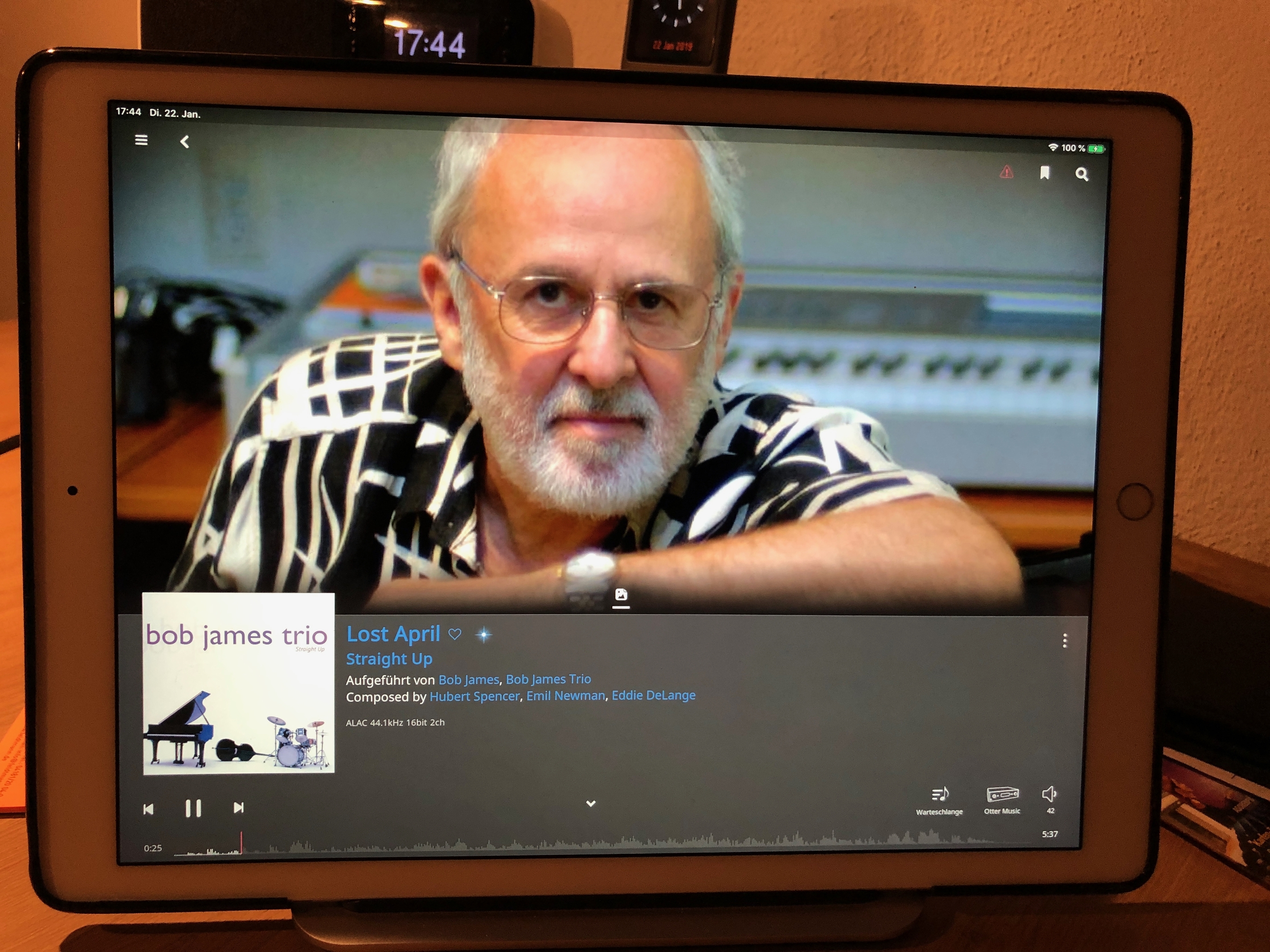
4 Likes
@support Is there an update on a “Now Playing” fix? It was my “go-to” screen for listening and I’ve been waiting in hopes this is fixed soon!
Thanks,
Spence
I really like the Now Playing screen, maybe a little tweak to location and sizes of controls whilst slimming down the height of the footer would be a good idea, but this old fashioned big cover art and controls only display really bores me for devices that have the screen real estate to display much more - I think the artist pic with smaller album cover looks just great! Perhaps release a personalised version for each user? 
The static lyrics with the huge font are a major problem. Based on my own limited survey, less than 1/3 to 1/2 of the songs offer streaming lyrics, and for the rest we are left with huge, ugly lyrics that must be laboriously scrolled through line by bloody line. This is completely a non-starter in a home theater setup. The good news is that Roon has said they will look at the issue – I am hopeful that means they will fix it in weeks and not months. On the plus side, the automatic scrolling works very well, even if the size of the text is VERY large and must have been designed for users with cataracts. It is the static lyrics – which is what we see most of the time – that is the problem.
This is discussed in the below thread. I encourage you to offer your opinion here as well, so Roon knows that a number of us share this concern.
The issue of the large static lyrics is also discussed at the bottom of this thread:
In other threads, I referred to this as the Curse of Sonos. Sonos periodically changes their entire app. In the process, Sonos throws out the baby with the bathwater, and abandon the parts of their app that work really well. In response, many of their customers loudly object, and complain that with each successive version, Sonos becomes more difficult to use.
To some degree, Roon did the same thing. Roon wiped out the use of large album covers in the Now Playing screen, which looked great and worked well. Roon also threw out the text box of lyrics, which worked much better for lyrics that aren’t live and don’t automatically scroll. In both cases, the UI developers behaved like Sonos and abandoned features that worked well.
But on the PLUS side for the Roon developers, the new ability to quickly click on the icons for artist bios and summary information on the albums is really helpful and well done. My primary reason to subscribe to Roon is for those features, so I appreciate that part of the new design.
I would urge the developers to RETAIN those new features.
Those icons should be on the very bottom, just above larger font that says what is playing. Instead of putting those icons across the middle of the page. Then, when we click on the icon for the artist bio, or for the description of the album, the bio would fill most of the screen, instead of only the top half. For many shorter bios, that would completely eliminate the need to scroll through the bio.
And when we click on the icon for the album cover, it would be restored and occupy the same space – most of the screen above.
Agreed. Many of us have spent hours downloading high res cover art, and now we are left with a thumbnail in the corner.
The photos that replaced the cover art are comical. Because Roon must automatically crop the photos to fit a home theater screen or an iPad, Roon ends up showing us the knee caps of artists, or the nose without a chin, and in one especially comical bit of auto cropping, from the knees to the chest. You can guess what part of the anatomy was then shown in the center.
3 Likes
Please don’t persist in this Fake News  - the lyrics box is still alive and kicking in 1.6
I haven’t looked at Roon since last night. Are you saying that this problem was fixed in the last 24 hours?
If so, that is great news instead of Fake News.
No, it’s always been there…