
A picture of a band from roon or Tidal that shows just one of the members, after the change in artist picture frame in 1.8
5 Likes
Albums = square
Artists = round
Simple! As long as the cropping of the artist images is carried out with a bit more finesse than is currently the case…
2 Likes
I was complaining to my wife last night about exactly this problem. I showed her some examples and she finally asked, “Does it really matter?”
I’m calling the divorce lawyer today. 
17 Likes
Finally some one who is reacting sane.
Insanity rules on this forum for a while now… i hope it will be over soon!
15 Likes
Funny that you posted this. I had a tough time adding this record (CSN Box set) to Roon with the 1.8 version. The only one, out of maybe 20 CDs, that I ripped and added to my library. I haven’t noticed the picture on my Artist page, will check it out when I get home.
Peace,
Tony
Yes…she is definitely the reasonable one in the house.
1 Like
Oh the humanity…
1 Like
Marriage is like a game of cards. At the start, all you need is a pair of diamonds.
Later, a club and a spade.
Does it matter, indeed…


Actually, after almost 37 years of marriage and being together for almost 40 years, we’re still at two hearts.
1 Like
You’re not the only one that thinks is wrong.
Artists in circle are OK with me.
Roon’s AI is simply unable to get it right automagically in many cases, like bands or photos where artists are not in the center.
Unfortunately there’s no way for the user to “adjust” this, be it on Roon images or user provided images.
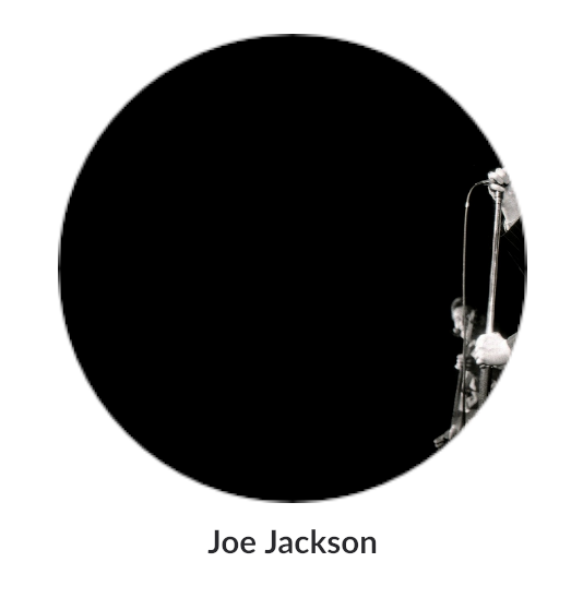
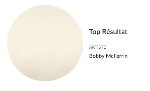
Erik Truffaz
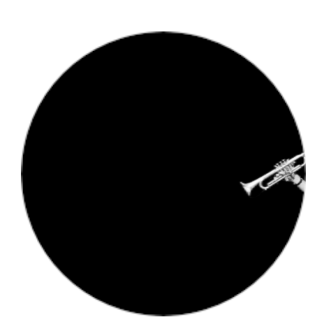
Manu Dibango
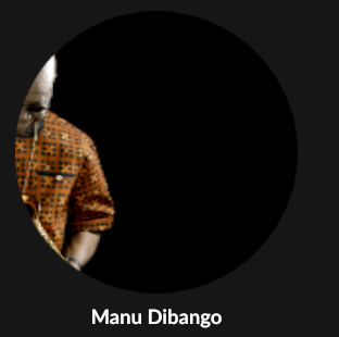
Eurythmics
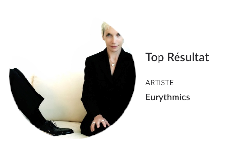
Bobby McFerrin
There’s another very irritating issue under 1.8 with the artist “banner” on PC/MAC desktop, like HD 1920x1080 resolution: more than often it’s completely off and disrespectful of the original photo, with no way for the user to adjust. Forcing a letterbox 3:1 aspect ratio is heresy on 3:2 or 4:3 material.
Example:
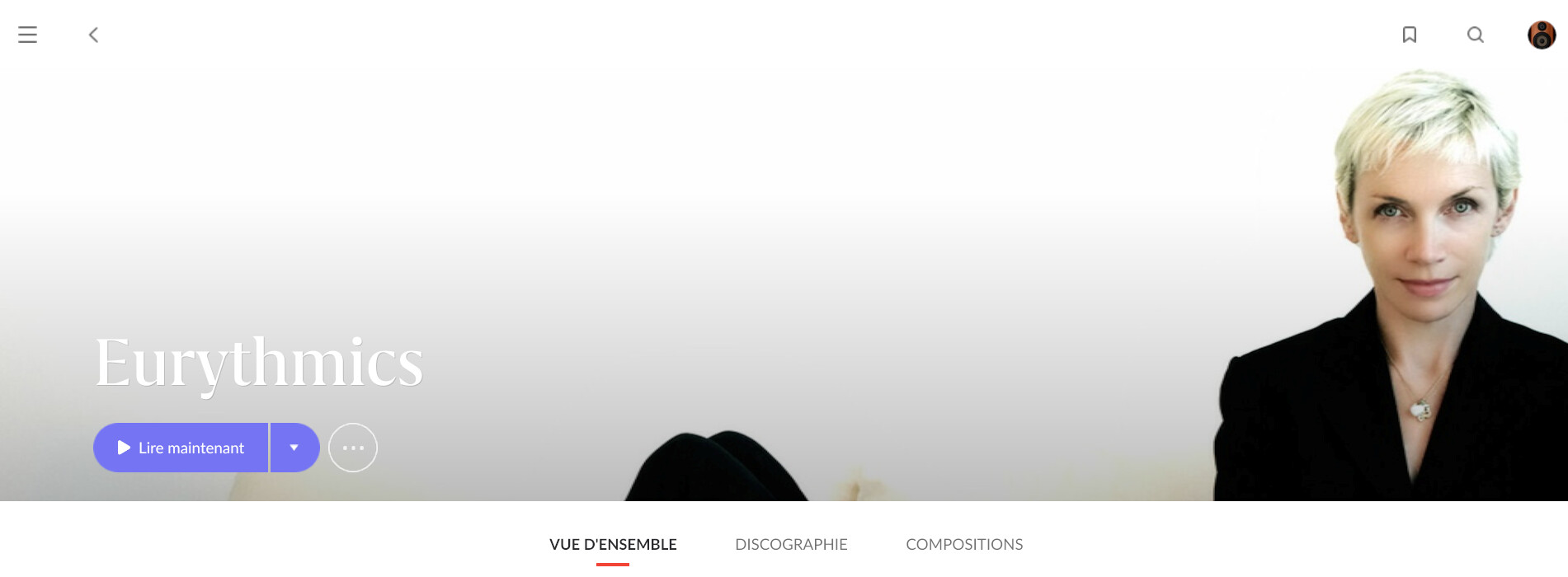
You might want to try and compare artist banner with original pic for:
The Beach Boys
The Police
Peter Gabriel
Justin Timberlake
Bryan Ferry
Grace Jones
Yoko Ono
Andrea Bocelli
Sia
Prince
Rihanna
Elvis Presley
Tom Jones
Bob Dylan
Angie Stone
Erykah Badu
Buck Meek
Stevie Wonder
Troy Andrews
New York Dolls
The Dave Brubeck Quartet
Ian Curtis
Sam Cooke
Daniel Barenboim
5 Likes
Never seen anything other than a square album cover myself , have reverted back to V1.7
29 years and ditto. But she regards my hifi habit as something to be smiled at sweetly if disbelievingly…
1 Like
Sure there is. Just add your own appropriately cropped image if this is bugging you…
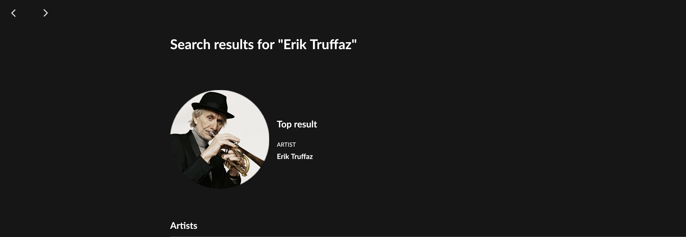
There are 10s of thousands of artists in the data that Roon has and it wouldn’t surprise me if it’s up to 100k or more. They’ve tried to have an algorithm to automatically crop an image to what displays in the circular window. This is very hard to get right and you can’t do this by hand. So that creates issues like you’ve noted with some artists. Over time the algorithm will likely get better, but in the mean time it’s really easy to fix anything that bugs you. Took me about 30 seconds to fix eric… Of course, it would be great if Roon added the ability to move the circular crop window around yourself to fix the image they are displaying…
But if Roon has a bigger picture, your’s will be not be displayed
Dirk
I’ve never seen this. If you add an artist image, that’s the one that is used.
2 Likes
Every time I open Roon, the new UI screams at me and I am at the point where I don’t even want to use Roon. It’s just way too annoying…for ME. I never liked the Qobuz app UI, and was pleased with the 1.7 UI. The 1.8 UI is more like the old Qobuz UI and that is a massive step backward…for ME.
I may stop using Roon for a while and use music service via their own apps. While I like many of the features of Roon, I just can’t stand using the new UI. It just drives me crazy. Again…that’s ME. Not even remotely suggesting anyone else does, or should, feel that way.
At this point, I wish I hadn’t gone with a lifetime subscription a year ago, because I wouldn’t be renewing an annual subscription at this point. That’s how bad the UI is…for ME. It just makes me not want to open the app. I know many will find that silly, but that’s how I feel about it.
If they find a way to make the Home Screen user configurable, that would help significantly. It can’t be that hard can it? Every phone and tablet offers that ability after all? I don’t know. I’m not a software engineer.
But there are so many other aspects of the Home Screen that are awful…to me…that simply allowing users to move and hide tiles won’t fix it for me. Would simply make it less awful…for ME.
I shall stop whining about the UI now. Sorry for the rant.
4 Likes
Noted something else with artist image treatment. (Only checked on android mobile)
Most artist imagery at the top of the individual artist page always gets a banner / rectangular treatment. But, weirdly IMO, a good number of artists in my library will alternate between banner and ‘circle’ on subseqent visits.
A deliberate choice related to applying the cropping algorithm? (I found none that always / only show in circles btw)
e.g. in the alphabetically sorted first 100 library artists that have a picture, I have 21 that receive the alternating treatment. Including:
A House
Abbey Lincoln
Afrocubism
Al Kooper
Alamo Racetrack
Ali Farka Touré
Andy Irvine
Angel Deradoorian
Angélique Kidjo
Anna Netrebko
On my 10 most recent NRFY album recommendations with an artist that has image material, I see 4 that get the ‘alternating’ treatment:
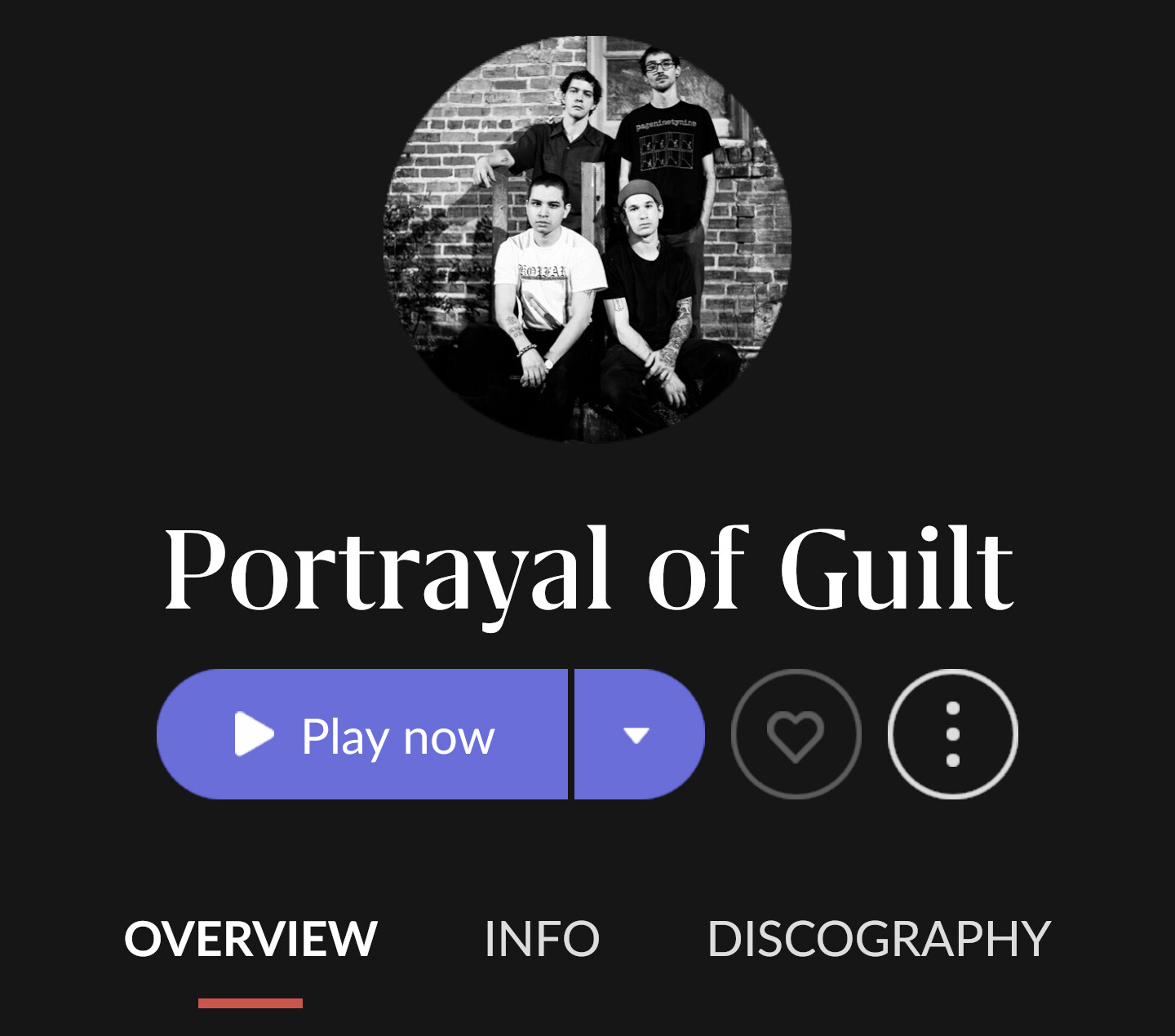
Portrayal of Guilt
Ethan Iverson
Nikita Karmen
Lia Ices
Three example below
Afrocubism

alternates with

Angélique Kidjo
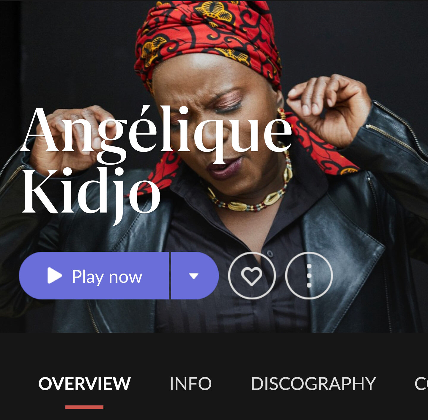
alternates with

Portrayal of Guilt

alternates with
actually i did add the pictures. and now, with the changed format… they are not well displayed anymore…
1 Like