There is always the chance that something changes with a new release and you have to redo something you edited… Probably no way to get away from that in today’s software world… I did the same thing and have had to redo some album artist photos in 1.8 …
1 Like
Hmm. That is indeed odd… One for support – you should post this there. Seems like a bug.
How did you manage that - I thought I was stuck with this once I had “upgraded”?
This is like a new found-art form. We should have a humorous thread for the best/worst/most interesting/artistic crops.
I’m on Mac OS Catalina, I do a back up every few weeks.
In the Applications Folder I renamed the file “Roon.app” to Roon_1.8.app, copied and pasted Roon.app from my back up to Applications Folder.
Perfectly working Roon Version 1.7
How about the remote apps for Ipad and Iphone ?
Sorry but I only use Roon on my iMac
‘y, Stills & Na’
One of my favorite super-groups !!
‘y’ made some really good solo albums, too.
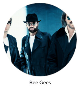
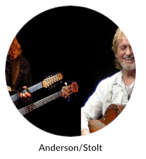
Spending about 12 years of my digital development career designing ux I discovered the hard way - never put anything in a circle which isn’t cropped manually. It causes too many problems which outweigh the aesthetics.
Generally good update l, but big sweeping ux changes can be a bit of a learning curve to unthink all the mental patterns users have mapped from prior ux.
2 Likes
This is exactly the issue that makes for extensive knee-jerk negativity with many users (and happens everywhere with new major releases in almost every market).
Whole heartedly agree with you there. Circles may be fine for individual artist perhaps, but just don’t work for groups. A poor design choice. TBH I think they look really naff too. They may be ok for mobile devices but for PC screens they don’t cut the mustard. Would be nice to have the option select squares or circles in the settings.
1 Like
The circles are horrible, and pointless since the space you lose cannot be used for anything else, if you want to differentiate artists from albums why not just use a different coloured border.
1 Like
Ha ha, what were they thinking? To the Roon makers: Camera sensors and film frames are all rectangular, nobody takes circular photos. I don’t wish to be a square, but in this case squares rules.
1 Like
Of course it matters, especially when your artist is cropped!
1 Like
For iOS you need a full Backup of your device (iTunes).
If you don’t have a backup, you’ve lost.
I must agree at least on some points regarding the new 1.8 UI. Just updated server and iPad app to 1.8. And the screenshot below, from the album track view, shows some violations against fundamental UI guidelines. These guidelines are not a matter of taste, they are well proven visual concepts.
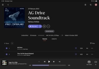
This screenshot shows at least two different font families and about six different font sizes. Major interactive elements are too small. And there’s too much information displayed on this single screen you really do not need at a glance.
Less IS definitely more in this case.
The color scheme… at least it needs getting used to, sorry. But, using rather well saturated colors is IMHO not the first choice for such kind of an app.
So, I think 1.8 is not an advancement over 1.7 when it comes to UI. And, as far as I can see, there’s no way to customize that. That’s rather sad. I, guess most of us just want a clear and sleek UI and UX - not a control center. It’s about music, not controlling.
So, please try to get more tidy here  .
.
1 Like