All of the artists pages are going through a machine learning process to produce that second picture effect. roon said it would take a week or two for the cache to change for users as they trickle them down.
Some people love the new look, some people hate it - who would have thought.
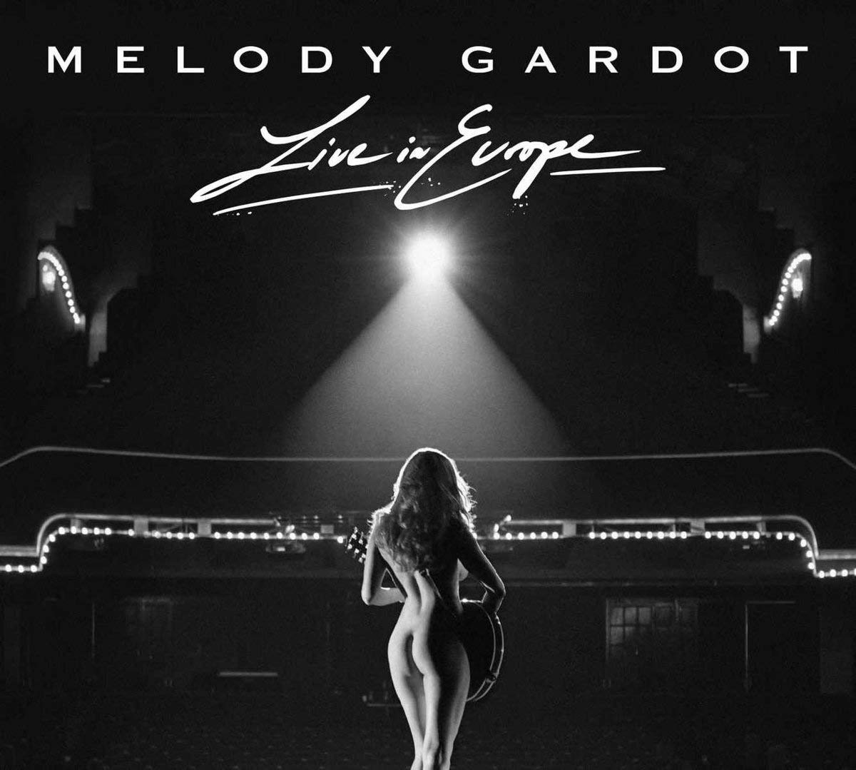
Well seeing as all female recording artists these days (even classical artists) have to be shown draped across a piano or something in what can only be described as sexy poses… I’m all for a bigger picture! (it seems the male dominated recoding industry hasn’t come that far really - I’m voting for a pic of Tom Waits in a skimpy costume draped across some bar with a whisky and a fag in his hand!)
Irritating isn’t it. When you watch TV the ugly male police lead isnt going to get home take his shirt off and wander about the rooms. But amazingly the beautiful young female cop always wanders about topless, just like every girl you have ever know DOESN’T.
Well, there was Andy topless, too. But I will only push the knife in so far! And, IIRC, this scene was very close to the end of the series. Maybe they thought it was safer then?
I always thought that Andy’s success with women in the series was either
a. proof that looks aren’t everything
b. proof the writers were living out their “ugly man gets hottie” fantasies atavistically
On the whole, I like version 1.6 and it prompted me to sign up for a lifetime subscription. To paraphrase Danny, I voted with my dollars. Please consider that when reading my comments below.
I haven’t engaged in the endless debates about colors of the bottom strip, etc. I’d be happy if a few big issues get fixed, like including album covers and fixing the static lyrics by again including them in a box in the Now Playing window, which Danny has said will be taken care of. (Hopefully Roon will slightly reduce the size of the font in scrolling lyrics as well, which is so large it is a bit ludicrous.)
I’d include this as another big issue that the developers need to address. This is just plain ugly.
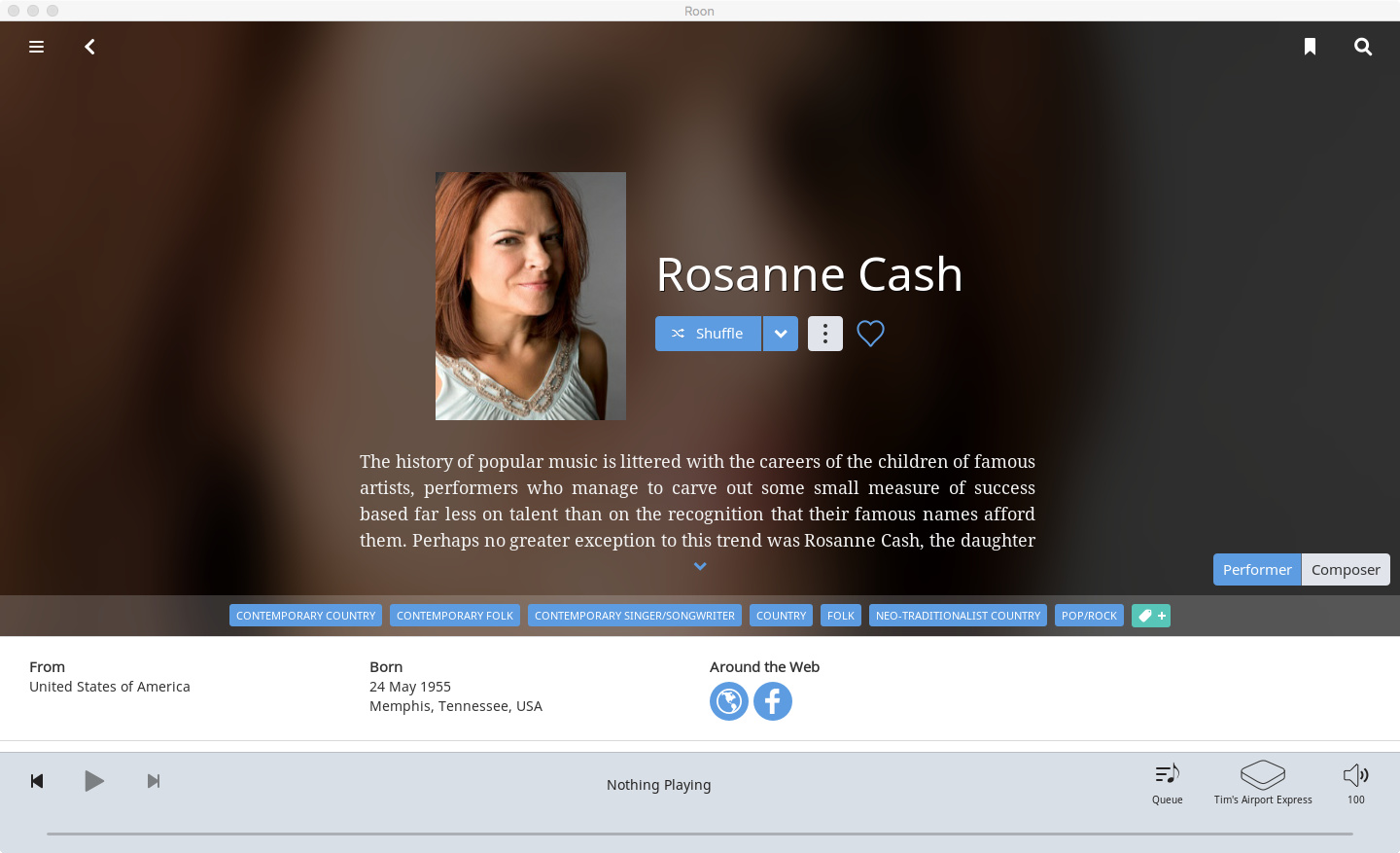
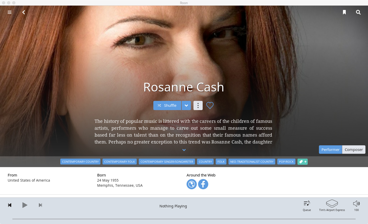
The problem is the severe zoom of a square photo that is then imposed on a rectangular monitor in what can only be described as the design equivalent of using brute force. It is awful based on this one example. All that is left of Rosanne Cash are her eyes, with the rest of her face blocked by the text. The crop is so severe that no one could even guess or recognize who the photo is of, were it not for her name pasted across her nose.
Seriously, who in the world of UI or design would have done this? How can any of the executives or developers at Roon defend this?
Danny, please tell the staff to back off on the brute force zoom – or find other rectangular photos that when zoomed to fill a rectangular TV monitor don’t end up with these results.
My post on the difference in cropping between a TV monitor versus an iPad was ignored, but I suspect that this photo is yet another example. This might not look so bad on an iPad as the crop probably picks up more of her face as the crop would be more square rather than a long rectangle. (I’m not in a position to use Roon as I’m typing this, so don’t know.) The crop of Mumford & Sons was a worse example, where the square iPad version worked fine, but the result on a rectangular TV monitor cut their heads in half. (Whether that will be corrected is unknown.)
This falls in the category of a big problem IHMO, along with album covers and lyrics. It needs to be addressed, even if it means that Roon must start over by selecting other pictures and zooming less to fill the screen of a monitor.
Or adapt a different design where Roon is not forcing square shaped photos to fill an entire rectangular screen, with these predictable and ugly results.
If ever there was a case for a design with a gray border around a photo, so the resulting zoom of square photos on a rectangle television monitor would look better, this is it. Or, as I said, substituting different rectangular shaped photos as the starting point.
It is such a severe zoom that it serves no purpose. As I said, without her name pasted over her nose, no one would recognize who the photo is even of.
All that Roon has to do is apply a less severe zoom. Or find photos that work for the purpose. Or restore borders or bars around square photos when they are zoomed.
When photos are zoomed so severely that they aren’t even recognizable, it is a bad design by any definition.
I’m assuming it is due to desire to keep the photo filling the space. If less zoom, then more blank sidebars or top/bottom bars. That would be preferable, IMO, to annoying photo cropping though.


 (it seems the male dominated recoding industry hasn’t come that far really - I’m voting for a pic of Tom Waits in a skimpy costume draped across some bar with a whisky and a fag in his hand!)