The picture is not just a visual eff3ct and should not be treated as such.
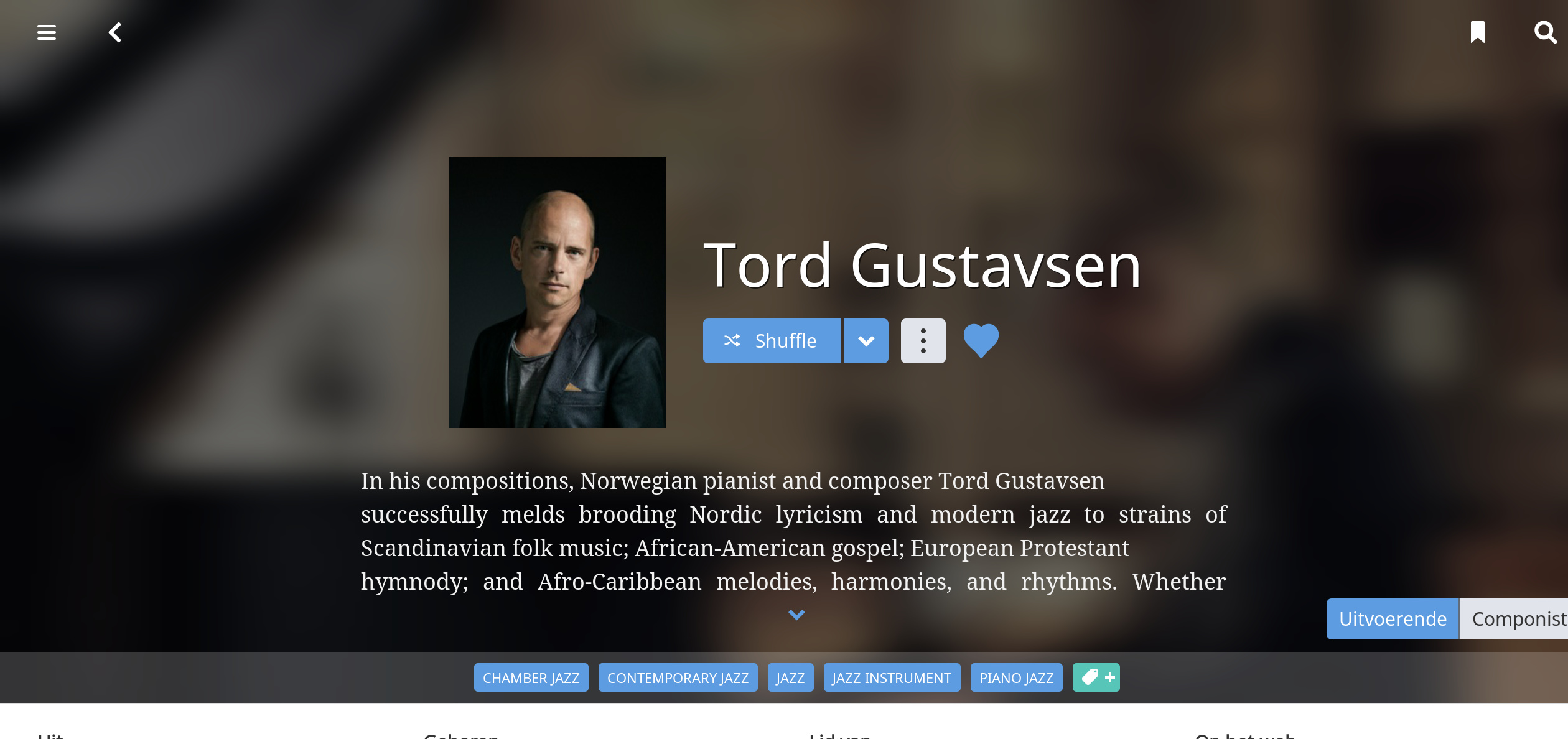
In my music choices, mostly jazz and “modern classical”, there are many musicians and I find it very valuable to pay attention to them, because following them will often lead to new artists and new music. But there are all these names. What does Drew Gress do, again? And Ibrahim Maalouf? Piano, or was that Abdullah Ibrahim? This is how I get to know and love great musicians that are not household names. To help with this, I strive to include pictures of the musician with the instrument. And that means it can’t be cropped to just the eyes, or even a face, however comely. Having a face is not a distinguishing factor.
I subscribe to Roon so that they will do the work for me. I commend you for substituting your own photos, but I have no intention of doing so.
Roon needs to have design that works 90% of the time, using their photos. This is not brain surgery. Roon needs to use rectangular photos so that the zoom works. Or restore borders around square photos.
The brute force zoom of square photos to fill a rectangular screen doesn’t work – at least not in the case discussed here, or in others that I have seen.
This is not one of the minor issues that result in long debates. This is a major design flaw. Visitors to my home theater will break out laughing when they see the resulting brute force zooms.
BubbleUPnP does a good job blending colors from the photo into the background making empty space integrated with the overall view. I will post a screen shot when home later.
That sounds like a practical solution to solve the problem. Roon already has a data base of tens of thousands of square photos, as that is what they were using in version 1.5. What they need is a method to zoom square photos – but zoom less and not to the degree of using brute force. Your suggestion to zoom less, and then use a blur to fill in the empty space, would work well.
I still love watching the On The Buses old films and series to see how Reg Varney and his mate always pulled the sexy little chippies that worked with them, they were queueing up to nip behind the bus shelter with them pretty much!! Obviously in the 60’s and 70’s the ladies were a little myopic!
I don’t think Roon check every photo and then crop to fit, that would be impossible and never ending seeing how many new artists appear every week, its a machine learning thing - maybe they can bring in face recognition algorithms to help with placement? But if only poor or square pictures are available from the recognised sources then what can they do? They could trawl the net but that would get caught up in copyright issues, not a problem when you are filling in your own pics for your own library use of course. It will get better as more images are found and more algorithms are employed for cropping and magnifying I am sure.
If the labels and distributors of media files for streaming supplied attached metadata and images for various formats then there wouldn’t be a problem, and Roon would be worried!
I addressed those issues in my first posting in this thread. And I have not been one to complain about small issues. I have reserved my comments to three major shortcomings in the new design. Not only that, I upgraded to a lifetime subscription in recognition of the many great revisions included in version 1.6.
However, this is not one of them.
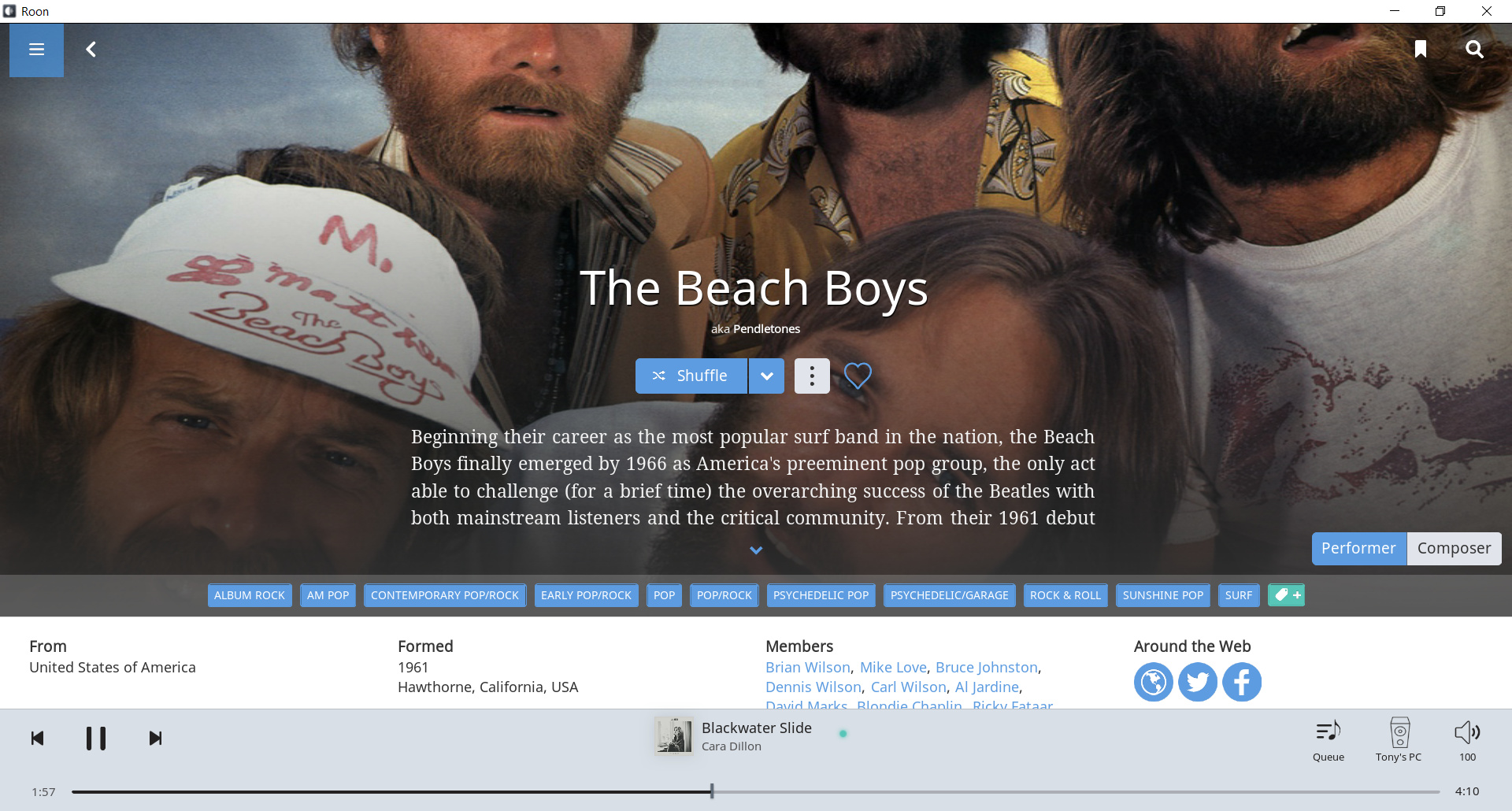
They don’t need to do that. They simply have to stop the brute force crop of square photos to fit rectangular televisions and monitors. This is the software design equivalent of hammering a round peg into a square hole with a sledge hammer. There are far too many photos where the current method fails. You may have found one so-called cool photo but there are too many others that are simply hatchet jobs caused by the automatic cropping. The designers surely saw that this would be the result, and did it anyway.
The response from Roon to prior comments about this has been that their face recognition software would focus on faces, and we would then see the face and not the knees or torso. Well, the result in too many cases is the eyes and the nose with everything else in a square photo cropped and thrown away.
The photo that prompted this thread is more typical of the problem caused by the cropping, than the few with a so-called cool result.
It would not have been difficult for Roon to launch version 1.6 with a design that would work with square photos on rectangular televisions and monitors. Pstrisik offered one suggestion above. I’m sure there are others.
This, along with absence of album covers and static lyrics that must be scrolled through line by line, is something they need to fix.
Again, I have only commented on glaring problems with the new design. This is one of them.
I’ve had the same crowd reaction with Roon’s Chromecast display - mainly with heads cut off / faces in half.
But Roon have mentioned something is happening in the background to improve this over the next week or two, so I’m happy to leave Chromecast display off and revisit in a few weeks.
Hopefully the advanced algorithm can get more advanced.
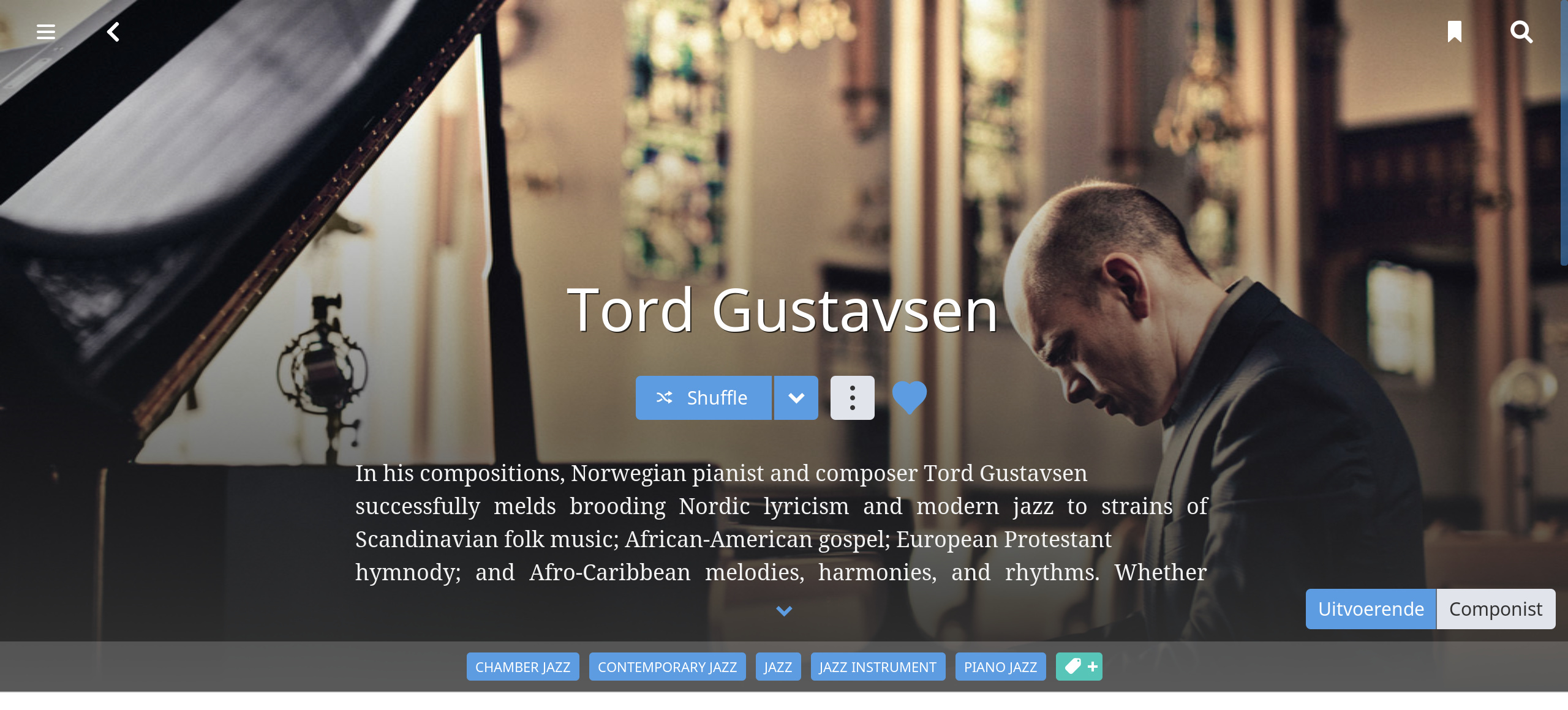
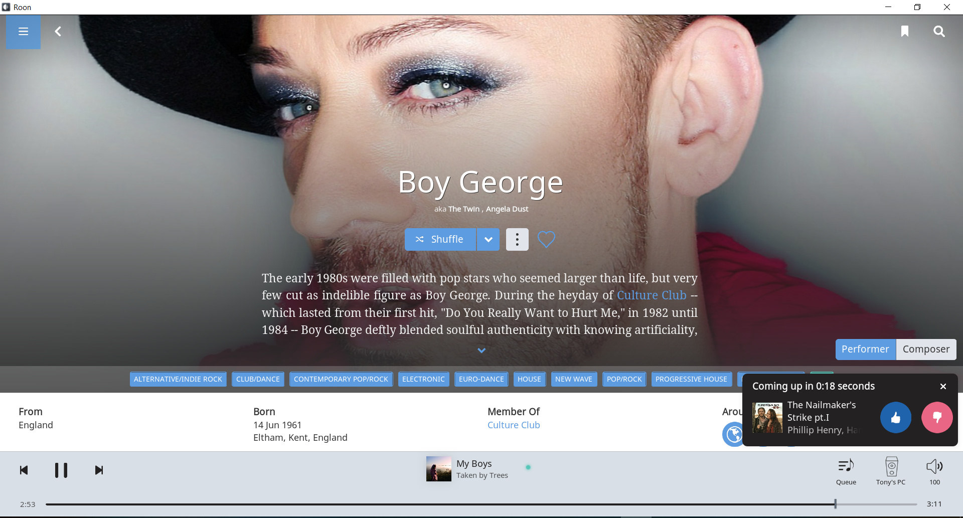
There is off-centerd art starting to come through (both horizontally and vertically). For me it works much better with centered text but it is a bit hit and miss. Most of the art coming through is centered. That’s going to be very difficult to make work with centered text. The hard cropping of low rez historical photos for Classical doesn’t work at all. I know no one wants to go there but fitting a predominantly centered art work stream around off-centered text may well be easier than fitting it around centered text.
I’m curious as to what’s wrong with any of the three examples? I read your description (centered, not centered) and I’m not fully understanding - Is it functional, aesthetic etc…?
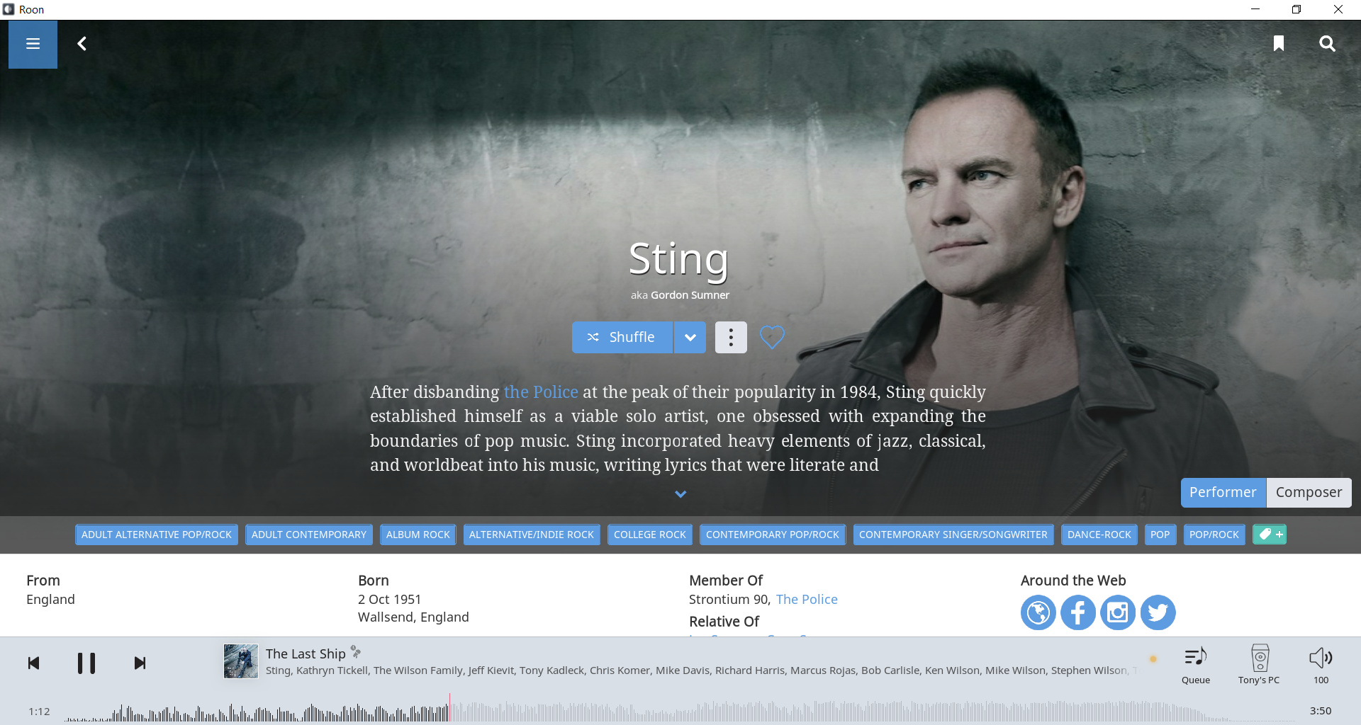
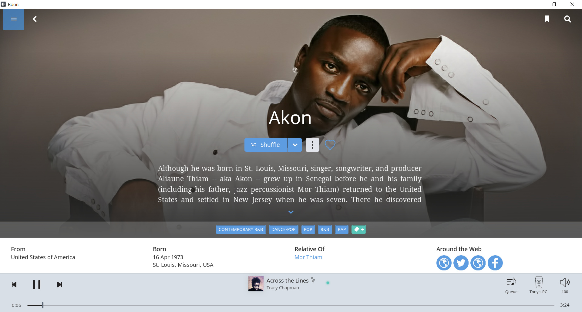
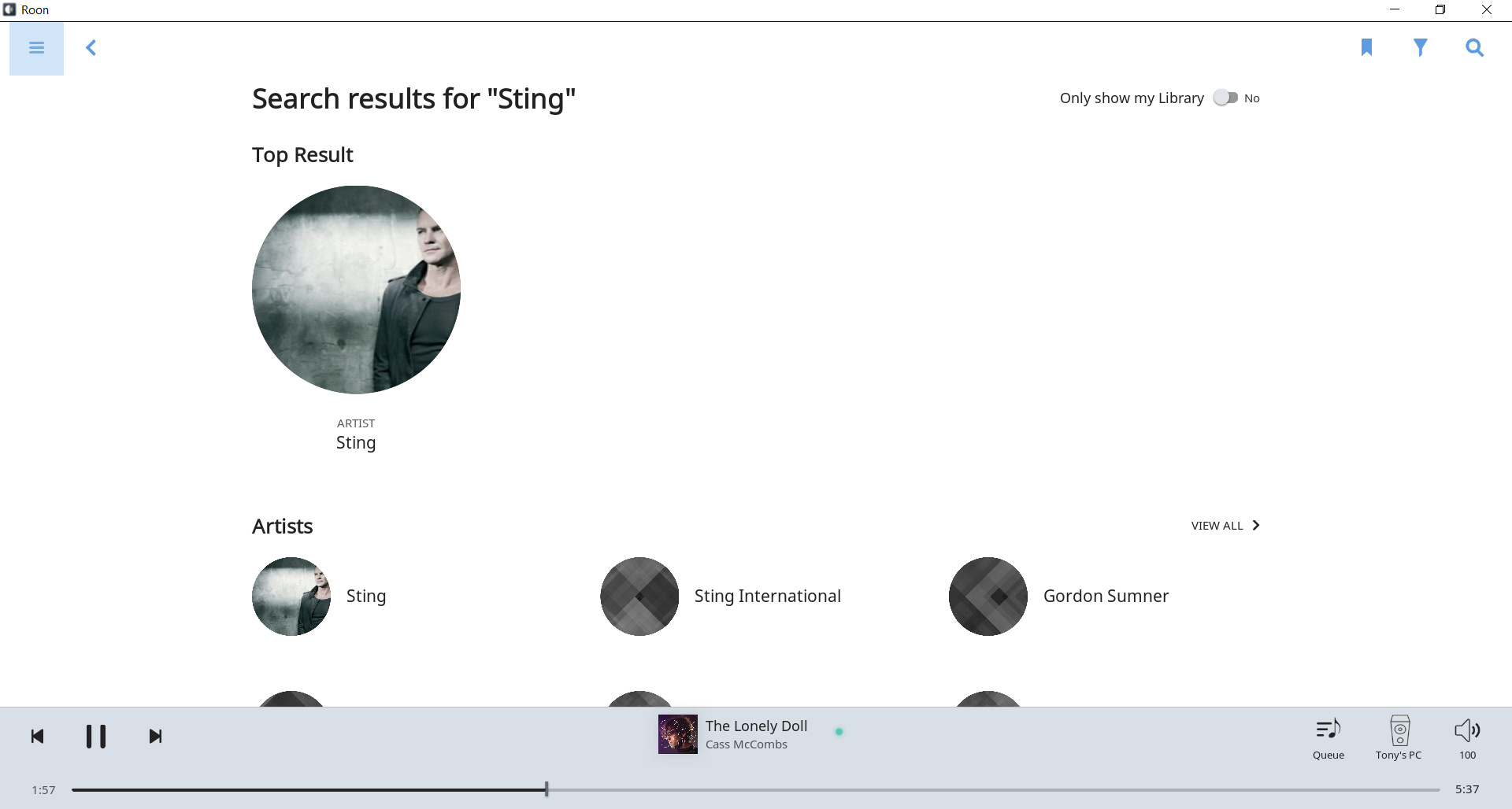
I didn’t say all three were wrong. I said off centered horizontally was good (Sting). And off-centered vertically (Akon) was also good. Blown up full page spreads of historical photos with resolutions as low as 200x200 I said was bad (Faure).
When you refer to “Most of the art coming through is centered. That’s going to be very difficult to make work with centered text”, are you referring to the artists “head” or face being centered behind text?
I think what you are referring to as a face shot is what I am used to hearing being referred to as a head shot. When I say, off-centered I mean the eyes.
It is not just centered single head shots which will be difficult to match to centered text. Centered group head shots to a greater or lesser extent are going to have this problem as well. I don’t know if these are recent downloads or are due to be updated but these are two more examples of what I have at the moment.
As I say I can see some off-centered art, starting to come through. Aesthetically it works better than centered images. The photo libraries stock a variety of images precisely for this purpose so that they can be matched with different text layouts. It is something likely to be important to some and not to others. But I would say that it will probably matter for most as otherwise the labels could have saved a lot of money by selling their stuff in brown paper bags in the past.
Here are another couple of examples of off-centering to the right which works better with centered text. In my library they are the exception rather than the rule. Most of the images are centered. From memory, I think these ones have been updated since 1.5 but I couldn’t be entirely sure:
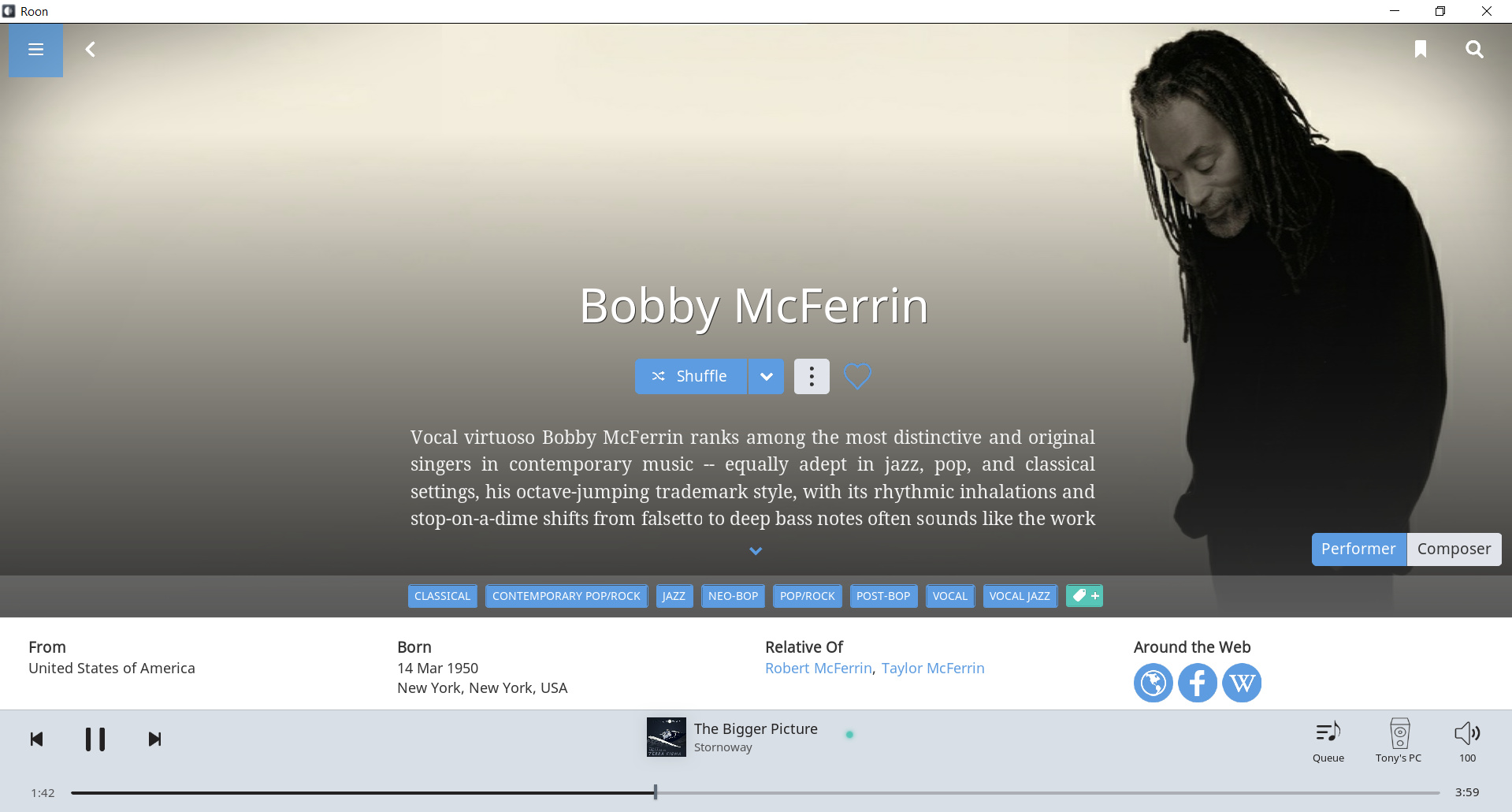
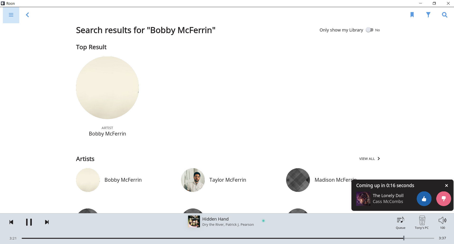
Unfortunately the Bobby McFerrin image is not going to work on all pages. On the search page for example the artist circle is just a blank background (presumably taken from the center of the landscape image).
Ok, here’s a screenshot. Since Roon, I haven’t been over to BubbleUPnP much. It looks like he changed the approach and elimated the blur. Still, the solid color drawn from the photo works well. The color would change when the photo changed. I think it would be elegant and we would have full photos regardless of their aspect ratio.
When the Roon team first discussed this issue, they (@brian ?) mentioned the conflicting requirements of full pages (e.g. wide shot with off-center focal area) with the artist browser (smaller rectangle needing centered focal area), and phone form factor, and 9thers. This is why they focused on AI for dynamic adjustment, rather than trying to find the ideal picture.
I hope they are successful with that “dynamic adjustment” strategy. The point I was trying to make is that centered text is an additional constraint that is going to make that adjustment very difficult with many stock images for all form factors. With some genres the number of available stock photos may be very small indeed. Maybe only one.
Well I just keep getting those cool images, what can I say, oops no I’ve just got a huge set of spectacles on Bill Evans, all pixelated and scary! Yes I know its a pain, but for me, and I can only speak for me, the concept is the best one and I like it. I don’t want colours derived from the image blurred and laid behind a square picture in general use - ok on a phone device definitely (but then the cover art works best here). Where it works, it works very well - its simply a matter of getting behind the developers and understanding that in those cases where it doesn’t work they need to identify when this has happened and what to do about it… maybe a blurred colour derived background behind a square pic in just those case, till a new image is sourced? I have faith - but then I’m a brand new Roon user.
 …
…