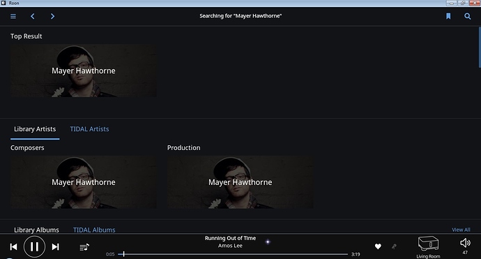
When I do an artist search the top row is dedicated to Top Result. Below is a section with Library Artists and Tidal Artists (if you use Tidal). In Library Artists, Composers and Production is shown. My question is, why not just put all three results and ttwo tabs in the Top Result section and label each one as Artist, Composer, Production? It seems like there is a lot of wasted horizontal space. This will allow users to see album results without having to scroll down a bit.
