First off, thanks Roon for all you do. I LOVE this program. When I signed up for a lifetime membership, it’s because this piece of software was simply perfect for my large home music library. And having AllMusic integrated completely sealed the deal. For me personally, I don’t use the streaming services (Tidal. Qobuz) so all my music is played through my local storage. Approximately 10TB worth! And things like lyrics and Roon Radio are of little interest too. I can find lyrics anywhere and karaoke nights won’t be happening at my place. And Roon radio is a nice idea but I simply won’t use it as I can curate my playlists as needed. So, Roon 1.6 is out and what most disappoints me is the Now playing screen which used to show the cover art with the “up next” tune in the right hand corner has been taken away. Now we get lyrics, or the dreaded artist large picture which has been featured as the “display” for a while now. Apparently, this was the consensus? I get that streaming sites are the thing now. Spotify, Apple Music, Tidal, Quboz but that means nothing to me. What I was hoping for was having access to the iphone mobile app to stream my library outside my home network. But that didn’t happen. Just more “streaming” options within Roon at home only. Primarily, I just want the “now playing” screen back. I would revert to an older version if I could. It’s actually making me less likely to wanna play something now with the very poor now playing interface. Please give us the option.
Restore the entire system backup you made before upgrading. They don’t provide a way back…
Thanks Larry!
If you want the old “now playing screen” just click on the album cover. It all comes back just like it was.
Downgrading is not supported guys – it’s really not a good idea, and not something we can support.
That said, fear not – we’re listening to the feedback and already working on changes. We really appreciate everyone letting us know what they think of the changes, so keep it coming.
Thank you. Hopefully the “Now Playing” page fix will be soon. This shouldn’t be a “roadmap” or “feature request”. It needs to be brought back like yesterday.
As much as I do like the new now playing screen for it’s functionality I totally agree that it is not a display anymore for just watching what’s on at the moment. It serves a totally different function now.
I have a 17" monitor attached to my PC and all I want it to show is the cover art, song title, album title snd band name in a readable font. I had no problem ever with that with my old player. With the now playing screen now that has become impossible. Now we also have the display function but even on my 32 inch TV I cannot read the artists name because of the tiny font size on a footballfield of empty space. I really question for what purpose this screen was designed, for sure not to provide you track information while sitting on the other side of the Room. It’s purely bling bling to me and of no use.
All the space is gone up to a artist picture that most of the time has got nothing to do with the album I’m listening to. Just yesterday I listened to a 1980 Dead Kennedies album an a picture was shown of four middle of the road granddads. I don’t think the bandmembers looked like that when they recorded the album so it does not reflect on what I’m listening to and therefore has no place to be displayed multiple times as big as the cover art. So yes, count me in for a (screensaver) screen with cover art as big as fits on the screen with big enough font for the trackinfo to be readable from 3-5 meter distant.
Even if they did look like that, so what? How they look has no connection to their music, unless maybe you’re listening to non-artists who trade mainly on appearance. And if Roon is going to show pictures, show them of live performances by the band around the time of the track’s ascendance.
Agree. Most of the time I don’t want to know what the musicians look like at the moment. I surely don’t want to get confronted with it in the way the display function does.
Is the “Now Playing” issue being fixed and do we have a timetable for getting this back to full album cover art instead of artist pic? Thanks.
I would roll back if I could for this reason I documented here:
I am a heavy DSP user however, perhaps most are OK with it…
I image my machines before making a major upgrade. I just re-imaged them back so now I am back on Roon 1.5 
Do you have an example of this? There were several font-size increases and visual consistency updates to font rendering in the Chromecast/web display code in the releases prior to 1.6. We haven’t really heard feedback either way regarding these changes. Even the font sizes that this feature originally shipped with are considerably larger than the fonts that other applications like Qobuz/Tidal/Spotify/Soundcloud/etc use to display the same information on Chromecast displays.
I agree, do please consider larger TV scale displays with folk a few meters away. Make the album art as big as you can, and increase font sizes to a larger level for us folk with less than 20/20 vision. Check out portrait modes too, as i use this method in one of my room, and actually this is pretty good, font wise, but there is way too much space given over to the artist photo, this estate should be for large album art (at least as a config option) If you are worried about fonts being too big, its should not be hard to wrap it or scroll it. Do bring back whats up next too, always nice to know whats coming next when listening to an album. Finally the radio toast message about whats coming is not well designed for dark mode, looks like it was only tested/built for light mode rather than dark. Mostly good, but I do think the design team had a bad day in the office when you fixed on the now playing design
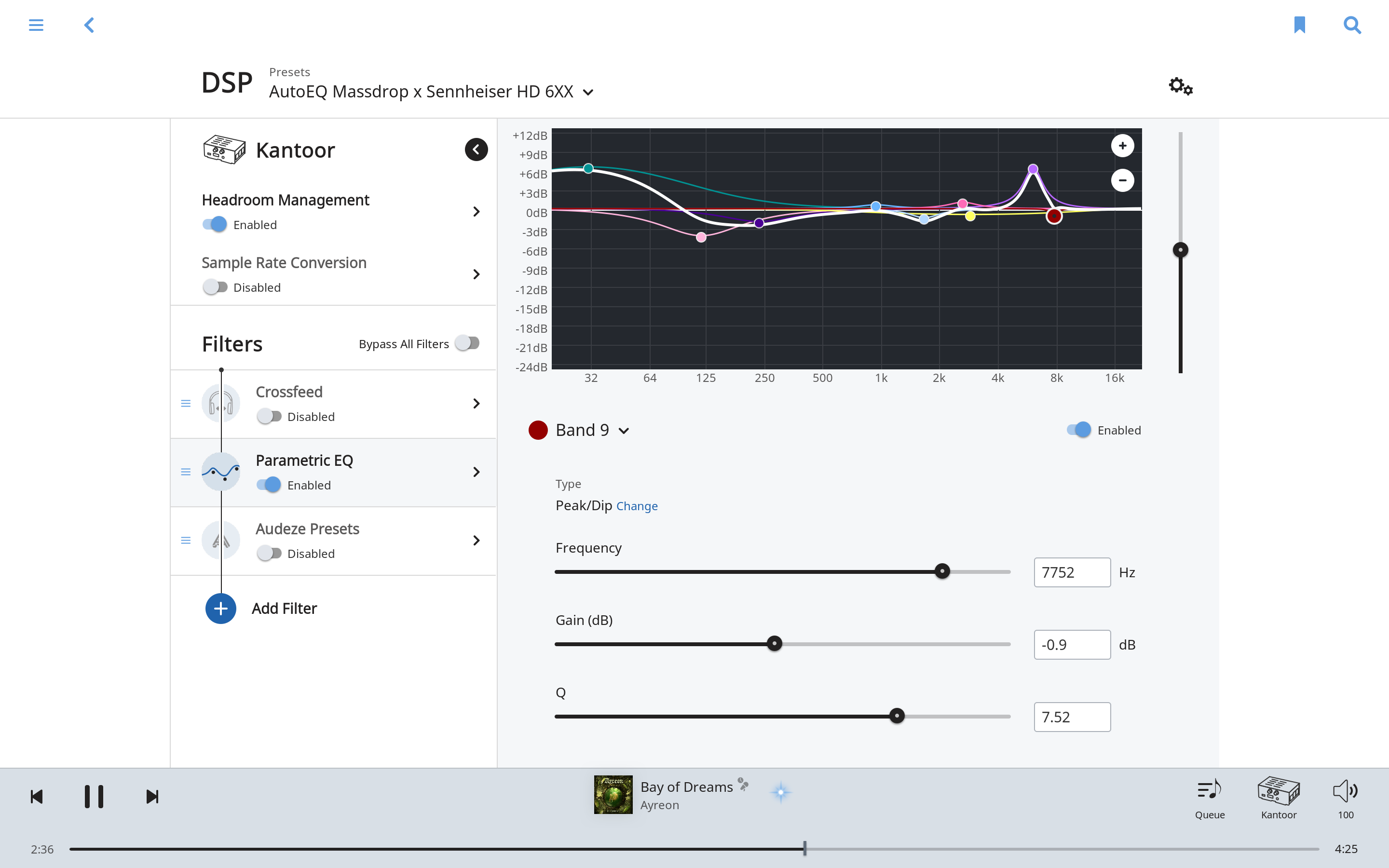
Did you try? I just created an AutoEQ preset with nine bands using numerical input on Roon 1.6 / MacOS. See attached screenshot. What is the problem?
It appears that the Roon developers primarily use iPads, as the new design for both the Now Playing page as well as for Lyrics works best on iPads and not on large TV displays in a home theater setting. (See the posts on lyrics for an explanation of that problem when lyrics do not automatically stream, and specifically why it does not work in a home theater scenario.)
After using version 1.6 for the last day, I recognize that the new approach on the Now Playing page is definitely a step forward with regards to making it easy to see the artist bio and information on the song from that page. And when using the Radio, the option of letting the photos scroll and change from one song to another is nice.
But on the whole, when playing music in a home theater as well as through my house using a Sonos system and iPads, it is easiest to be able to glance down at a large image of the album cover with large text showing the artist, album and song that is playing. Even on a iPad, that is nice, as it can be quickly read, and in my case, without putting on glasses.
The approach taken in version 1.5 and earlier, to be able to implement that by clicking on the small square, and then close that page by clicking on the X in the corner, worked very well.
Can the Roon developers retain the improvements they have made, and continue to allow the quick selecton of artist bio, song info, track info, and photos, etc? While returning to the approach of version 1.5 and allowing a user to click on the square and then have a single page showing the large album cover with only the information on what is playing?
That would combine the best of both versions.
I’d also observe that the Roon developers appear to suffer from what I’d call the Curse of Sonos. The developers of Sonos, have, time and again, made radical alterations that tossed aside what worked really well, just so they could have something new and different. That led to many Sonos users strenuously objecting and arguing that the new versions were worse than the old.
I wouldn’t go that far when describing Roon version 1.6, as it has many great improvements. Unlike those who posted above, I have no desire to go backwards to version 1.5.
But it is true that Roon has discarded many strong features in version 1.5, which is similar to the Curse of Sonos. Roon needs to retain what worked really well in version 1.5 (such as the box of lyrics for lyrics that don’t automatically stream) while incorporating new features that really work well (such as the large line of lyrics for lyrics that do automatically stream).
And from version 1.5, retain the ability to call up the large Now Playing page with only the album cover and info on what is playing.
I agree, that this former Now Playing page is needed again, which shouldn’t be a big issue to reimplement. Besides this: The new release is great! I love to have QOBUZ besides TIDAL. Certainly this improvement is much more important than the former Now Playing page.
I entirely agree. While I can’t yet use Qobuz (live in the US), that along with other features, like the improved Radio, is a major step forward in version 1.6.
Roon just needs to avoid the Curse of Sonos and retain the features from version 1.5 that worked well. The former Now Playing page, and the box of text for lyrics for lyrics that do not automatically stream, would be at the top of my list for the strengths of version 1.5 that the Roon developers unwisely abandoned.
I have not tried the display function in 1.6 yet because I did not see anything about it in the changelog and had given up on it. In 1.5 the font size of the artist name is to thin and to small to be easily readable. There is plenty of space to make them bolder and bigger, I mean it’s an information screen so my guess is that the info itself should come on the first place and then the rest of the design. The timing in the progress bar is completely unreadable.
The fact that others also use small fonts does that mean Roon has to follow. I thought you guys liked to do things differently. But yes I have also tried those. Spotify also has small fonts but these are bolder and have more contrast with the background.
O.k. just tried 1.6 version. The font is indeed a bit bigger but still. Here a quick foto of the Roon Display viewed from where I am sitting (about 3 meters from the screen)
As you can see, the Title is readable, the artist name is problematic, it’s hardly readable, at least not without much effort. The timing in the progress bar? what numbers? I don’t see any.
The letter are simply to thin and samll on a too light background to be easily readable. Doesn’t look good to me. There is soooo much space on this screen
Problem is there is no numerical input for global gain (there was in 1.5), only the slider (all the way on the right in your screenshot). You don’t boost over 0db with today’s compressed music do you? 
Now shrink your Roon window so that Q and maybe Gain (band) is off screen, and an second narrow windowing slider appears at right. Now, carefully, click on this narrow slider. Now, miss it by a hair - what happens? Global gain is “adjusted” to some absurd (possibly loud) amount.
Now, do all this on touch screen…this is a BIG problem. I now consider Roon DSP dangerous with a mouse, and broken for touch.