I’m sorry my post might not have been clear. I am not advocating for Vince Clarke to be “demoted” from being a key member of Depeche Mode. There was no argument presented about the value of these band members outside of perhaps Andrew Fletcher still being a member of the band and can”t understand why he wouldn’t be included.
Instead, I was attempting to illustrate that a group with a total of only five present and former members cannot be displayed on this screen with all of this available space. In 1.7, when band members were treated as list credits, this wouldn’t have been an issue.
Therefore I was advocating for the benefits of list view in our Roon interface.
I hope this helps clarify my post for you and others!
A I mentioned before, you weren’t display the credits screen. Moreover, whether using a list or images the metadata are the same. This discussion should be about presentation since that is what has changed. Metadata are another matter.
I think the issue is most noticeable when you have a famous guest star that only sang a little background on one track elevated to important member whilst actual band members who wrote the song the guest star appears on are demoted to the also appears on category.
Requiring more clicks and typing “saxophone”. What about clicking once on Credits and immediately seeing all (hotlinked) credits needed to be fixed or improved?
IMO, this is emblematic of the way this update generally makes information harder to find and/or see in favor of larger images and more white space. From the old credit list, I could click on the artist if I wanted to see a pic of the artist. Now images are primary, information secondary.
Sorry, I’m not buying that as a reason the new format doesn’t work. I don’t think the argument is very compelling.
Take 10,000 Maniac’s In My Tribe – which happens to be the first album in my library – and there is a credit for Michael Stipe (1 track) ahead of Natalie Merchant (all tracks.) My question to you is how would a list be differed? It wouldn’t since it’s the same metadata. Maybe it is legitimate to question order or weight of an artist, but again that’s not what’s being put into question here.
Martin. Either you’ve picked a great example where all those getting credits have pics, or you’ve actually added pics for everyone in your library that has credits. If the latter you have my immense respect…
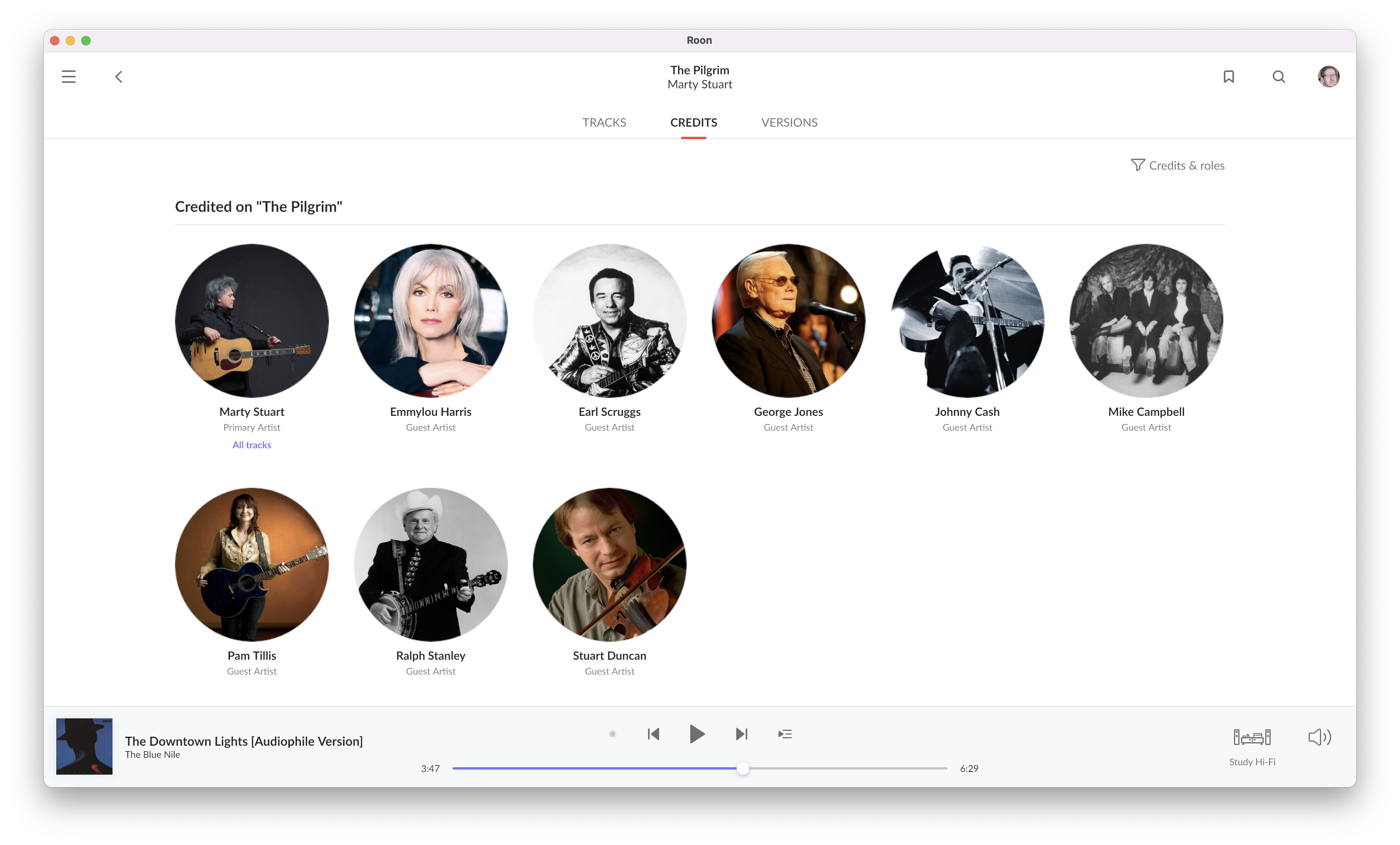
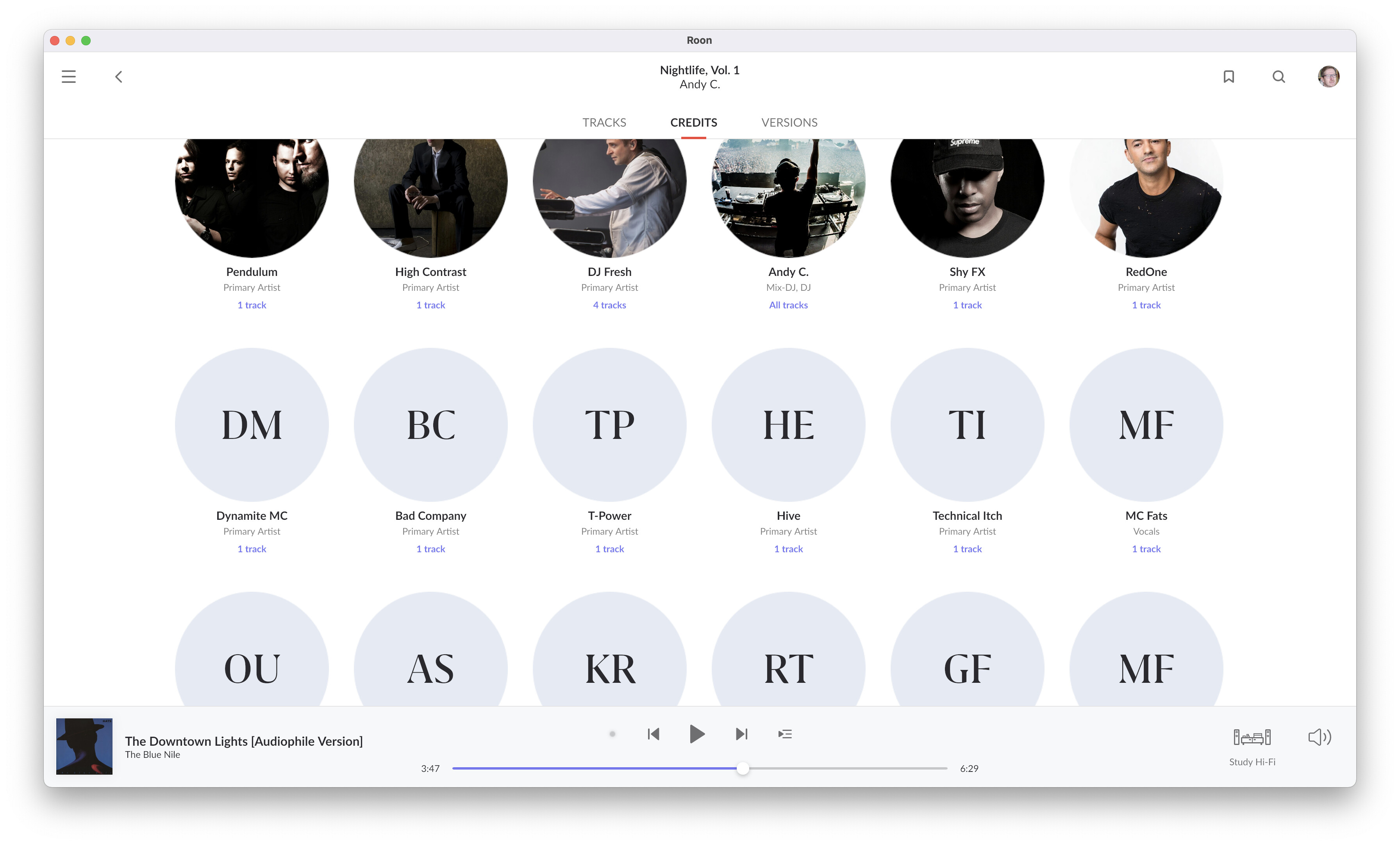
But the key issue with 1.8 credits from my perspective is the vast majority of those getting credits that I’ve looked at have no pics. And I am one that has added enough pics so all the artists in my library have them… A screen full of empty circles that take up so much space I generally have to scroll now to see all the credits (on a tablet) isn’t a positive step forward, even though in general I really like 1.8. If Roon would license more pics as they could from someone like Getty Images so blank pics would be few and far between I would feel differently and I wouldn’t mind the scroll. And I’d probably take the time to fill in the missing pics in credits if they were few and far in between…
And BTW, I embrace change…just don’t think this page is a good design given the issues above.
It is genuinely the first album in my library. Over the years I have added some pictures so it is possible that some are additions in this view. I certainly fill the gaps from time to time but some of my albums look more like this:
But I don’t see this as an issue and think maybe it’s an indicator of what may come in future. I prefer incremental change rather than giant leaps. Nonetheless, I still find the new look a big leap forward and would hate to go back to a simple list that serves little purpose in that form.
Your argument seems to suggest Roon leave things alone until, for example, the metadata are fixed. If we all take this approach we’d never get anything done! I believe Roon has a vision and we’ve seen changes in 1.6, 1.7 (with a mixture of UI approaches) and 1.8 that move the product closer to this.
It would be so much more helpful if people stopped bahaving like the victims of change and explained why things don’t work well for them. If we don’t think this is a good design we should say why. What’s good? What’s bad? What could be better? Rubbishing something achieves nothing.
Not suggesting that at all. I’m only suggesting for the single credits page (not any of the rest of the 1.8 design that I like) that a graphical/pictorial design for credits when the majority of pics frames are empty isn’t IMHO a great design and I’d prefer to go back to more of a textual display until coverage of pics could be improved. It’s fine that you disagree.
BTW, If it wasn’t obvious, this is not a major issue with me. I just think they could have come up with a better design for credits. I’ll live with it if they stick with it exactly as is. It’s more of a “the design could be improved”, not “it’s a completely broken design” kind of issue. Frankly for me, 1.8 has no show stoppers. Quite a few rough edges to sand off, some bugs to fix and some issues that I understand are major for others (tag handling, only playlisting with 5000 tracks, ratings, etc) but none of these are major for me at all. I really like 1.8.
Please do the same for label. Bring back ‘Labels as a list’ instead of max 6 items + more button (another click after a huge scroll)
Simplify it, just like 1.7,
I partially agree with what you are saying. Previous versions of Roon never revealed completely who played on each track of an album and what instrument they played. The source of information was All Music and their information was for an album in its totality, not each track. The new Roon doesn’t tell me track specific information on artists either. However, if the artist on an album are the same ones on each track and the instrument doesn’t change then there is no complaint.
My data base source for Roon is an iTunes file (4.5Tb) of about 5,200+ albums. In this data base in the artist field I have listed each artist and instrument for each track. This data is then presented in Roon directly under or near each track. It’s helpful if you do Playlists, as the artist and instrument info is displayed in the artist field of the playlists.
The downside of course is that I have typed this information for every song in every album
@William_Krause – you have my undying respect! I’m kind of a meta data fanatic and also have about the same number of albums. I’ve made sure all track names, album names, and artist names are all done to a consistent style. All have HD cover art. And all artist have photos. And for a long time did track based genres but gave that up because it was too hard to use that work seamless with Roon’s data. But I never bothered to even envision tackling track based credits one track at a time - that is an insane amount of work… Kudos…
Hi Craig. You’re right. The work is insane. I follow what you do by standardizing song titles and composer names, and artist names. You especially have to correct song titles when the creators of the info substitute a french accent instead of using an apostrophe! A good example of the song title problem is Cole Porter’s “Ev’ry Time We Say Goodbye” (this is the correct spelling). Many albums use “Every time”, as well as “Everytime”. Both are wrong. If you don’t standardize you can’t search properly.
It does. But I still have issues with song titles and composer credits. Trying to get up the energy to deal with this. It’s all a lot of hard work. But I have the time and the inclination.
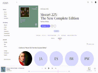
Looking at the Mozart225 box set shows how unworkable the credits page in v1.8 can become. It takes me almost a full minute (going quickly) to page/scrollwheel through the whole thing (there’s no scrollbar on the page):
Obviously, better box set handling would make this process less painful, and 200CD box sets are not common. But even for “smaller” box sets (in the 30-50CD range, of which I have many) I don’t find the new credits screen usable.
Was just starting my own thread when I saw this one, so am posting here.
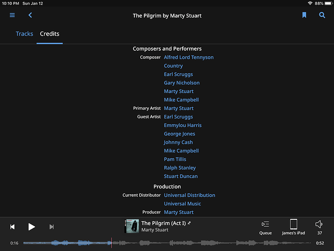
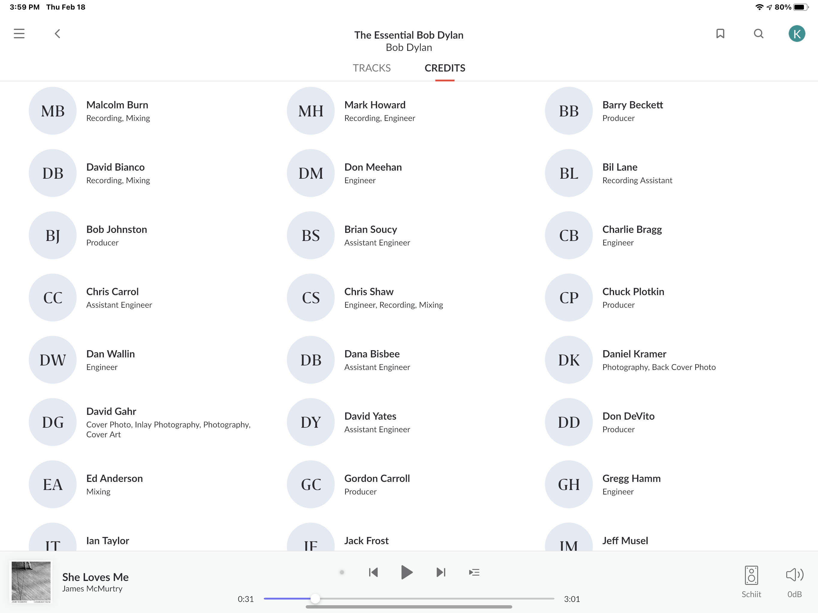
Total agreement with Original Poster. The biggest problem with moving to thumbnails for credits vs the previous list view is when it come to production credits. Since there are rarely photos for these credits (and not necessary) it just creates the need for unnecessary scrolling to review the production credits for an album—and just makes the production credits generally harder to review.
I’ve attached a screen shot as just one example.
Please, Roon, bring back a list view option—at least for production credits.
I think that a button to toggle between list view (with sorting capabilities) and the thumbnails view, would be the best solution.
in the thumbnail view i like the “x tracks” link that focuses on the tracks of the album with the specific performer.
anyway, that is useful only when roon has track-level credits, which is pretty rare.
or when you have polulated track credist via the file tag PERSONNEL.