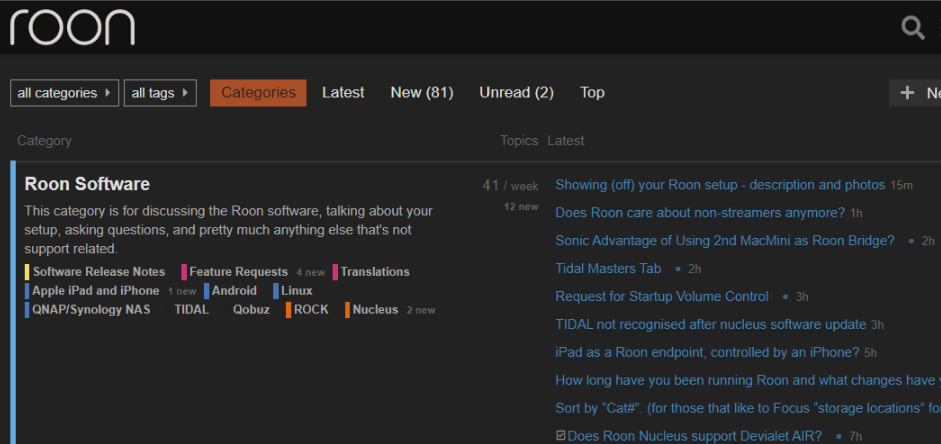
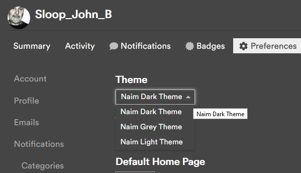
Im not seeing it…maybe I’ll logout and in again…Update… a forced screen refresh seemed to do the trick…all old community screen shots will stand out like dogs you know what’s but hey…1st world problems. Thanks guys. now maybe can get a little something in-between like grey?
I’m happy for everyone who has waited for this but like every other dark interface that are so popular at this moment this one is also plain terrible to my eyes. Why are all these dark interface so black? And why are all the light interfaces so white? I agree the light interface is too white but why is everything in the world so 100% opposite to each other these days as if there is no other option anymore? Literaly black or white, I think that is the biggest mistake in modern UI design. The same counts for Roons interface, either too light or way too dark, nothing in between. I know it is on the “never will do that” list of Roon but custom colours…my biggest dream for the UI.
I have to say that I lasted all of two hours using the dark theme before I switched back to the light. I think that after a lifetime of reading, I must be too used to black ink on white paper…
For night reading my phone, laptop and desktop turn their brightness down automatically. Together with f.lux or Apples nightshift it’s just o.k. I am not an old fashioned guy but the colourpalettes of modern interfaces are all following the same trend of just being too much of a good thing. As if it is designed for the sake of design and not with usability in mind.