The glass is half full, huh brother?
Many thanks. May I offer another suggestion?
I don’t want to turn off the time-code lyrics. It is a great improvement.
Brian said that you can determine in real time whether the lyrics are time-coded or static text. Brian indicated that you could address those two scenarios in real time. (Or at least that is how I interpreted his comments.)
Therefore, please simply change the UI so that we only have to click on the lyrics icon in the Now Playing screen a single time. We simply click on lyrics and turn them on and let the music flow, so to speak.
Your UI would then AUTOMATICALLY
(1) show the time coded lyrics when they are available
(2) revert to the text lyrics when they are not available
And switch back and forth automatically and seamlessly. That might be asking a lot, but is that possible?
1 Like
It’s actually always full… half with air 
UI changes are always tough… but you’ve been around long enough to know we have tougher skin.
Sweet dreams are made of cheese
I do not wish you gone. You are loud and opinionated; I personally like that. However, I do wish you toned down the insults and trolled less (see burger above). It’s just not productive.
9 Likes
I did not mean my original comment to be so harsh, apologies to the team.
I’ve loved Roon, it’s been terrific and greatly enhances the music listening experience. It has taken a step back with this release in terms of UI in my opinion, but does have good additions in terms of functionality.
I hope the screens I shared showed the areas I’ve found most confusing with this release.
1 Like
Add user-supplied lyrics to your lyrics todo list please. This opens the door for people to hunt down and display lyrics, such as Christmas carols, hymns, and certain period pieces. Maybe translations of foreign-tongued chorals.
Specify a tag name (LYRICS comes to mind) and display the tags contents, if the other two sources come up empty.
Its a feature that would not detract in any meaningful way. Non-interested parties can simply ignore the feature. And even users like me couldn’t screw up a text tag. Or could they?
Thxs
We read almost every post on these forums, and discuss as much as we can. But one thing we do not pay attention to is volume of requests or polls. The community is a vocal minority of our user base. It started out as a huge % in 2015. It’s now a small %. The community grows every day, but our total subscribers grow even faster.
We also are catering to many more types of music lovers than the original “computer listeners”. For example, a significant % of Roon members are iPad + dedicated Roon Core with no Mac/Windows/Linux involved.
8 Likes
Same thing in other places with the three-line “drag” symbol, like in Roon or Safari bookmark editing.
1 Like
I would respectfully say you may want to get beta designs into the hands of some the non-audiophile crowd but who might be highly visual persons, i.e. designers, photographers etc and who are also hifi and/or streaming enthusiasts.
As a photographer, I work with visuals and visual programs/equipment all day so ease of UX and eye/brain fatigue is important to me. It does seem as if this horse has been beaten at this point though. I understand that things like color schemes, font choices, etc are burdensome and most are fine with light and dark theme (I’m fine with dark). Perhaps in the future stick to the mono theme but offer a light, medium, and dark?
To me the UI change feels like a first step, not finished. For instance the DSP pages give me a better sense of what the idea is. That design consistency is not visible in the rest of the ipad app.
Are there plans to tie it all together in a later stage?
1 Like
If you read the thread you will see roon say it is a phase.
Hi,
There’s a lot to nitpick but still waiting to get used to the chance to criticize it. While that happens, three things spring to mind:
- I have a feeling if there was a option to darken the tone of the blueish grey colour bottom panel a bit, the backlash would be considerably less. Feels like that hits the people that feel the dark modes are precious in the face, and that instigates a negative-minded hunt for other UI features to bicker about. Original and 2 darker options overlaid below.
-
It’s now 6 big releases later but Mac app still does not have the support for OS’s native Back/Forward gestures. Come on, guys.
-
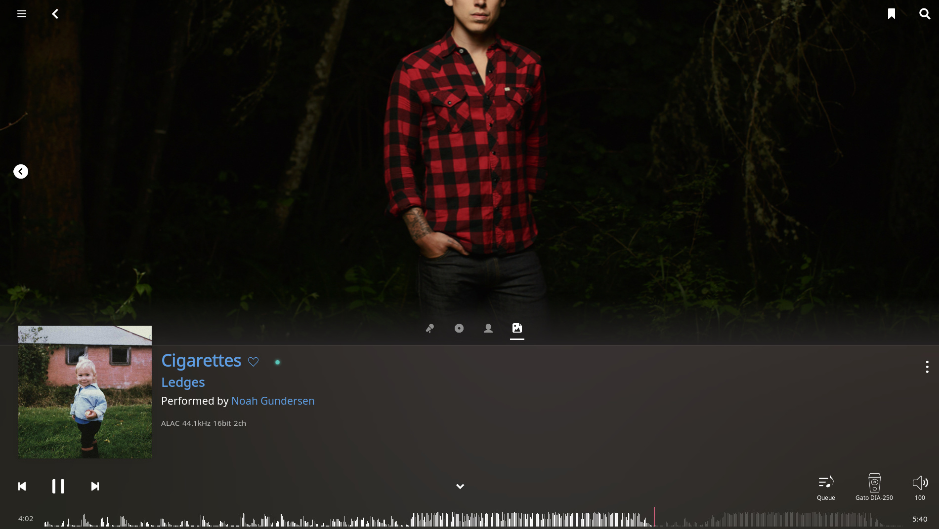
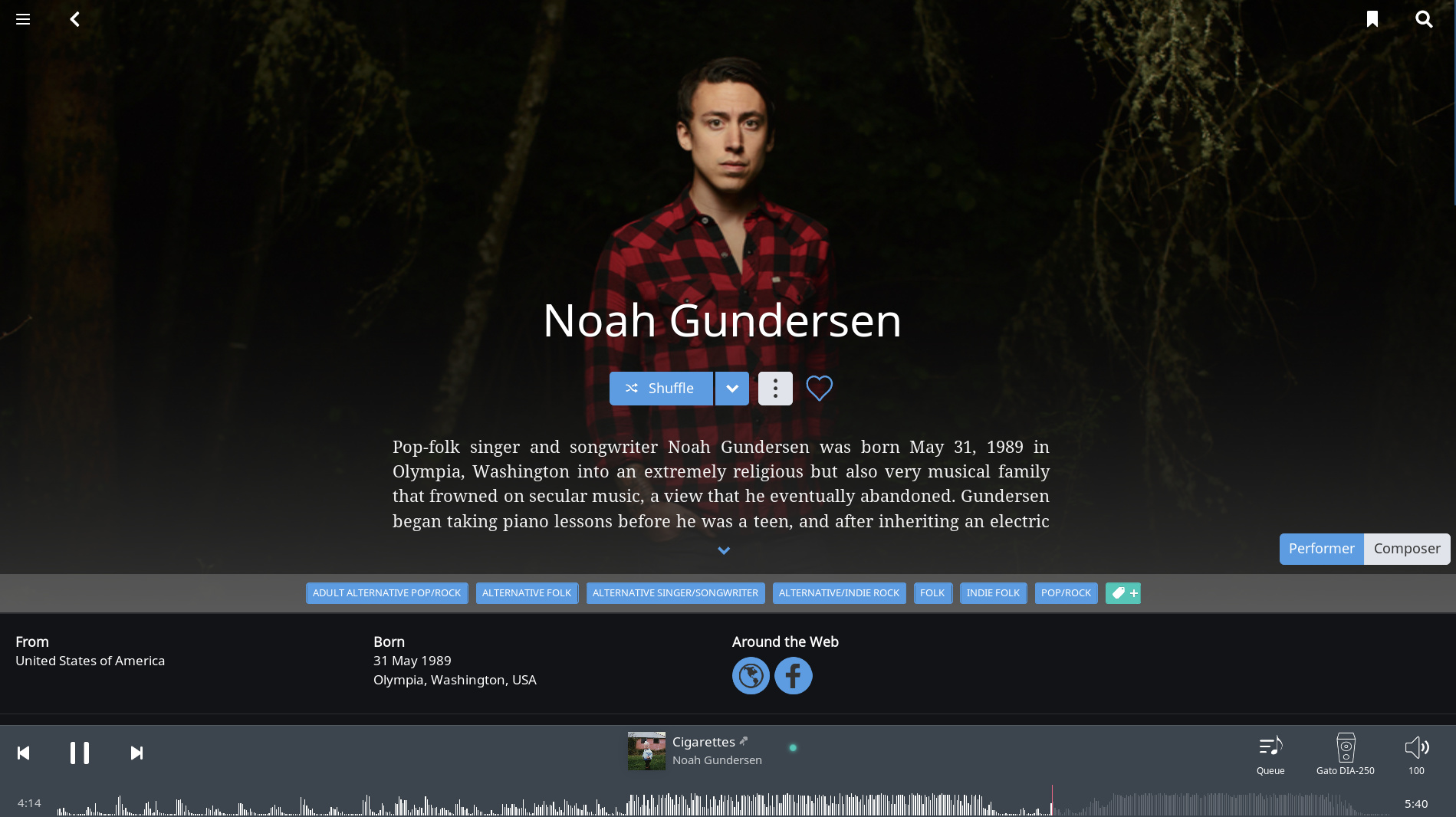
May be a bug but the Artist Image in the new Now Playing screen is from a different portion of the saved image. You don’t have to cut Noah Gundersen’s head, he’s done nothing wrong.
For the more functional changes, I will comment after the change settles in.
Thanks,
Danny,
The proof is in the pudding, so to speak. You told your critics that they can always speak with their dollars, cancel, and get a refund for the remaining month.
I voted with my dollars but in the opposite direction.
Version 1.6 demonstrates that Roon will have a long and healthy life. You’ve added another streaming service in case Tidal disappears. You have listened to your subscribers and improved the Radio. You listened to your subscribers and added streaming lyrics. And you improved Roon in many other ways.
In the last 48 hours you have said, quite clearly, that the comments offered by subscribers, including me, will be addressed in a future release within the limits of what is possible for the application.
That is a great record, and I voted with my dollars.
Yesterday I paid for a Lifetime Subscription.
I urge others to do the same. Vote with your dollars, and support Roon.
14 Likes
I do think it is more Windows like. That’s great in my view. I like some control. Apple ‘sensibility’ is for people who don’t understand computers or software. It has it’s place, I suppose, but I prefer the way the Roon UI is headed. That said, there is some clean up to do… like the overview page.
Beauty is in the eye of the beholder; I love the new interface and have found little to complain about. Radio improvement and Qobuz integration are the cat’s meow for me.
Kudos to Roon and the entire team for this release.
2 Likes
Danny,
One request for the Radio. Can you please include in the Settings the ability to turn off the box – permanently – that keeps popping up that asks “Skipped the XXX. Tell us why: [with three choices.]”
I often fast forward, i.e. skip tracks in Radio, and want to just ignore that popup, and prefer it not appear at all.
I don’t want to fill it out, as that would tell Roon that I don’t want a certain type of music to appear, and I don’t want to influence what Roon does on a permanent basis. I might have not liked a certain choice at the moment, but I might really like it in the future as my musical tastes change and evolve. Which they do, thanks to Roon!
So I just leave it alone, and let the Radio roll along, so to speak.
At the same time, I’m not suggesting that the box be eliminated, as it performs a useful function if you want to fill it out.
I just don’t want to see it every time I skip a track in Radio.
Out of curiosity, when I click on with and say I didn’t like the track or it doesn’t fit, is it changing what I want to listen to, and only me, or is it changing it for all Roon listeners?
So if other Roon listeners are clicking on that box as I type this, are they changing how the Radio works for me and everyone else?
1 Like

There is a detailed discussion about that here–
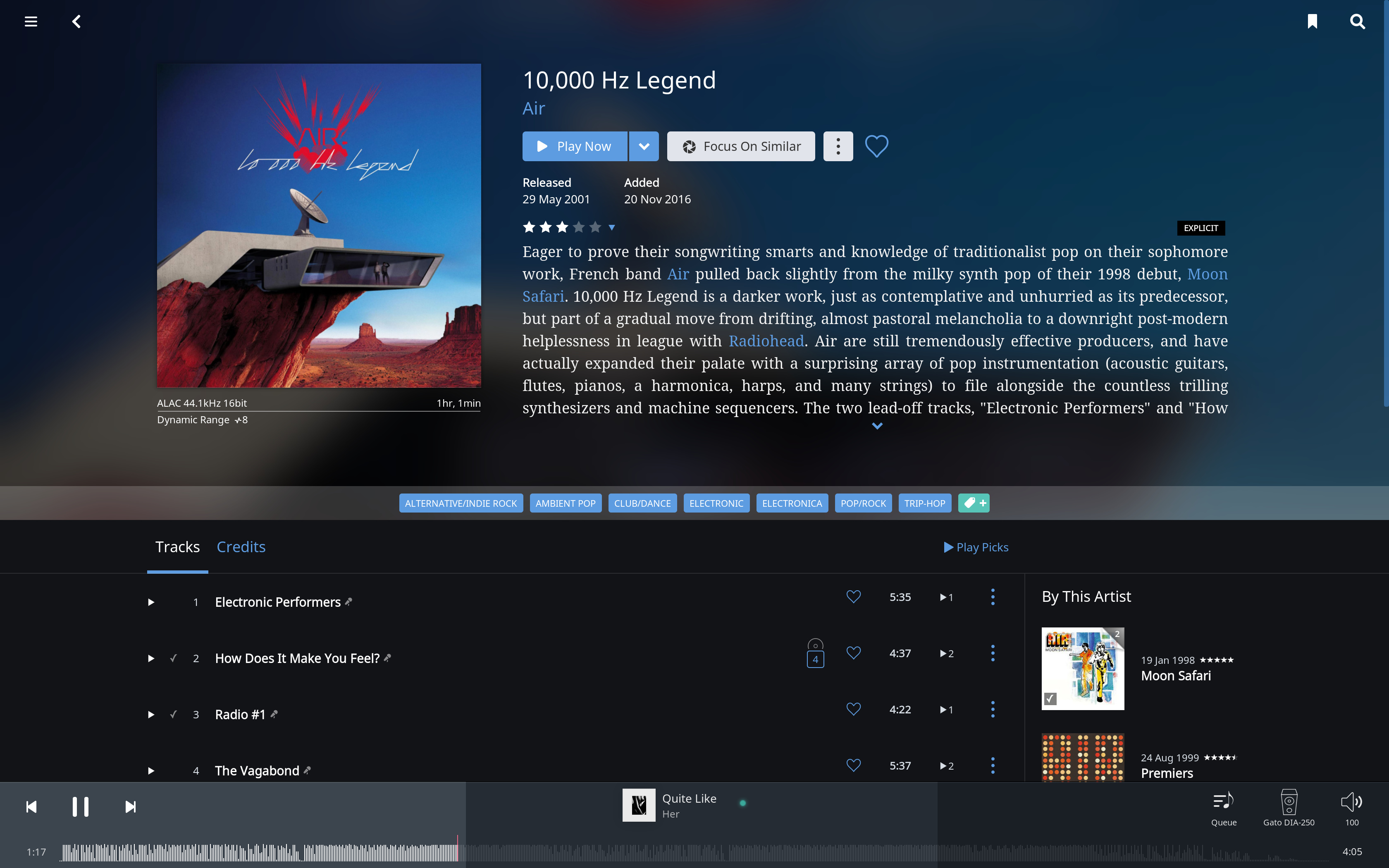
Regarding the UI I actually think Roon is heading in the right direction. Sure, due to the gradual approach by Roon there are inconsistencies, but the screens they have introduced are imo an improvement (minus how search results are represented*). If all screens were to take on the same design approach as Now Playing, we’ve reached the target as far as I’m concerned. I understand that people want album art there, I personally like the artist pictures.
*The search results themselves are pretty solid for me
2 Likes
Regarding complaints about the new footer design, I like how it blends into the Now Playing screen when it is showing. If the footer is collapsed, perhaps moving some elements around would accommodate many remarks in the feedback threads without affecting the core design principles:
- Move the album art in the lower left corner, making the album art as high as the footer itself
-> People seem to prefer it as large as possible, as opposed to the small icon in the center - The frequency wave would not extend to the whole width, but up to the album art.
-> People seem to dislike the fully stredged wave (I don’t, but I also don’t mind it being smaller) - Move the playback buttons back in the center.
*Note that I am quite happy with how the current footer is
1 Like