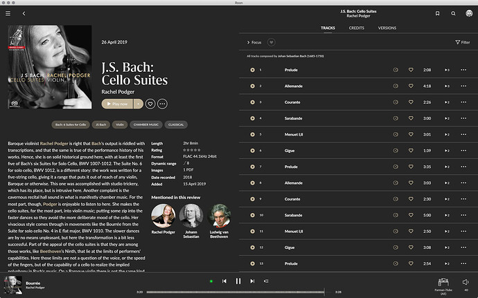
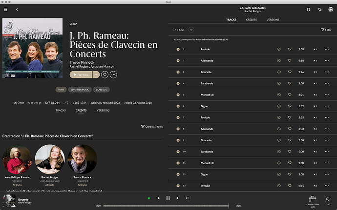
Given the recent discussions regarding the utilisation of space on the desktop version of v1.8, how about something like the following? One window, but two scrollable panes.
Just for fun (and a feeling of helplessness regarding roon’s evolution): it will look weird if no description available.
Some information will be always available (length, format and so on) other not. The design needs to balance that.
I see what you mean, but maybe Roon could automatically include the credits view (or something similar).
As suggested by many roon could do a lot of things differently but they chose not to. Sometime it’s a good thing, some other times it is not. I sincerely believe that 1.8 falls in the last category.
Personally I’m absolutely perplexed at their unbelievable stubbornness in seeing things only in black and white (and purple  )…
)…
This is a great effort, but I am having problems already now with too much information in portrait mode on my iPad.
Luckily , I can turn it in landscape mode to ease it up.
Probably less an issue for the younger generation, but my eyesight is really going down the drains theselast years.
I was planning to replace my iPad Air2 witth a 12,5” PRO , but I am very hesitant to go forward, experiencing the new 1.8 layout.
Far more fatiguing on the eyes than 1.7 , and I am afraid a couple of inches will solve the problem.
This is of course very personal, but view the number of Roon customers older than 60, I tend to believe I am not the only one.
For me, With the 1.8 release , Roon has opted for ‘ webpage’ design, whilst on remotes, one is used to Apps
Dirk
I’ll be honest, I was a bit underwhelmed when I first saw v1.8, there are a whole bunch of bugs that should have been caught by the beta team, and there have been several backward steps (tags etc). That said, it is growing on me and I suspect - maybe two or three weeks from now, when the dust has settled - Roon will have ironed out many of these problems. That doesn’t quite explain how we ended up with such a polarising release, but I am reasonably confident that we’re (probably) moving in the right direction.
What I really think Roon needs to do is give us more options and more control over the UI as I don’t think they’re best placed to make unilateral decisions regarding each and every user. A few years ago there was a discussion about making the home page configurable. I thought this was a great idea, but it didn’t happen. In recent years there have been several discussions about the appearance of Roon, but no way for the end user to implement any changes in appearance or functionality (1.8s color document is a back door to this, but it’s hardly elegant).
I appreciate Roon’s purity of vision, but for most of us Roon is a tool rather than an icon - a means to get the job done, in an elegant and functional way as possible. And while 1.7 worked for a lot of people, and I’m sure 1.8 will work for just as many - as soon as the dust settles - I don’t think it would harm their bottom line, or vision, if they allowed the users of their product a bit more flexibility in how they wield this particular tool.
Well, what can I say one can just hope for the better. Unfortunately, the way I saw roon evolving along the years, both application and customers relation wise I’m not confident at all. To have the tags broken for example is nothing out of the ordinary, can happen in any development. To have them broken because you changed the logic without at least giving the users (many which are really using and base their library on it) at least a simple heads up that’s another kind of issue. Software errors/bugs/mistakes can be relatively easy fixed, the stubbornness (I’m being polite)… not so much.
It’s actually worse than just the logic changing, the whole tagging workflow is a complete and useless nightmare now in comparison to v1.7. No argument from me.
Yeah, well I think that maybe that’s a double-edged sword. If you can say anything about the Roon team, it’s that they’re passionate about what they’re trying to do. That they steamroller over a few thousand, or maybe ever tens of thousands of users to implement that passion is clearly a downer … but I’d rather support a passionate company with vision than one with not. Hopefully we’ll all create enough fuss over the next few weeks for all the major gripes to be fixed ![]()
And by the way, sorry for hijacking your enthusiasm, I really like to see people passionate about what their doing, it just that all the good will and enthusiasm and passion that a lot of us put in this looks (to me at least) so for nothing…
No worries - I’m having a glass half full type of day, but could easily swing the other way.
Put it this way: passion and arrogance seem to go hand in hand, and Roon often come across holier than thou - hence the various outpourings since the release of 1.8. “How dare they a, b, c, and d?” I can see that, but I’m hopeful that they’ll listen.
And that’s where my perplexity with roon is: why is so difficult for them to see that the life is gray? With them is either black or white and that’s it.
There is no way on this planet to satisfy 100.000 or so tastes/needs with the same thing, but you can really narrow that by giving some options (and even then some will say that there are too many options, but still). They simply don’t get that: it was horizontal scrolling, some were happy some were not. Now is vertical scrolling, some are happy (me included) some others are not. We’ll never see an option to chose between (and i can go on and on). And beside the personal taste, this example is also a device usability issue, which will never be satisfactory with only one option…
Yep. That’s most certainly the elephant in the room ![]()
The elephant in the ROON !!!  (I’ll apply for copyright on this one!)

