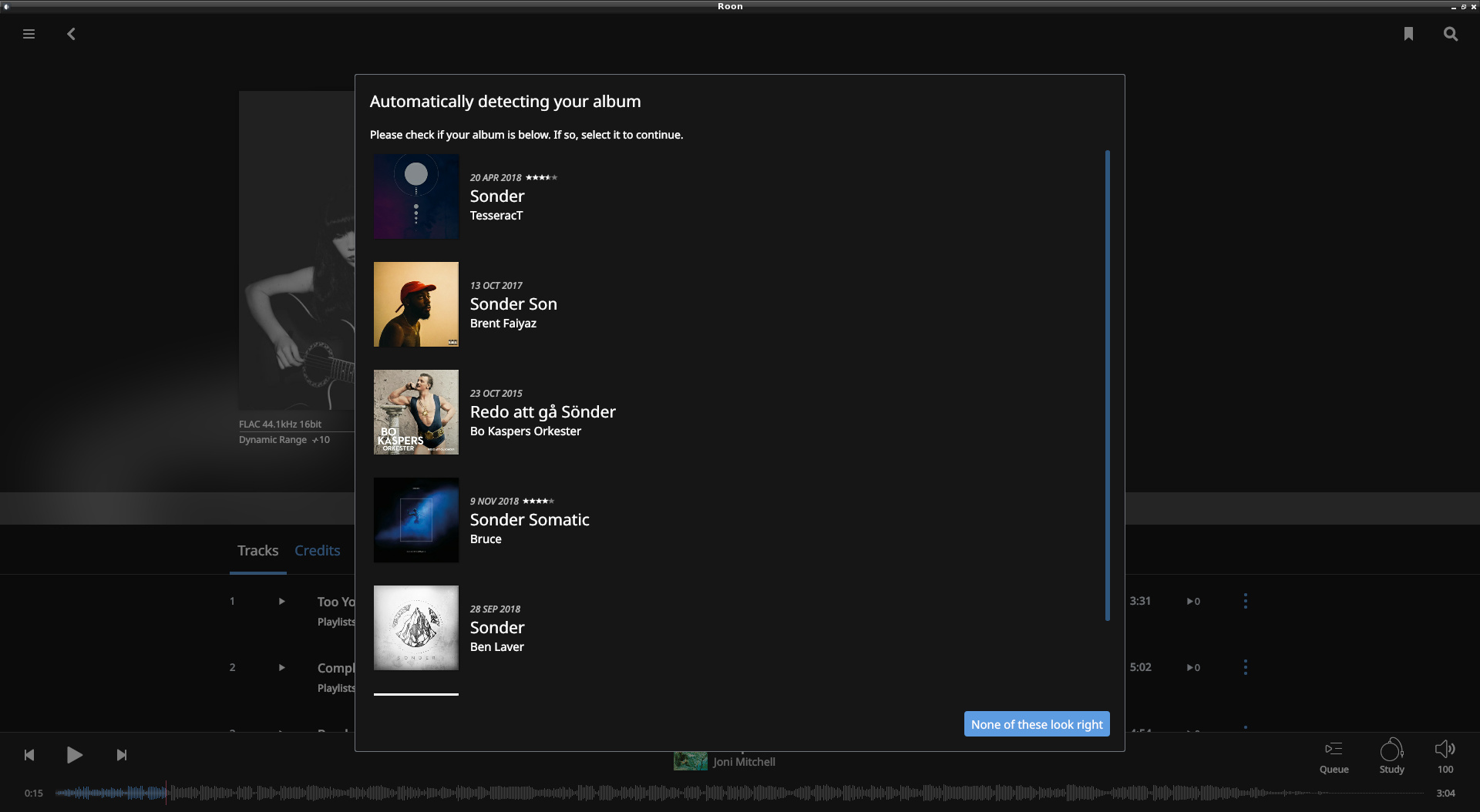
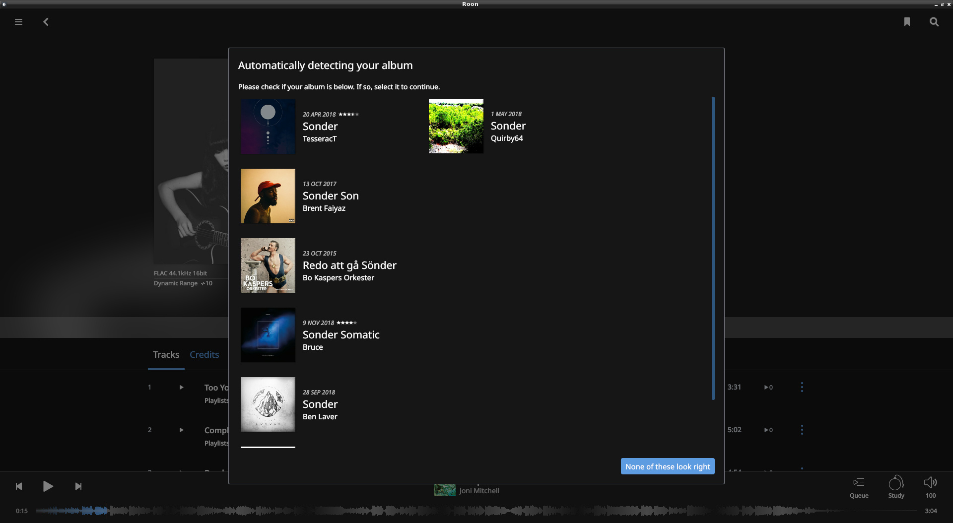
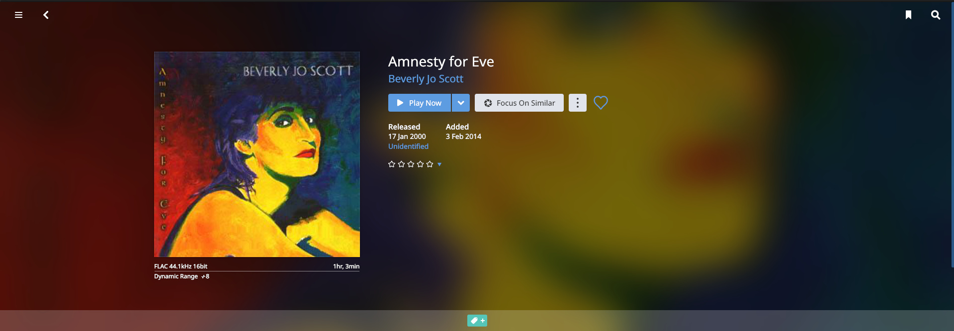
Unidentified album:
Click on Unidentified (fiddly on a tablet because the response area is pretty small): album partially obfuscated
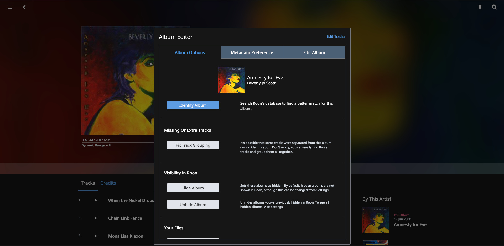
Click on Identify Album: album art almost completely obfuscated, in fact anything that makes it identifible is hidden
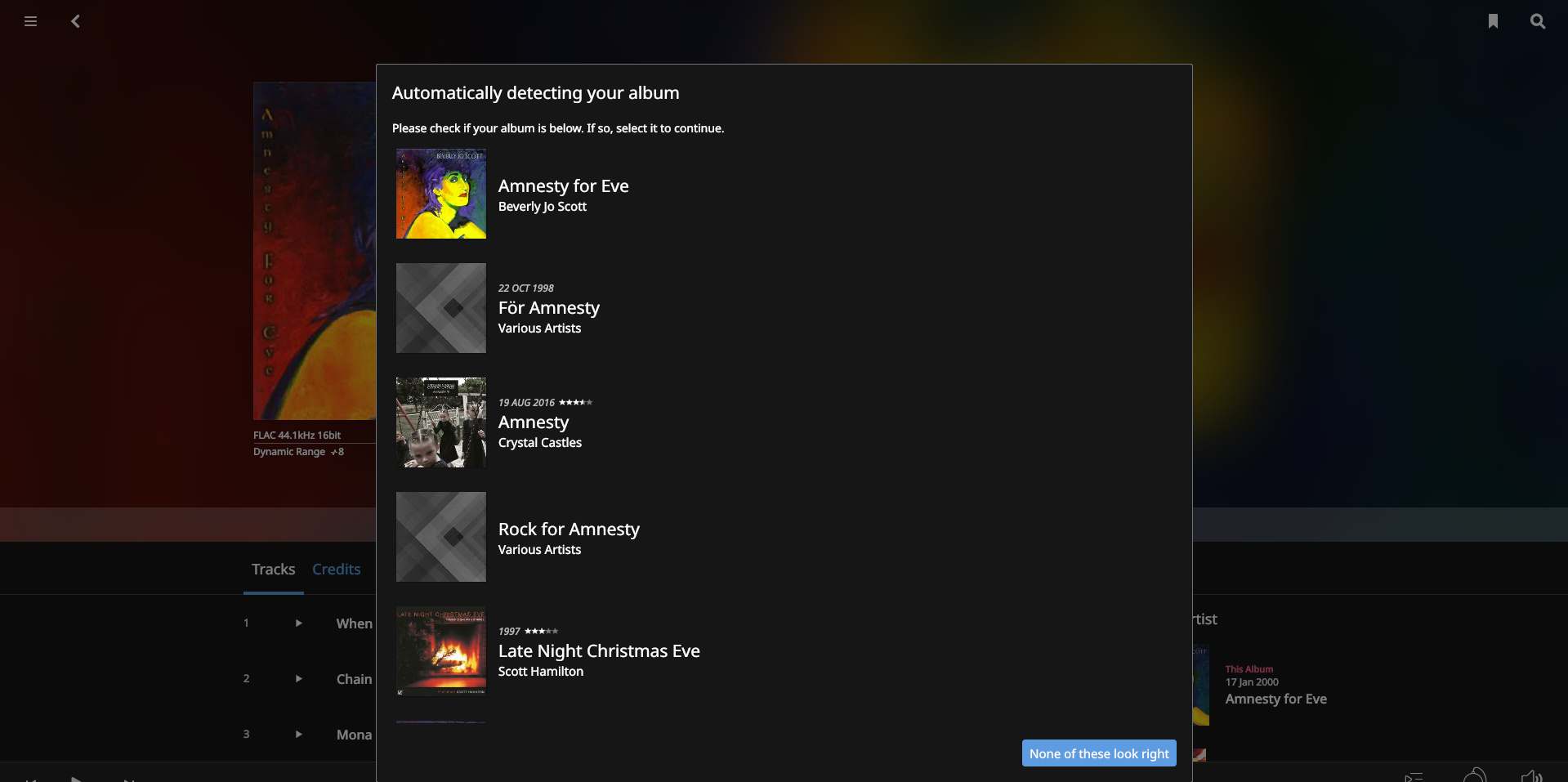
Having manually identified around 50 albums using above sequence last night I’d like to request that the popup windows should be moved to the right half of the screen so as not to obfuscate the underlying album cover. The reasons for this are as follows:
- it’s easier to find the matching album visually than having to read the text
- whilst one may think you don’t need the visual cue, when you’ve churned 30 or so of these, it’s late at night and you’re trying to enjoy your listening it becomes increasingly difficult to pay attention to which album you’re identifying - seeing that cover on the underlying screen knocks that issue on the head and makes it simple to pick the correct album from the list.