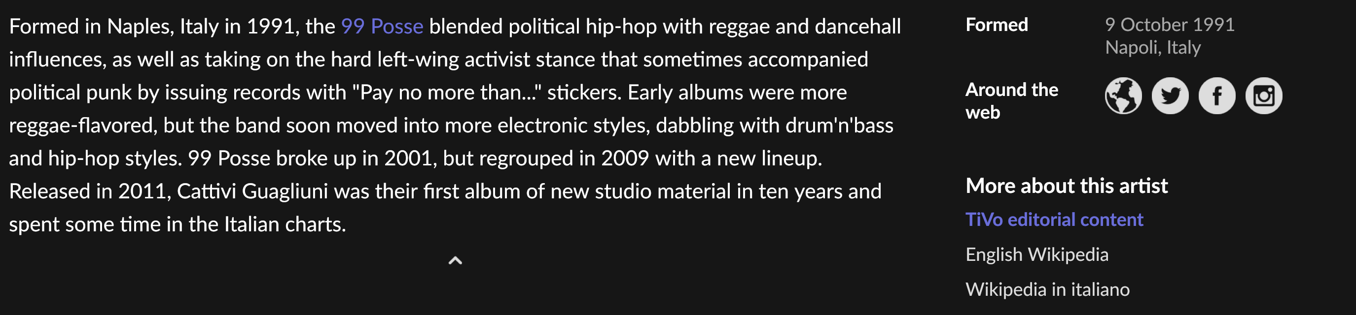
The editorial links are using purple inconsistently to elsewhere in Roon, which is a bit confusing. Everywhere in Roon, purple signifies a clickable link. In the editorial links, however, purple signifies the currently displayed review/bio, while white entries are switches to the other sources, which seems semantically similar to links.
I.e., how it is currently:
- Purple: currently displayed
- White: Link/switch
- Not listed at all (even though WP language enabled): Does not exist in this WP language - good
For instance, artist 99 Posse, I am reading the Tivo version, hence Tivo is purple. English & Italian WP articles exist, hence white. (Spanish WP is enabled but has no article, hence not listed - good)
This already confused one person here, and I did a double take as well.
(It should not freeze, but note that there was confusion about tapping a white entry)
I would switch the colors, white for the currently displayed one (which is consistent with the majority of the text in the review as well) and purple for switches/links to other sources. To avoid too much purple, maybe a light plain font