I just wanted to drop in to say that, in spite of having my plate full with planned features that I have yet to complete…
- Windows executables (still don’t have my Windows PC set back up
 )
- Setup wizard
- Filter playground
- Junk filter recommendations and auto-pilot
- A proper website (it’s in the works)
- Meter and spectrum page
…I’ve been giving a lot of thought to what HQPTuner v2 is going to be like.
The one and only problem with HQPlayer, as I see it, is that there is no onramp for people to pick up speed before merging. That is, users are left to piece the “big picture” together for themselves.
Although it is one of my primary goals, HQPTuner currently fails to solve that problem.
My app is awesome if you already understand how to use HQPlayer. I am not afraid to say that it’s a big enhancement over the default UI. I’ve nailed the details, such as the filter narrowing system. And yes, I think HQPTuner is better organized… but the big picture is still missing. In other words, it lacks cohesion.
And that will be the primary goal of v2: rebuilding the UI around the big picture.
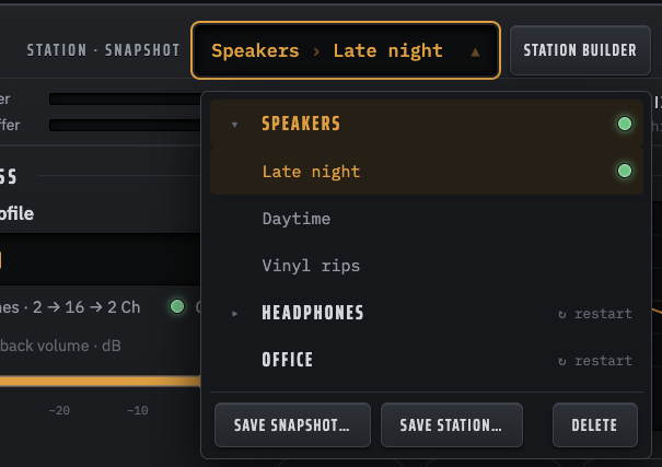
The gist is that everything will be focused around the signal chain, which will become interactive rather than just for display. Live settings like output mode, filters, dithers will always be on the main page, and deeper tweaks/settings will be found in “drawers”. This should, among other things, eliminate the need for Live mode while maintaining all of its features.
I’m also looking into how better to use the bottom Apply bar, such as pinning volume settings in the bottom left and moving the A/B switcher to the middle.
Every setting will be preserved; nothing’s going away. But the entire visual approach—the card system, the tabs, the cluttered top bar—needs re-imagined.
To that end, if anyone has any ideas or requests regarding how the next version looks and works, please do not be shy!
EDIT: yes, I am specifically building it to be tablet friendly  portrait and landscape modes!