I’d add that the forums regularly being overwhelmed with visitors in the days following 1.8’s release might be indicative of the experience, and maybe sentiment, of the silent majority, moreso given that I don’t recall a sudden influx of overwhelmingly laudatory posts.
Anyway, @Co2004 needs to try Roon out and see for themselves… and not hesitate to ask if they have further questions.
While I find it not helpful to throw around numbers like this, you should be able to calculate the amount of users having issues if you’d knew all users that had no english localization. Since this bug was technically reproducable to happen on non-english localized hardware, we could deduce the number of users that should have had issues upon release change.
Assuming that all of those 100.000 users have installed the new release. Some non regeular users of Roon might not even have noticed that there is a new release… you never know.
I am on board with 82% of what you said. I don’t have iOS crashes and I don’t feel light it too light and dark is too dark. But the rest is spot on. To take it one step further:
When someone opens a playlist what is the one button that will be most used. In my case it is the only button used? It is the play or shuffle button. Why move it to the right side of the display? People read from left to right and will look to the top left of a display first. Basic 101 of usability is put your most used featured on the left top where people will easily find it. It is very weird it got moved to the right.
Missing playlist and tag info on an album track listing. Gee folks, I really hope that was an error. If the intent was to permanently remove the playlist name and tags from an album’s track listing I just can’t say strongly enough what a huge misread of how your users use that info is. I constantly look at the playlist listing and tags to make decisions on what to add or remove from playlists etc. Without that info easily accessible, about 70% of the usefulness of Roon is lost. Can’t stress enough how important that is and to take it away with zero explanation is a massive oversight.
Impossible to see lyrics easily. When in an Album and listening to a track and I want to see the lyrics, good luck clicking on the microphone icon and seeing the lyrics. It literally can’t be done. Is this a joke and your developers are rolling on the floor laughing at those of us who use Roon?
Once you add my main complaints, I’m 95% in agreement that 1.8 is a massive failure. But nothing wins users back faster than a great recovery. So here is positive mojo being sent your way that all this can get fixed in short order before it is too late. Thank you.
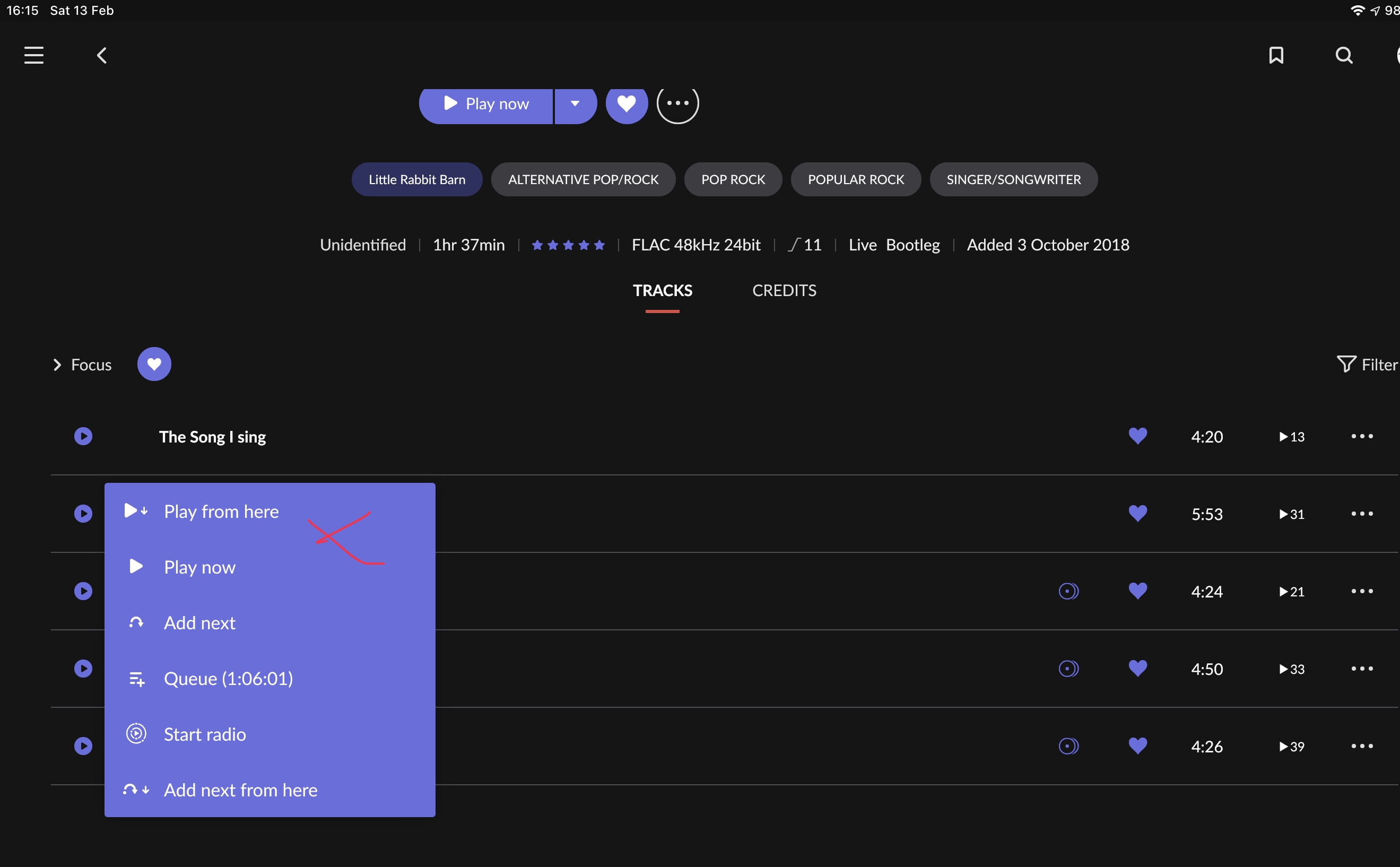
Would the simple thing just be use the play button on the top left on the first track?
It’s not really an issue and you have complete flexibility depending on the orientation of the devise used or being left or right handed.
Well, technically that’s not an 1.8 problem. I mean, if we’re gonna go by all the stuff that was already impractical/not working as intended/not working at all in 1.7, we’ll that would make 1.8 a fairly poor bit of software. Oh, wait…
I’m being flippant, but yeah, like I said above and elsewhere, the fact none of the stuff I wanted to see corrected or improved has at best been kept as-is is my main reason for being beyond disappointed with this version. It’s all well and good for people to say the new fonts are at worst a minor issue, but a realistic perspective is that this version has not actually improved Roon in any way beyond equally minor tidbits (aim happy for vertical scrolling on my iPhone, but I just can’t pretend for one second that was my priority).
It was a case of over promise and under deliver. Instead of sending a slew of emails hyping how awesome and exciting this new release is going to be, it would have been better to set a much lower bar and state that a new release is coming and like all new things, we’re going to see what you like and what you don’t like and make it better as we go along. When the actual release came out, it was no wonder people were upset. The fact that Roon decided on this marketing approach is emblematic of the overall problem. From marketing to software development. It seems the entire approach missed the mark by a wide margin.
Unfortunately basic functionality that many user rely on is gone. It is only partly about the look. If you cannot easily see basic things like playlist and tags on a track level within an album, or provide an option to turn those visual elements on or off, or make it easy to figure out why the change was made and if it is going to be fixed, then there’s a serious problem. I can adjust and adapt to a new look and feel. But if tools I used daily are gone, well, I can only hope these concerns are heard and fixed quickly.
Yeah, it’s absolutely great :nothing is working anymore; the only thing at the moment witch is great, is the price. i’m not here to see some fancy new letters and pictures. All i want is just simply enjoying my music. Same it was before 1.8. Better old but stable thjen new and not working.
totally agree Steven. also i wish that support had enough staff to respond to messages. i realize everyone is upset at this new design but i asked a question 2 days ago with no response. i know i am just one person but roon is expensive and i expect a quicker response.
Makes sense, who is responsible for user testing at Roon? Ultimately the CTO has to carry the can, but who knows, perhaps the CEO forced the release. Unlike Apple with their completely owned system, poor Roon has to cope with so many different configurations and user-personas. It must be a nightmare for Roon!
This forum shows the extreme variability and volatility of Roons user base which in turn must make it very difficult to attain consensus on features.
But whether a user likes the UI or not, STABILITY is crucial.
BTW forum users who upgraded to 1.8 - you ARE THE TESTERS! Cheers

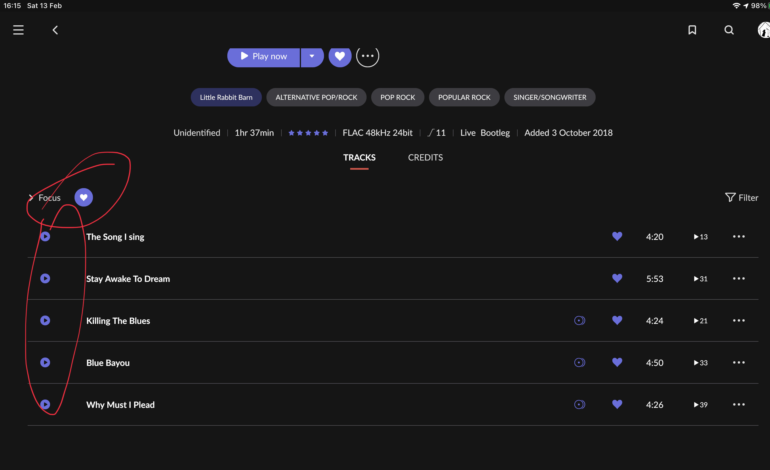
 above the tracks which will focus on your favourites. Then hit play from here on the first track