You should still be able to take a screen shot on your iPad by quickly pressing the Power and Home buttons simultaneously.
2 Likes
Roon 1.8, after the latest build, is the best and most stable version of a music player for years.[Moderated]
2 Likes
I don’t understand all the fuss about the Black/Purple combo…I can read it fine on my iPad Pro 10.9". People gripe that there is “Wasted Space”…why does every Open space need to be filled? I agree with Dafy above…I only wish when I select an Artist to listen to, it actually plays the chosen Artist from MY LIBRARY! What a concept???
2 Likes
Yes, but I don’t have iTunes installed on my PC and no easy way for me to transfer a screenshot from my iPad Air (no USB connectivity) to my Win 10 PC.
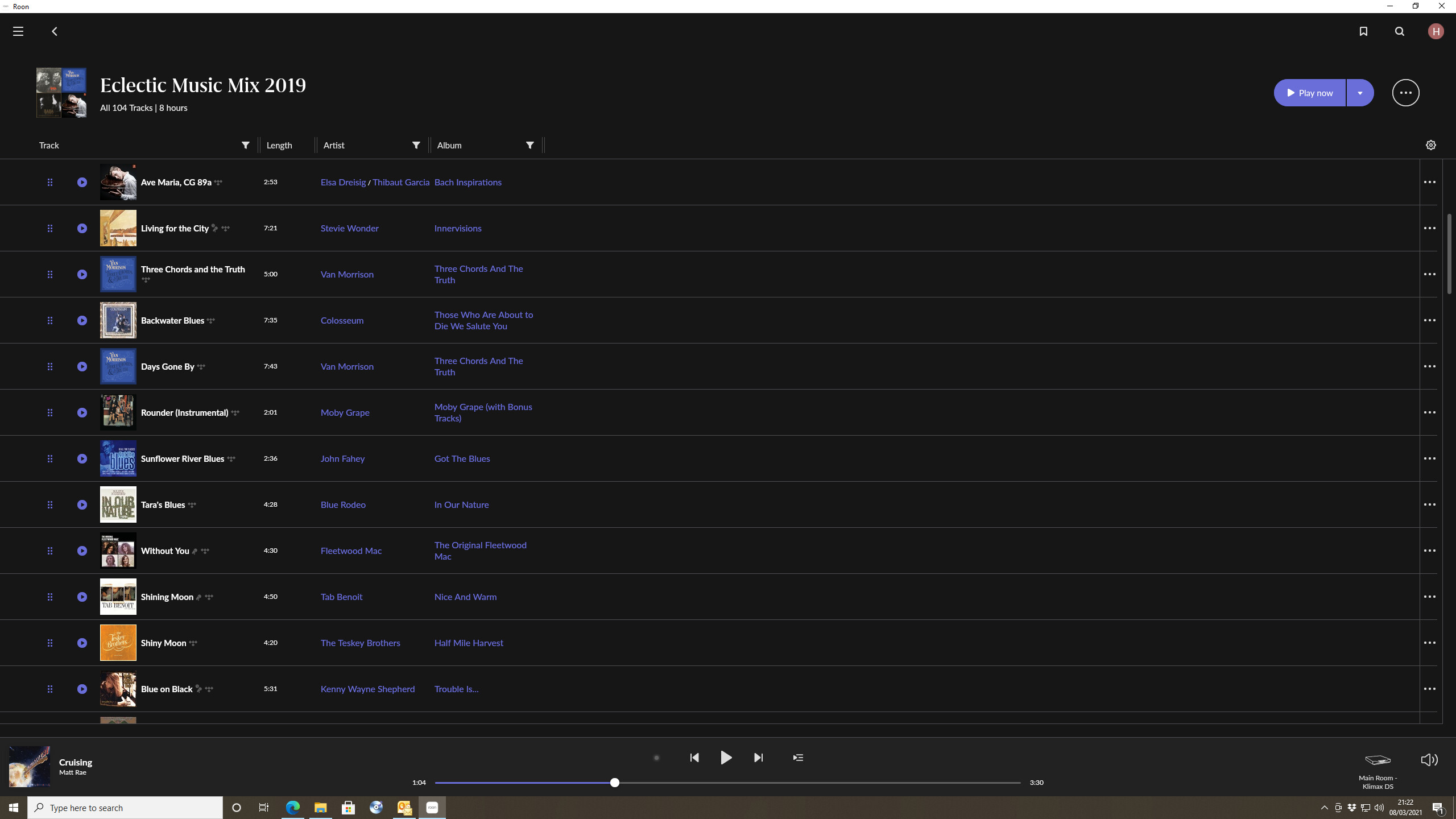
SO, I have reverted back to the default dark theme on my PC and here is an example screenshot from Roon on my PC. It’s actually easier to read on my 32" PC Monitor - significantly more difficult on my iPad:
Hi,
Just in case you’re not aware, the iPad screen shots can be uploaded directly from the iPad to the forum.
3 Likes
Or it can be sent/email directly from iPad to Windows PC or using the Windows explorer (very easy and convenient - google is your friend here).
Now I see what you mean and I honestly hadn’t noticed it until you brought it to my attention.
1 Like
Now they have even taken away the “Date Added” …I always find that date incredibly useful……why would they remove that???
They just changed how they listed it and I had to “unfold” the rest of the album listing to see it at the bottom on the right side….
Thanks.
Yes - but I did say no ‘easy’ way.
Much easier to temporarily switch my PC based Roon app to the default Dark theme.
I use my iPad these days pretty much only as a Roon endpoint. I don’t use any of the free Internet based email services, and I don’t have an email client configured on my iPad…
Good point!
So simple a solution that it didn’t occur to me. I never use my iPad to log into the forum, or for that matter for any internet browsing these days.
1 Like
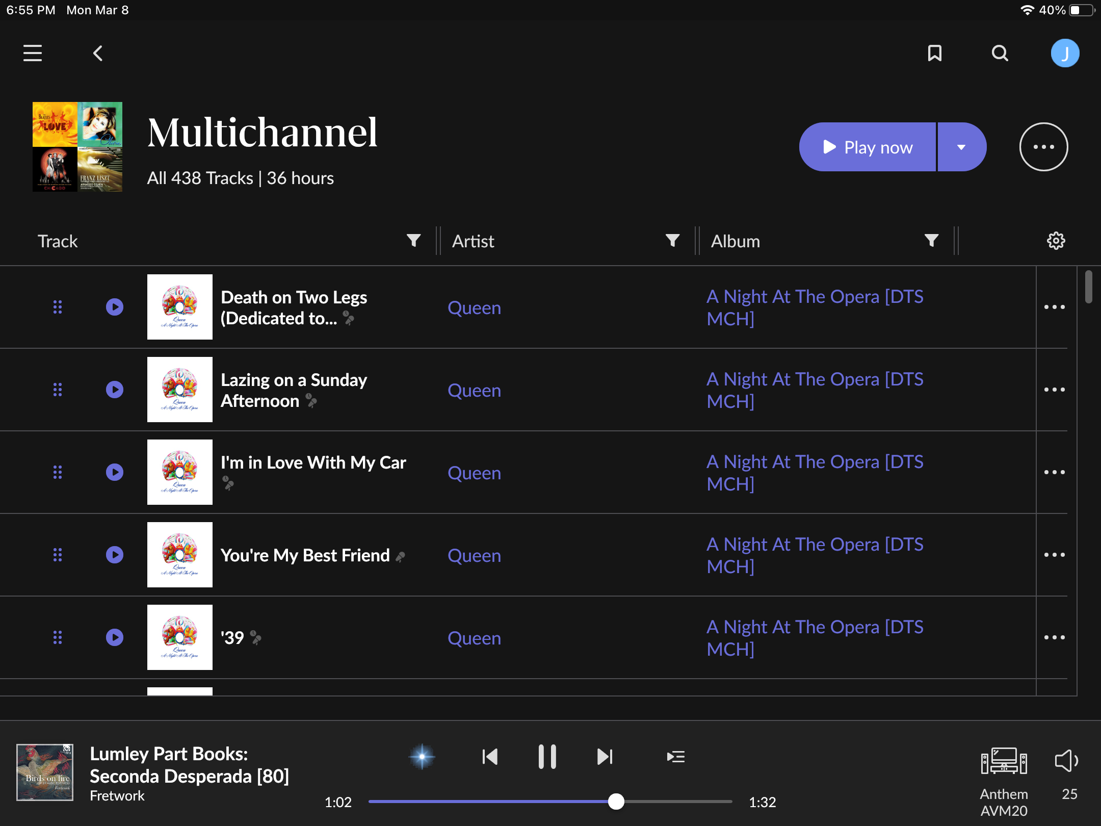
Here’s an iPad screenshot for you. 
Personally, I don’t have much trouble reading this. But, I do understand the frustration for those that have trouble with it. I have trouble reading some shades of red text on a black background, sometimes to the extent I can barely tell there is even text there!
1 Like
Oh, I understand completely. At my age, there are many times when I have difficulty reading something and it’s usually due to low contrast.
2 Likes
Yes - all the more reason why we should be offered a number of options (with a little higher contrast) particularly for the iPad and small phones which cannot be tweaked in the way that colours and themes for a PC can.
I can actually read the dark blue/purple reasonably well using a pair of reading glasses. However, my reading glasses are only normally used for reading in low light situations, and I would very much prefer not to use them for anything other than reading small print books. A higher contrast option would be hugely better for me and I’m sure many others.
Personally, I would also prefer not to have large background areas of either black or white, and I have customised my own themes for use with my desktop and laptop to reflect this.
No need for any division or acrimony - a few more colour or theme options (which Roon could slip into a future update with next to no work) would potentially satisfy all. I for one would stop complaining …although complaining is so much fun  ! - Note that my use of this emoji is meant to signify that this was an attempt at humour and not meant to be taken seriously
I probably shouldn’t say this, but I will make one serious point here. It is not particularly pleasant or helpful when someone posts to say something like “I am not in the fountain of my youth and I have no problem reading purple/dark blue on black”. Well in that case you are lucky and I’m happy for you, but don’t assume that everyone else is in the same boat.
Would you adopt a similar stance if Roon were to introduce red text on a green background? I would be able to read that perfectly well, but I know that many others with a particular form of colour blindness wouldn’t!
4 Likes
I use an iPad and other tablets as remotes. I have no trouble seeing the purple. I was going to post an iPad screenshot yesterday, but I realized what people see will vary depending on the device they use to view the screenshot. It should be noted that on the iPad the contrast increases as screen brightness increases.
Even an option to switch to bold type would make it more readable. That should be a fairly easy fix.
To what? I’m not aware of anything else similar.
1 Like
That depends how you look at it. SQ wise there are a lot of programs (free or cheaper) equal or better than Roon.
The only plus of Roon is the ‘experience’ you get when browsing through the library (and multiple zones). Personally I don’t use multiple zones, so the only thing left is the ‘experience’. Is that worth the extra money? For me I am still not sure. I have a subscription for a year, will I extend it? Only time will tell. For now I am on the fence. I find myself just listening to music most of the time and not as much browsing trough Roon during listening as much as I expected. For my use case Audirvana or Foobar2000 are just as good.
Oh there are plenty of players out there. My streamers are all Linn and their player app works fine (similar sound quality) but Roon is streets ahead in terms of everything else it gives - functionality and the user experience you mention. I love it but if something else is out there that is a proper competitor I’d love to know about it.
2 Likes
Lumin App with MinimServer works great with Linn Streamers. Linn‘s own App(s) all suck.
You don’t get all the fancy stuff with Lumin/Minim but its entirely bug free and just works.