Information density and sorting

What’s the downside of making this page more useful?

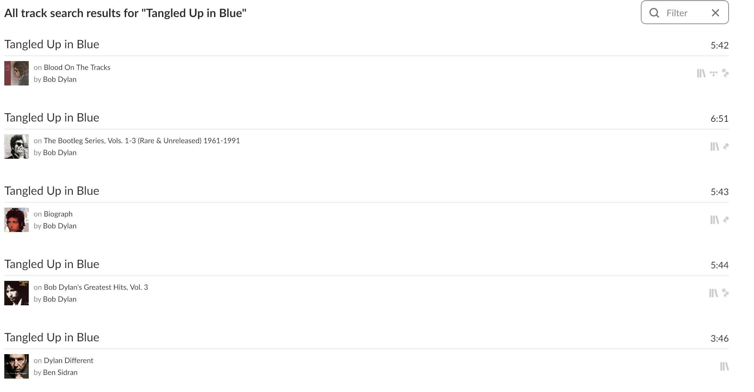
I’d like to sort by length (I used to be able to)
and I’d like to see at least twice as many entries per screen (I used to be able to)

What’s the benefit of all this white space after I’ve already told Roon what I want to see?
And who benefits from removing the sort option?

Thanks.

Completely agree. It should be more of a functional grid view where you can add, remove, move around column headings and each heading can be sorted Ascending or Descending. The only place Roon does this is in the Tracks view, which is probably one of the least used areas.

So search results and lists should have the ability to go into a more functional, less flashy, view to get more done.