i’m not going to say if i like or don’t like. everybody has a different taste…
but…complaints:
- The main problem, in this release, is that NONE of the feature requests from the community have been addressed (except, maybe, a better classical music browsing experience).
- “forehead problem” worse than ever… as the artist picture has been cut in an even longer stripe
- i cannot find anymore the “group zones”… maybe it’s there… but i don’t find it… a problem in both cases
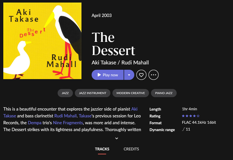
- the album title on 2 lines is a problem
- besides, as it has been pointed out, the hyperlinks are not recognizable anymore. i’me referring at the artists names under the album title, that could or could not be a link.
- when the album has not a review, the infos are really badly displaced in a row
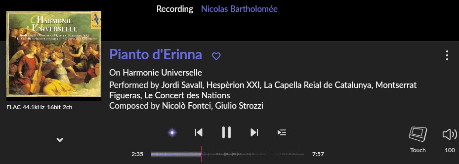
- a long living bug… in the now playing window, the albumart shows black stripes on top and bottom:
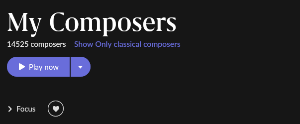
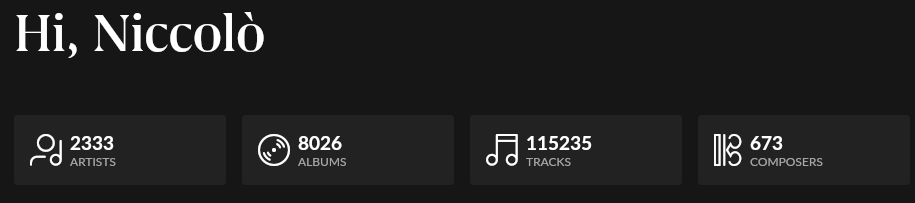
- a BUG in counting the composers in the home page:
but
- the number of performances of a given composition has disappeared, why???
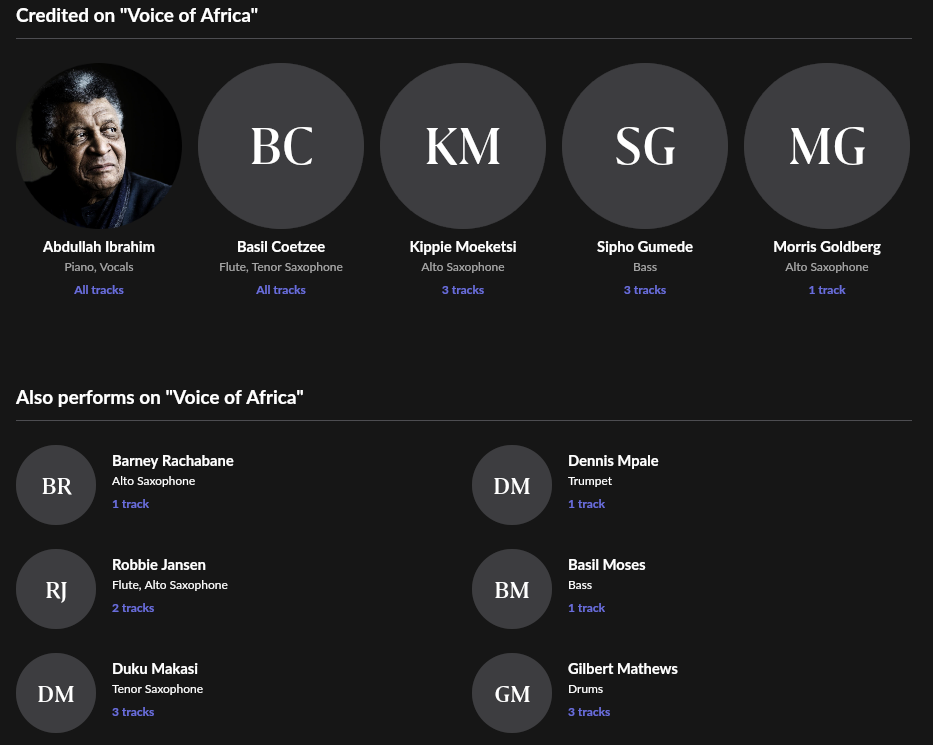
- uncomprehensible hierarchy in the album credits, that are now divided in 2 parts with NO LOGIC
besides… i could understand change the previsous list with round pictures… if there would be pictures!! what’s the point in populating the page with grey rounds?
and besides, the credits cannot be sorted by role anymore, a thing which was quite usefull… - the big BUG in the settings page (i have a win10 PC with english language, and the bug is there…)
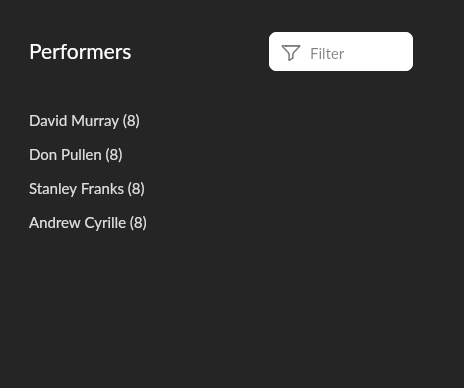
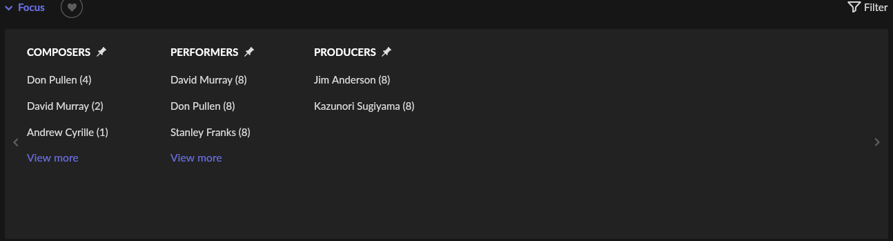
- in the new interface… nothing is on sight… i mean, you have always to navigate with “view more” buttons or arrows. almost always, in a absurd way. for example, in all this empty space:
there is room eneogh for 1 more name:
- there’s a UI BUG in the compositions page. there’s a violet artifact, and the composer is not showed anymore
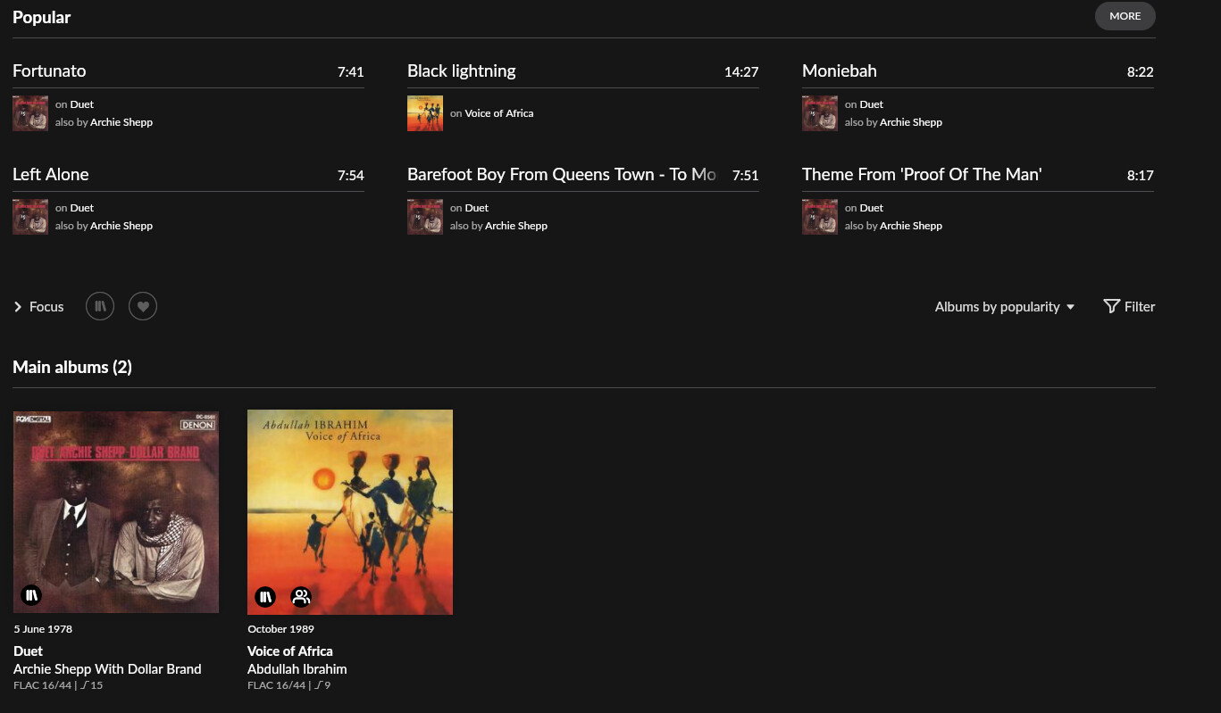
- in the artist page the albums are now after a meaningless “popular menu”, that i think it used to be collapsible


WHAT I LIKE
-finally we got rid of those awful gray squares… the grey bubbles with letters inside are bearable
-the focus feature at all levels is a PRO, in my opinion the one and only new feature in this 1.8 release