Thoughts for a modest makeover of the now playing display, when displaying in landscape mode on large monitors or HDTV.
-
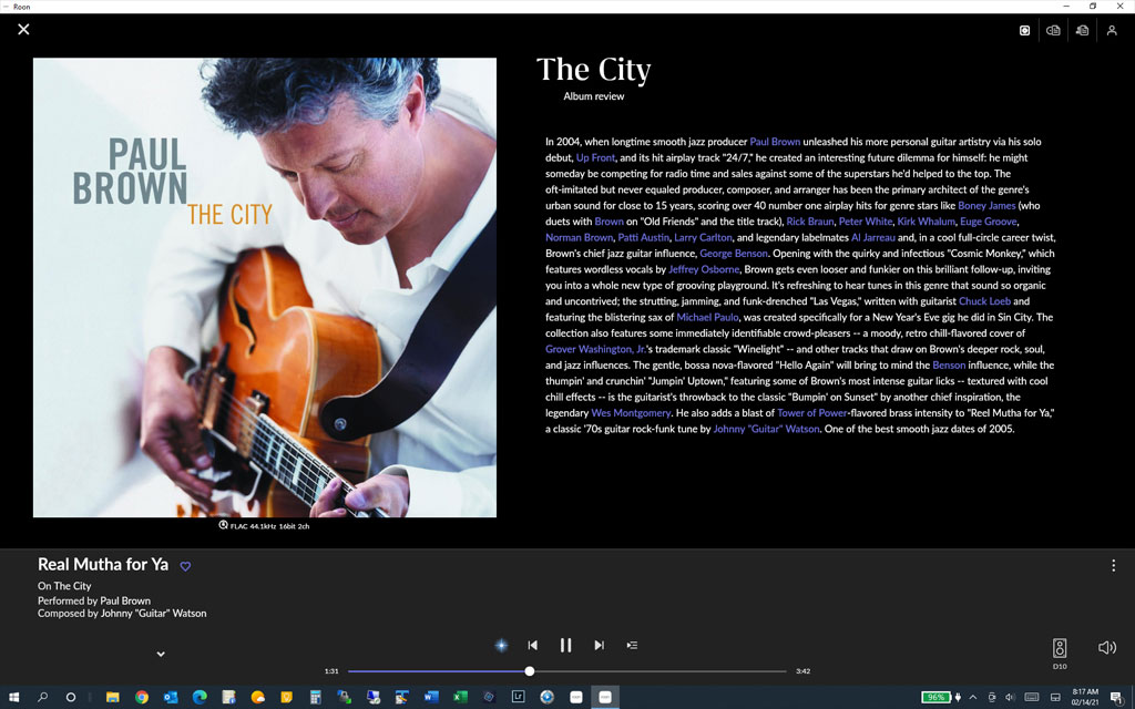
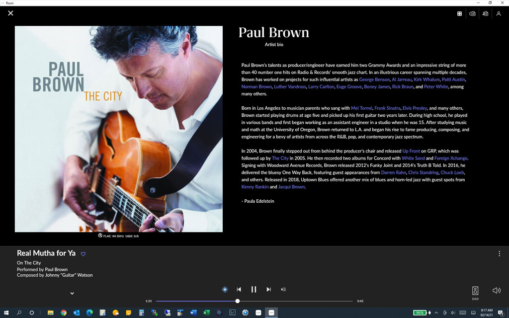
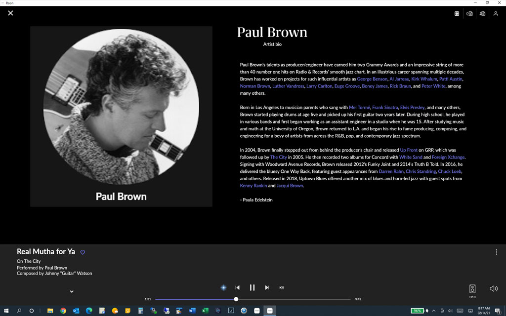
Divide now playing into a left zone and a right zone, each roughly half of the display, maybe with the right zone slightly wider.
-
In the left zone, let the user pick album art or artist photo (probably the circular one so it can scale to fit).
-
In the right zone, let the user pick either lyrics, artist bio, album info, or track credits (all scrollable).
-
Remove the multiple album cover icons and put arrows under album art to allow cycling through them. (Or just remove this feature.)
-
Leave the top row content selection icons, but separate them to their respective zones.
-
When playing roon radio, remove the ‘add to library’ line under track info and make it the circle with + sign like on album display. Move it over next to the 3 dot menu. This keeps the now playing screen from resizing/flashing when this line appears and is removed.
-
Make the track info fonts slightly larger.
-
Optional setting for one zone similar to current layout.
Some examples: