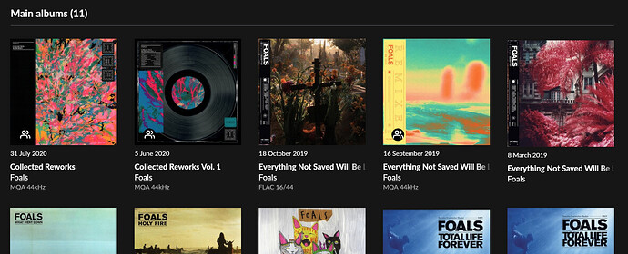
My compromise would be to let the row height grow and show a multi-line title rather than enforce the grid layout. The three records to the right in the top row are Vol1, Vol2, and Vol3.
+1 for this.
Yes - either that or a scrolling title. I have three different versions of Sgt. Pepper but have to tap into each one to discover which it is.
Michael
Agreed. remember having a long running with Sonos over just this. If you have a list of violin sonatas, or whatever, the crucial bit of information is often at the end (e.g. No. 11). If that is truncated you are left guessing or counting.
+1000 A major concern for classical albums, whose titles tend to be somewhat long.
+1 here too!
+1 here as well. 
+1 I use Roon for classical music, and almost all my albums have their names truncated in the album grid view.
+1 from me too. I’ve given up voting, long live +1.
+1 yes please
+1… already at my vote limit.
+1
Maybe the truncation style of macOS could be good alternative. There you can see the beginning and end of a string and the letters in between are replaced by …
But multi line titles with an adaptive grid would be the best. Or a flexible grid size.
