Hi,
While being happy with the general UI direction of v1.8, I think that one of the visual elements that have worsened is the Track Grouping/Works in Album view.
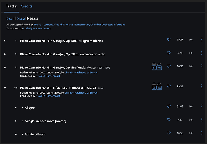
This is how it looked like pre v1.8 (nicked it from an earlier thread) You can clearly identify the title of the work, and the tracks that are included under it.
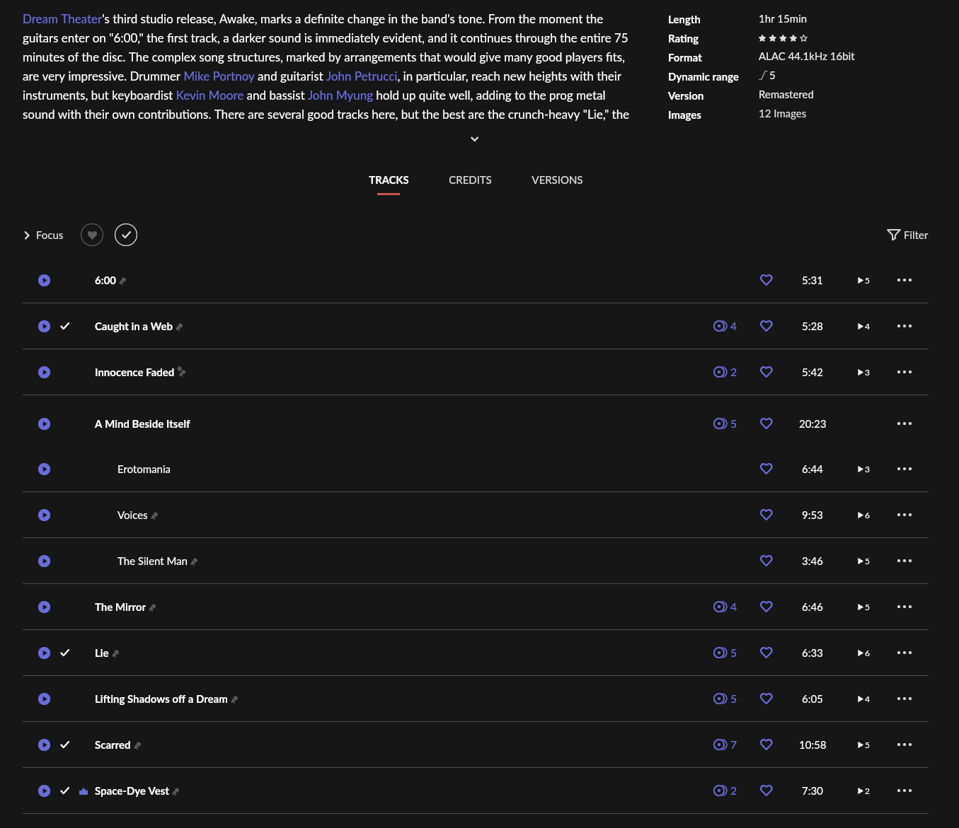
This is v1.8 (without track numbers) The work name (A Mind Beside Itself) is way too similar to the tracks. Only differentiator is some white space. And the absence of that single separator wrongly suggests that the work title and the first track in the work is the entire grouping, looks weird.
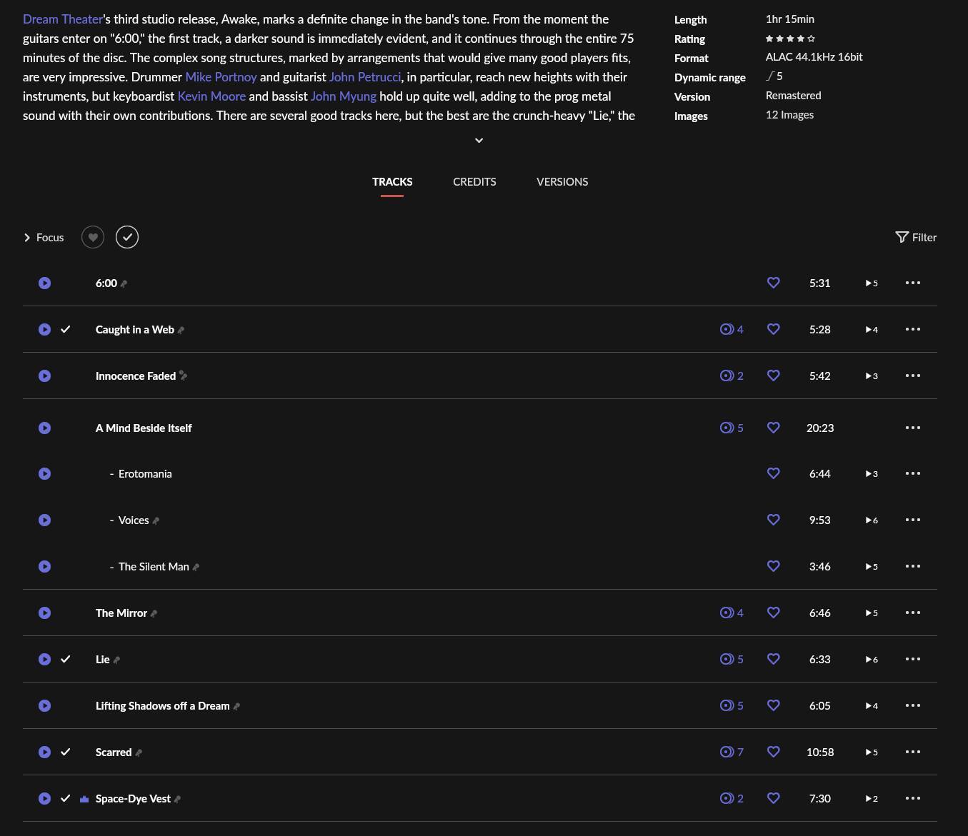
This is with track numbers enabled. Not much of an improvement.

I tried toying with the UI to see if there’s a simple way to improve.
Take 1:
Added the missing separator, but then changed the size of the separators between the tracks of that work, tying all the tracks of the work together visually

Take 2:
Separators are left the same for visual consistency but hypens are added to indicate the “ingridients”

Take 3:
Same w/ 2 but without the separators within the “work” to indicate that whole piece is a singular thing (with parts)
Take 4:
Same w/ 3 but I also stole the idea from pre v1.8 to take the play buttons slightly in.
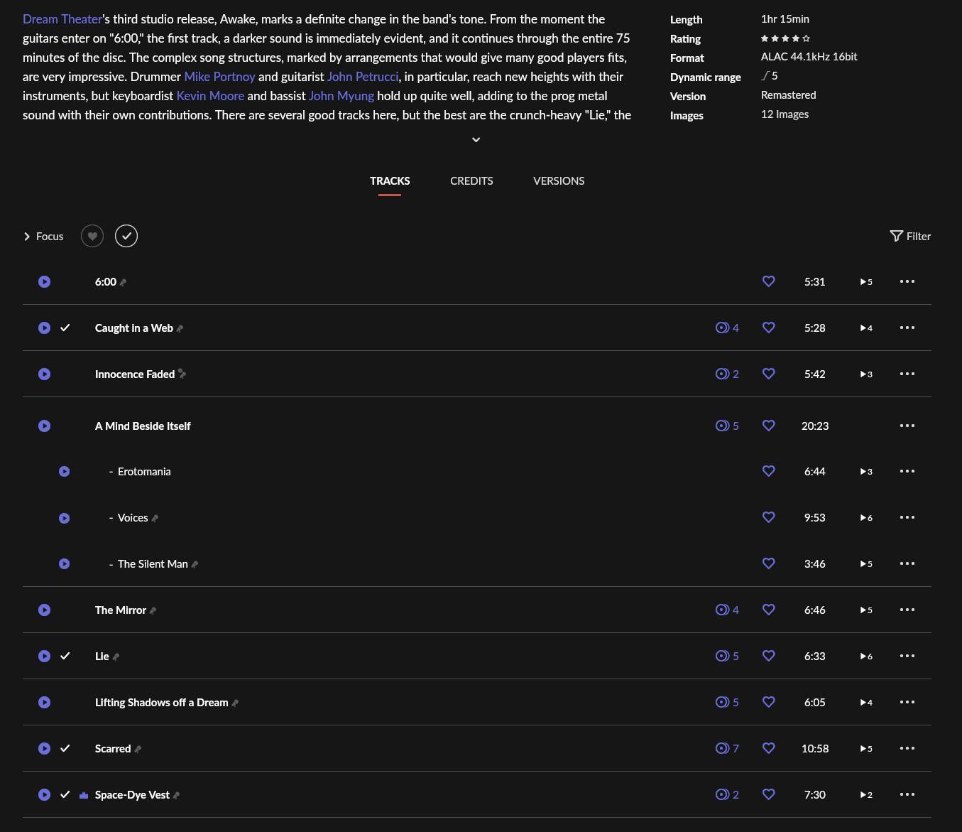
I think my favourite is 4, it just makes much sense from a UI perspective compared to what is given us w/ v1.8.
Do you have any opinions on this? Is there anyway this can be somehow made visible to the design team of Roon (to hopefully get a comment)
Cheers,
-Y