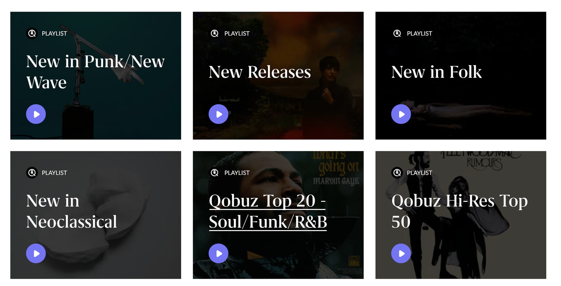
I don’t think it’s a matter of opinion that which one looks better and offers a more pleasant user experience. I can imagine some reasons why Roon renders them this way (white font on the center requiring darkening the images), but honestly this looks so ugly and unusable that I think whatever the premise is should be rethought. I think it’s probably better to just generate a synthetic collage of playlist content (the same for roon native playlists), rather than using Qobuz official photos.
While the Roon ones might lack visual appeal and be hard to distinguish from each other. The Qobuz ones, with their mish-mash of fonts and glowing drop shadows look (to me) like someone with little eye for design was let loose with a copy of Photoshop.
A halfway house might be to simply reduce the opacity a bit on the Roon ones.
I think this may be a bug as I don’t remember them always being this dark before. It’s pointless having the artwork if you can’t make out what it is. On my phone hardly anything is visible.
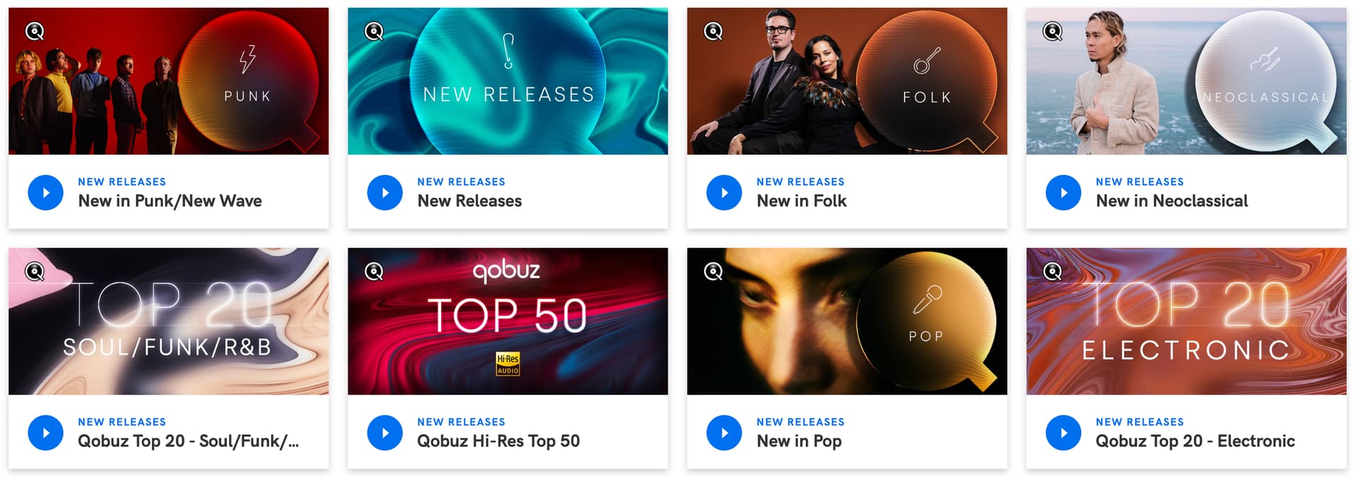
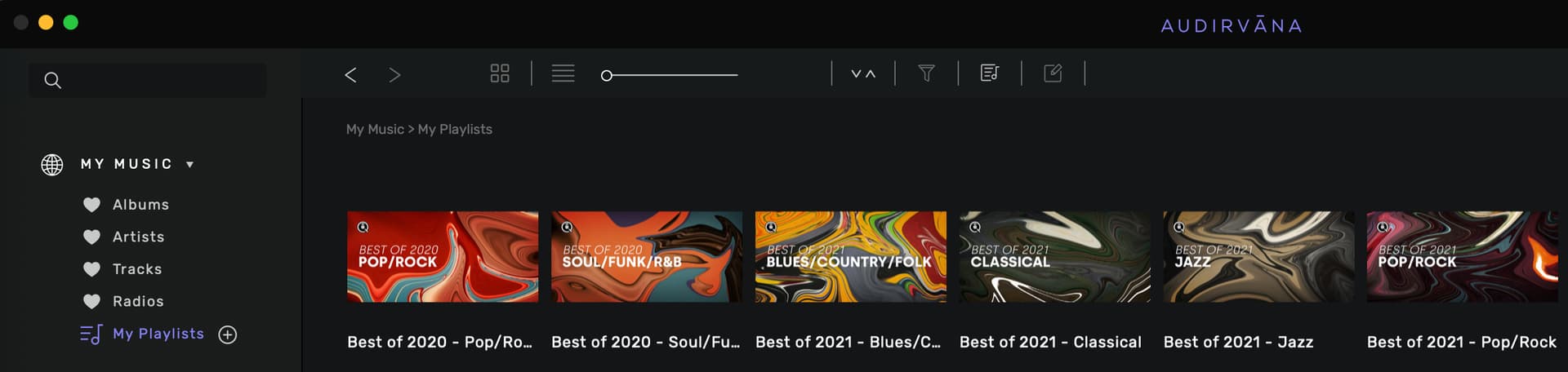
The playlists should look like the original illustrations on Qobuz app. Audirvana does it really well on that respect when showing Qobuz general playlists and My personal Playlists, as well.
Great UI challenge! (great meaning hard). At first I really liked the Q. screenshot, but in terms of actually knowing the playlist title, the font is small in the text. The images give you a bit of a clue but not exact (“Punk” in image, vs. “New in Punk/New Wave” as the actual title.
I think the Roon way is more functional but is a bit dull, so opening up the images is a good suggestion.