Thanks for the info, I haven’t tried searching for it yet being on my phone, if you have a good example could you post a screenshot? I’d love to have the option of a vinyl like cover while playing with some info to read - booklet sounds along those lines perhaps it will give some food for thought to any Roon guys whom come along. Thanks.
They’ve teased a couple times that a new UI is coming soon, in the next big update.
I think all the tada around mqa slowed the real progress of getting us closer to the experience of listening to music.
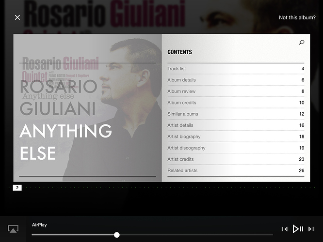
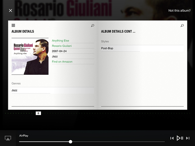
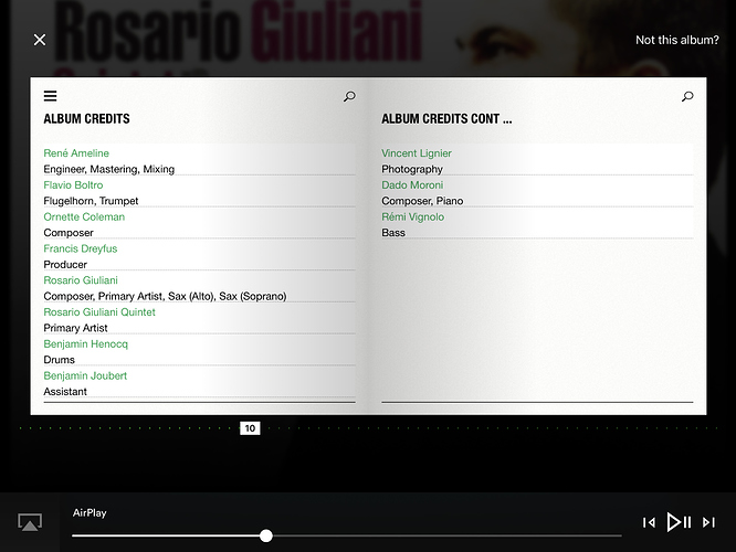
As requested, here are a few screenshots starting with the index page. Roon, alas, doesn’t currently compete in this area.
I like these views very much. Much more like the LP experience.
Agreed, Naim had a head start but this does show the possibilities. It could also increase sales of CDs & downloads.
Thanks those are quite nice and a definite improvement over what room does. I personally feel it’s more like a CD cover than a vinyl insert. Being 43 now I only vaguely recall the vinyl days of old, but did enjoy reading about the artists and things in the cover. Contextual and live information is where Roon could take this a step further than others have I think. A good place to start looking for ideas might be existing sites that offer this information already like lastfm and trakt.
Getting some good comments and ideas through though aren’t we!
Why is it that in this digital age where music is primarily stored on computers there is this idiotic hang to album covers and inlays. Don’t get me wrong, I do like album art but why does it have to look like a CD or LP, why not like a cassette, a DAT tape, A USB stick then? I like the album information but there are better ways nowadays to present it once you get rid of the idea it has to resemble something from the past. Personally I find the examples here but ugly.
You could say that Nucleus is an example of this. It’s a computer dressed up as a hifi component to make it more acceptable to the audiophile elite.
Nothing wrong with skeuomorphism when your value proposition is that we love browsing LP sleeves and computer interfaces don’t match up 
Surely we aren’t talking about retention of, possibly, archaic information & presentation but more the fact that there are opportunities to present that information more effectively. As we know Roon is a complex piece of software surrounded by a culture of end user involvement to facilitate change. In the last couple of years it has been demonstrated that user feedback in these forums influences development.
Artists use PICTURES (AKA Album Art) as a means of visually identifying their work, they also provide much additional information (Text in Sleeve Notes, or what ever you prefer to call them) for those that are interested. The additional information is often absent from Roon but present on the CD (or supplied with a download), with the Naim App there appears to be, currently, far more information available.
As long as the information is available & easily accessible I don’t mind what the template is. The current display of additional information (Notes) is not as effective as I would like it, hopefully viewing other options and stimulating discussion here will eventually result in an improvement for the end user.
How is this information appended on the Naim app? I have a couple of downloads that came with PDF documents that I can access through Roon.
More of a reaction to this:
WOW!
I don’t think it’s that odd to desire large screen display of the art and information that came with the work when media was physical. That said I agree with posters above who say the specific template isn’t what is critical. It’s the more effective use of all the real estate available on Now Playing, and give us a version that works on a 60 inch screen.
Oh yes, absolutely agree on the use of real estate issue. That’s a weak point of Roon caused by a strong desire to be too much consistent between various devices from phones to 60inch tv screens.
Other then that, it’s not a queastion of how it looks like. The looks of the old album inlays were dictated by its size and square format etc. Now we have past that restriction we have to ask what it is we’d like to see and let the form be dictated by that, not the other way around. And yes, I find it strange trying to resemble something (with all of its restrictions) that a whole new generation doesn’t even know how it looked in real life.
ok. Not sure if that’s constructive feedback or not. How about having a stab at what you would like to see?
After the initial excitement of what Roon does (and buying a lifetime sub), it does become pretty apparent that the actual UI of Roon is it’s weak point.
One thing in regards to the playback screen is how one gets there - far too many clicks in Roon (don’t even get me started on deleting a Tidal lp) to do anything that should/could be set up as a custom go-to by the user. I would love an option to bypass the que screen altogether and always go to the “Now Playing” screen. Or, the now playing screen could be easily combined with the que screen into one great show all package. Often the back buttons get confusing - do they take me where I just was, or does it take me back to the complete library? Also, a PIP of what’s next in radio or shuffle on the Now Playing screen is needed, as well as widgets for desktop/laptops so one doesn’t have to always switch screens to see what’s playing.
Lots can be done, and I would say more simplification and customization of the UI is key.
I like what I see right now! Love the simplicity, not being able to press all kinds of buttons while listening. Listening should be the focus!
Of course things can be improved on the UI side (specifically on the collection browsing side of things), but the playback screen is fine for me.
I guess it will work for a lot of people. And that’s great. The point is you shouldnt have to press lots of buttons. I’d argue that the current screen has too many buttons. Credits. Lyrics. It’s like being in someone’s living room having a conversation. They offer you a drink and when you accept they say “ah. You’ll have to go drink that in the kitchen. But when you are done I’ll be here waiting…”
Is an LP sleeve or a cd insert skeuomorphic? Sure. Is a kindle because it has the notion of a page? Agreed we can use screen real estate better but when you take credits, artist notes (from the artist page) album notes from the album page, lyrics and any pdf or image that may have been associated there are a lot of elements that are kinda related and kinda suit a paginated experience. Does that mean you have to use it on the playback screen? No. (I agree that we do have too many clicks already to get to the playback screen). The experience I personally would like is like the kindle experience - pages with an overview capability. But that’s me. I’m one voice.
The ability to lock open the main menu would be a great one as well, esp for large iPads and desktops - one less click all around to get to anything.
I agree with @Nyquist. Computer screens are not LP covers or books and I don’t see the point in trying to make them look like it. Screens offer so much more opportunity to present the information effectively.
I do agree that the information could be presented better and that more can be made of screen real estate but the whole notion of skeuomorphism seems pretty pointless when you have grown up with computers. Maybe it is an age thing and you can’t let go of the past, adapt or accept change (not directed at you personally).
I have faith in the Roon team and we know that they listen to their customer base (you might not always like what you get but that’s life!).


