Impressions after 48 hours are this is a real mixed bag of an update.
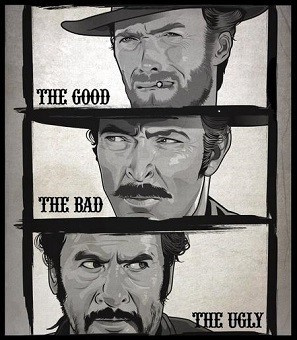
The Good: The new Roon Radio personalised listening feature is already excellent and will only get better over time as crowd-sourced feedback improves it.
The Bad: The new Search should be great, but isn’t at the moment - results are still very sketchy with duplications. Somehow we’ve also managed to lose functionality because it’s no longer easy to see at a glance which results are local and which are from Tidal/Qobuz (works with albums, not artists). The visual design is incongruous with the rest of the UI.
The Ugly: The overall UI design decisions are pretty poor. There’s a real lack of cohesion. A lot of screen real-estate is wasted but also manages to feel cramped at the same time. An odd double-whammy of crapness.
In summary: a lot to look forward to in future updates
On 1.6 I have on Tags 1 layer with 4 album covers to choose from.
On 1.5 I had 2 layers with 8 covers , can I have same 2 layers on 1.6 version or not
pls let me know
James_I
(The truth is out there but not necessarily here)
757
Well, except that the comments don’t all agree on the same thing either. See my thread about the philosophies of configurability versus a simple single presentation.
It’s obvious I favor the former – I don’t see how Roon can please everyone all the time and so I want to be able to configure to my wants, but I also understand that creates a more complex product under the hood and could mean that Roon takes twice (? more?) as long to implement cool new stuff than it would if the product was more streamlined.
It’s a real challenge. People can bash the design – and I for one am totally scratching my head as to how there is no large album cover for Now Playing – but users must also understand that aesthetics are inherently subjective.
I think the current criticism stems from the observation that each individual section looks like it has been “designed” (I use that advisedly) by a crack team of badgers.
There is no overall flow or DNA to put your finger on. You can praise or criticise an individual view and have a completely opposite feeling about another part of the UI.
I’m nostalgic for the days when all I wanted was scrolling consistency
Aesthetics were also the main selling point of Roon. “Roon turns this… …into this.” It still on their main page, but not a top priority anymore, at leas as far as I can (subjectively) see how things are evolving.
I think you may have misunderstood how this works. If you want a “dance party mix” let Radio create this from a good example of the genre–either track or album. Mix tapes and various artists collection such as NOW That’s What I Call Music! are not going to be good seeds.
Personally, I think new Radio is brilliant. I’ve had a big grin since I started using it!
I’m a lifer so no new version of the software is going to chase me away. I have been using it for a few days. I don’t subscribe to any form of radio service so I have nothing to add about those changes. I do appreciate the efforts of Brian and his team to make the interface better. I only noticed a few things that I wish were different-
I had to edit some of the album metadata files to get my hand selected album art to display again. I believe this has happened before with some updates in the past. It would be nice if a global option was available (or better yet a default) to use the artwork from the files rather than whatever Roon thinks the correct artwork should be. Some of my CD rips are from special versions (like Mobile Fidelity) of albums and I want to display the correct artwork.
The lyrics don’t scroll when playing music through devices in the airplay zone. The scrolling seems to work fine in my other zone which is a Bryston BDP-3. To me, the lyric scrolling merely a “parlor trick”, so no big deal with me.
Keep up the good work Roon Team-You asked for feedback, so my advice is to focus on enhanced functionality rather than lipstick and makeup on future versions.
Best
Jeff C
James_I
(The truth is out there but not necessarily here)
763
I agree that Roon launched with the claim that aesthetics would be primary in philosophy. Nor would I defend any element of the design as being my favorite (but I also have not just terrible taste but no taste whatsoever).
My observation there was simply to point out that users may hate the design but not agree on how to fix it, and so it is really not an issue of pointing the finger or allocating blame, as much as it simply is expressing one’s taste and then working with Roon to see if something can be done to accommodate it while avoiding crossing someone else’s aesthetic.
I love Roon for its functionality and playback device integration.
I design commercial apps for a living and my impression has always been that the Roon UI is designed by engineers, with little input from a skilled graphic artist. An experienced visual designer can ensure a cohesive application of a design language which mitigates the inconsistencies that have always been prevalent in Roon. In some cases it feels like different parts of the interface were designed by different people - another symptom of the above.
This latest release, which I really do like because of the Search enhancements, shows a bizarre lack of digital design acumen in places like the Now Playing screen (though I appreciate the functional changes made there). This is evident from the many comments to that effect, though most can’t precisely describe the why.
Roon will get there… in the meantime, I am really digging the new Qobuz and Search features.
FWIW I just tried for the first time on my Google Pixel XL (firat gen) phone - and loving the UI! The darker mottled black/gray play bar that then goes all black to match the background when it goes to the Now Playing screen - with just the album art.
I also like the screen switching tabs along the top in the phone app (the blue Now Playing, Queu, Roon Radio, and History). I know this was done because of lack of real estate, but to me it works really well. Very much like the tabs in Lightroom, all of which have keyboard commands to switch between them: Library (G for grid view, E for enlarged single image view, C for compare - how cool would that be to see multiple lps at once and quickly play bewteen them) and Develop (D), Slideshow, Book, Print, Web etc. They call them modules.
So just like the Android phone app, maybe some separate screens - a Now Playing screen that is just that with some basic controls and ability to hide/unhide text, and a PIP size/type radio screen that can be hid/unhid; and a Radio screen, for those radio fanatics (it really is unique and great now in 1.6) that is all about what’s next with a PIP size of what’s currently playing.
I’ve always wanted a fixed main menu option in Roon - with a 12.9 ipad or my 27” screen in the office, I don’t want to always have to drop down a menu to get to where I need to go. Clicks add up over time and really not necessary with the right screens. Along the top for the majors would make sense, and separate out Settings, Support etc to a drop down as current. But even a lock open on the menu as is would be appreciated
Hi All,
I finally had a couple of days with 1.6. Awesome work. ROON has already allowed me to explore music I never would have gotten to listen to by allowing me to endlessly browse. The new ROON Radio, now reaching outside my own collection, just pushed music discovery into overdrive. I’ve tagged so much new stuff to listen to it’ll keep me busy for infinity, And to think that this algorithms will only get better.
Great work.
Cheers,
Jay
And I never would have thought that someday I’d say the Android Phone verson of an app is beautiful and the iPad version butt ugly! But there you go - like others have been saying this is obviously design by committee - a piece here and a piece there to fulfill functional but not aesthetic criteria - or perhaps the various versions were designed by different parties? If so, bring the Android person over to the iOS team!
Anyway, for now I’m using my phone and a bit more relieved that the main design could be/will be something much better someday.