You’re right, ultimately, but $20 a month for Tidal ($25 for Qobuz) brings the price of using Roon up from $12/month to at least $32/month. There seems to be an element of unfairness there, but that element also seems to fade in the hypothetical where Tidal removes “browsing” access (as opposed to being able to play the tracks) to its catalog for logins with no subscriptions. If Roon Radio just can’t work well without such access, then it’s my bullet to bite, I guess. However, consider these two factors: 1) folks here are complaining that Roon Radio will play Tidal versions of tracks in their local libraries; 2) Tidal has a history of removing music from its catalog. The equities in play seem muddled by those factors. The world is leaving me behind, in my old age, I suppose…
One can draw an infinite number of lines through a single point, but they’re not all going to be what you want. Better to provide multiple examples to allow for effective induction of implied principles.
I don’t think this release has the abilities of a haruspex. 
And same on Android (no option anymore to clear queue with one click), if I am not mistaken.
My view on the esthetics:
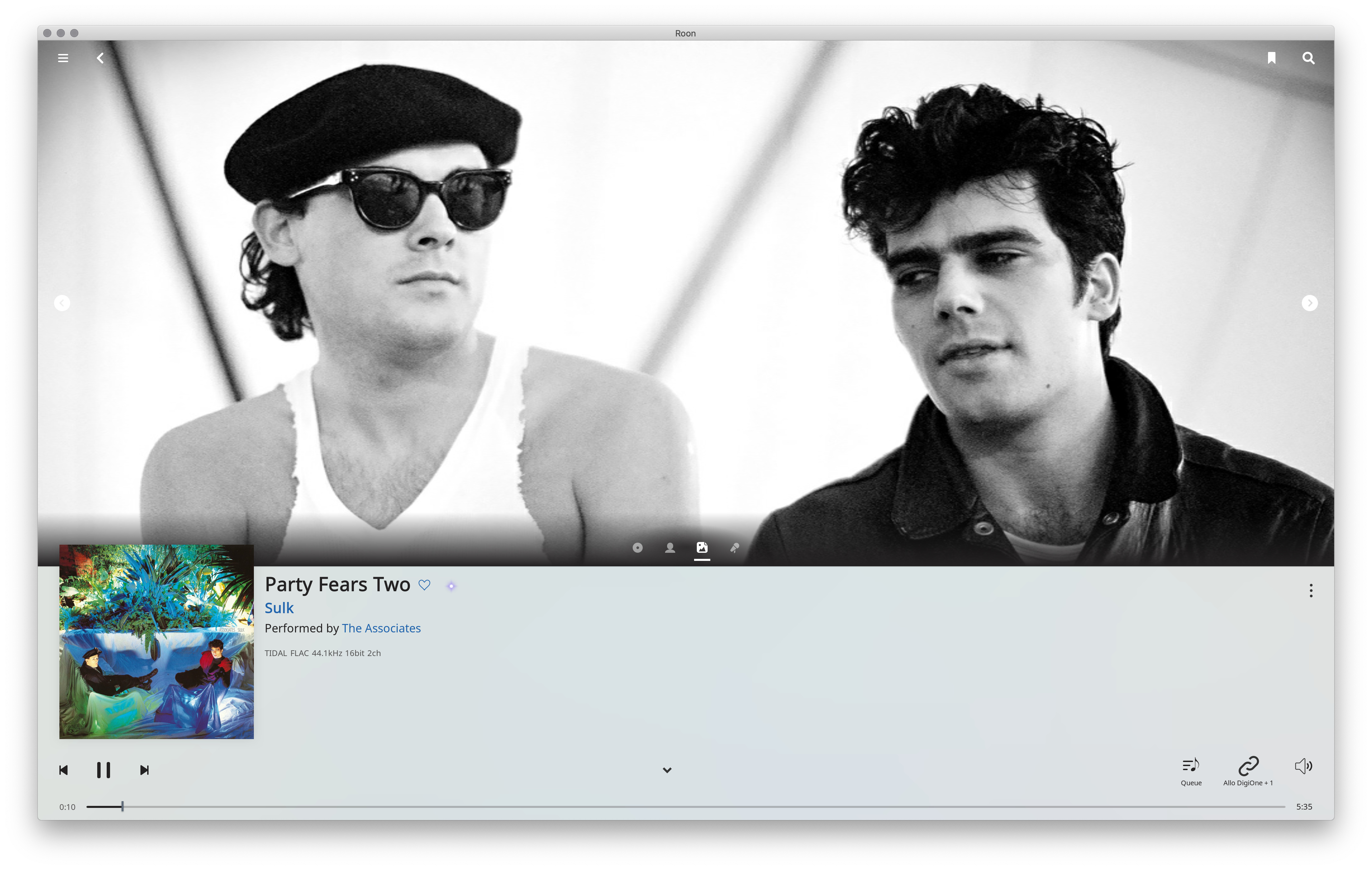
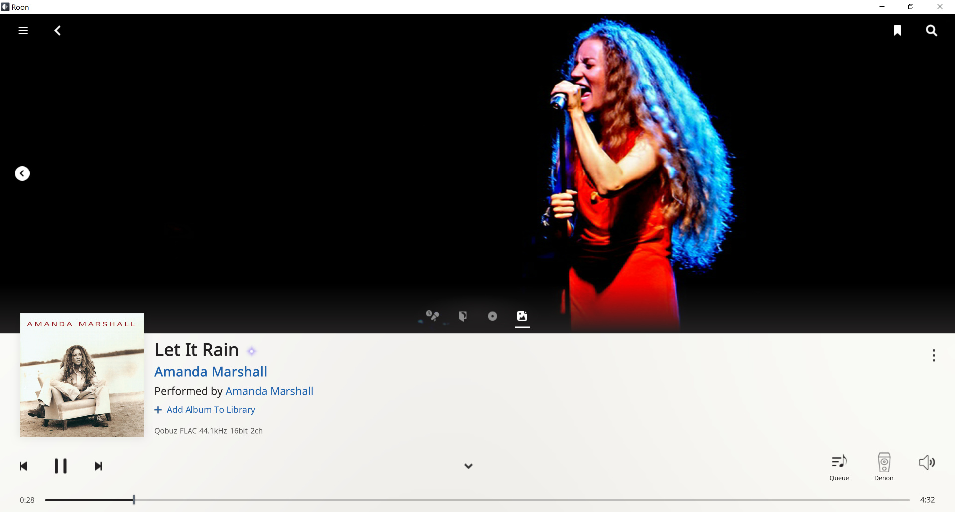
I really like the Now Playing screen, from a design perspective. Details below the picture:
-
I like the uniform white, with no delineation of areas, like the footer bar vs. the rest of the page. This is modern design — “modern” in that it came out of Switzerland in the 30s. Early computer design was Victorian, with centered headings and labels, and lots of frames and lines delineating areas. Look at any modern magazine, or a photo book, or something like that: minimal lines, no stupid drop shadows, text for the album is left-aligned.
-
Look at the left margin: the hamburger menu, the album cover, the play controls and the time line are all left aligned, this creates a virtual left edge that doesn’t require a line. And similarly on the right edge, search button, three dots, volume button and time line are right-aligned, creating a virtual edge with no line.
-
No borders on the pictures either — when was the last time you saw borders on photos in a magazine?
-
I like the album picture breaking out of the grid. Adds a little tension.
-
It’s actually not white but light gray. I can imagine some reasons for that, less glaring, but I disagree with it. Newspapers and magazines are white, my iPad is mostly white — this page is white! Doesn’t matter much on this page which is all uniform, but when you collapse the page and get back to the footer on an album page, you get the area delineation again. All white everywhere would be better.
-
I absolutely didn’t like the old black play bar. Black over white is such a harsh contrast. You don’t see black section demarcations on magazine pages, the page footer is just a white bottom area with a page number. Similarly, the main menu is black - yeww!
-
I similarly prefer a few things like DSP now getting a full page, instead of being a pop-up dialog box. Such pop-ups are terrible, they break the flow, don’t fit in normal navigation, especially when modal (or system-modal — WTF?). We still have a few: the zone selector, which does not go away when I hit play but does go away when I touch elsewhere, and the volume button brings up its own dialog box but doesn’t bring down the zone selector and their lifetimes are stacked, and if I have both zone selector and volume box open and hit the Play control arrow the volume box goes away but I have to hit Play again to make it happen but if the zone selector is up the Play control works directly… Random stuff.
And the cleanliness of the Now Playing page is missing elsewhere. As @brian said, such cleanup is incremental. But I can’t wait. All white, no sections!!!
Seems like good advice.
And, just to be clear, pandering to users afflicted with ocular fixations, who always have to be looking at some huge TV screen, is not enhanced functionality to my way of thinking. Though I could see arguments on the other side, related to the mystical ineffable “SQ”.
I’m still disappointed in this release, because some major areas have yet to be addressed:
-
On-the-go music. What’s the solution for hiking or driving?
-
Better metadata. The metadata currently provided is both extremely weak (compared to what comes with CDs these days) and kind of stale. The support for box sets and classical is appallingly poor. The new focus on artists appearances is perhaps another instance of the pandering to ocular fixations I mentioned above, though I do understand that many rock and pop artists exploit exactly that focus to stand out. And perhaps fans of those kinds of music enjoy seeing them. Though personally if I never see any pictures of any of the members of Fleetwood Mac again, it would be a blessing and a mercy. Anyway, I think it’s a wrong direction to take.
-
Better lyrics. Support for the user’s LYRICS tag would be great, but Roon seems to be (wisely, I guess, from a business point of view) moving away from hand-curated collections of digital music towards the great on-rush of streaming services. I do realize how hard this is, with all the various copyright and rights management problems, but I dream that someday Roon will be able to do something others thought impossible!
The UI changes seem to be something of a misstep (though no doubt well-intentioned) but overall minor (to me). The Qubuz integration is still a non-factor for me, as I live in California. Ditto the “new radio”, as I don’t subscribe to either Tidal or Qobuz; even if I did, I’m not sure my tastes would match those of the great mass of subscribers – remains to be seen, I suppose.
Just a note that my CCA Roon player just cut out on me because I opened another laptop elsewhere in the house; first time in six months of Roon I’ve had that kind of problem.
The AI still needs training! 
I’m curious as to what your goal is in linking a Tidal account with no payment added. Is it just for browsing/shopping?
The “intelligent” version of Roon Radio works only if a Tidal or Qobuz account is linked to Roon. Though it won’t play Tidal/Qobuz tracks, it will at least play locally stored tracks picked by means of the “intelligent” algorithms. Without the linked account, you only get the “dumb” version of Roon Radio.
For my laptop and Android tablet, I am in the camp of NOT liking the new UI.
But on my Samsung S7 Phone, it is as you said great.
What is even better on the Phone, is the Album Art is physically bigger than my other bigger devices.
Interesting. Do you feel like you’re getting better selections from your local library using this method? My understanding is that the 1.6 Radio algorithm is really premised on having the Tidal and/or Qobuz library to select from.
I don’t want an AI deciding whether I get wide or skinny women to view 
Agree with this observation, from what I see on over a hundred and fifty favourites and purchases, those few where roon has assigned different metadata for the title are seen as separate / duplicate which makes sense. For e.g. almost every album with something like “XXX Live” on the title sleeve, the link gets broken when I use Roon’s metadata, which typically is the whole thing rather than just ‘Live’ often used in Qobuz’ tagging.
Using it just for 2 days now but already really like this new release. Qobuz integration is the best thing to come to roon in my view so I’m really happy with this… even more integration would be welcome eg localized reviews&bios and inclusion of "Panoramas on the overview screen…
I see a lot of critique on the new elements added like the now playing screen. Well I like the direction roon is taking but more work is still needed as the over-all design is no longer consistent across all screens.
Light mode is my preferred view so the new footer color is not that big an issue but I even found the old one to big so the added size only make it worse…
I never use radio ( real radio yes ) just not the roon-kind so updates in this area are of little importance to me.
With the new search we do get a sense of what vertical scrolling will look like it seems…
When I was married I had no choice 
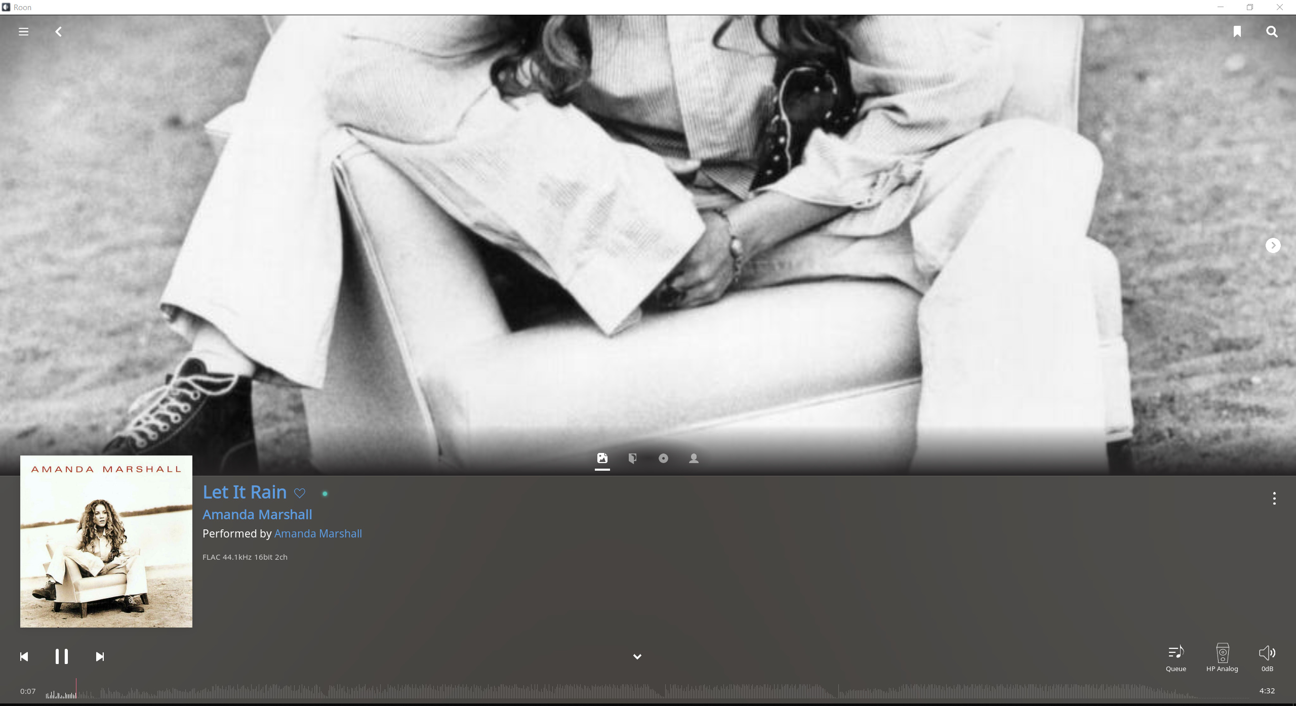
I talked about my dislike of excessive delineation of sections. Of course, the Now Playing page which was my go9d example is also a bad example when looking at text:
Why do we want white text on black background? Aside from the esthetics (and eye strain) of the negative colors — I chose the Light theme for a reason! — this serves to delineate the sections, the text from the bottom part. Heavy-handed.
Yes, if that was inverted, the white background album cover would blend in. Do we need to fix that? Don’t think so. I sometimes have the Economist lying on top of the New York Times, both white, doesn’t cause a problem. It’s true, in that situation the Economist casts a drop shadow which helps separate them visually, if ne essay we could do a minimal drop shadow.
Seems unfair ? That you have to pay for music access ?
To avoid your issue simply don’t add your Tidal login credentials to the System.