Thanks Brian for the direct feedback, much appreciated. So far so good with the new Radio - I mean, it is not always hitting the mark with great music, but I haven’t noticed any head-smacker genre misses yet either. So it is finding relevant music within Tidal for me.
Actually I did use it pretty often.
But maybe it was not used broadly because it never has been very attractive and we’ve always been waiting for something better. The prior version gave us little in terms of configuration choices - you could have a somewhat large album cover that looked like an overlay over another Roon page (like it was camping there), and then you didn’t get any semblance of queue or “up next,” or you could have a small album cover with “up next” and the queue, and it seems a combined page with a reasonably sized album cover, or larger if user-desired, with “up next” as well, would be very welcome.
I wouldn’t mind the possibility of album art, artist photo, and up next on the same page, with it being configurable as to whether the album art or the artist photo is the larger, with the other being an inlay. Then “up next” with a small album to the right, kind of thing. The web display could do that if not a page internal to Roon (actually preferred since the web display can be used on any screen without interfering with Roon control functions).
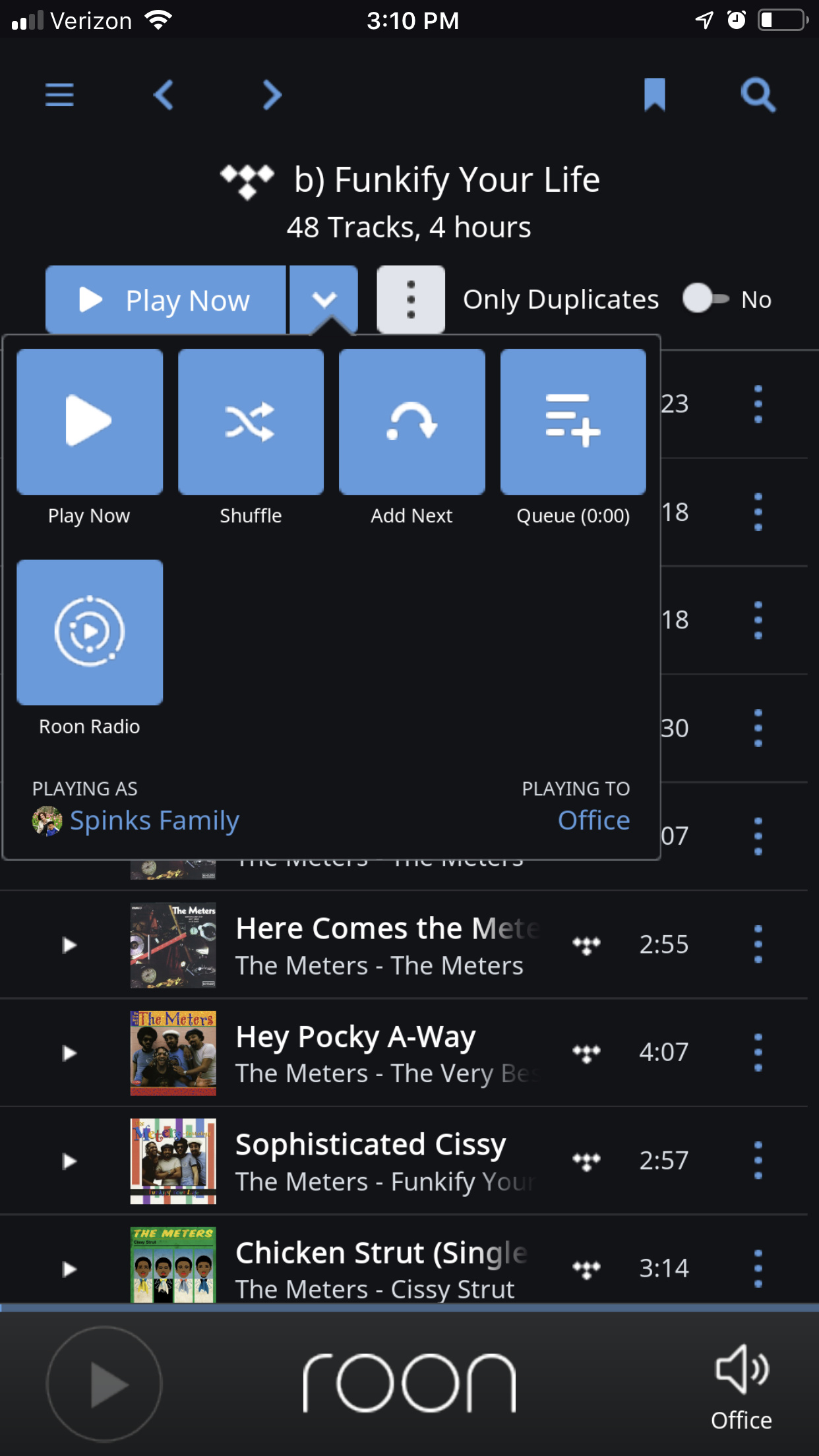
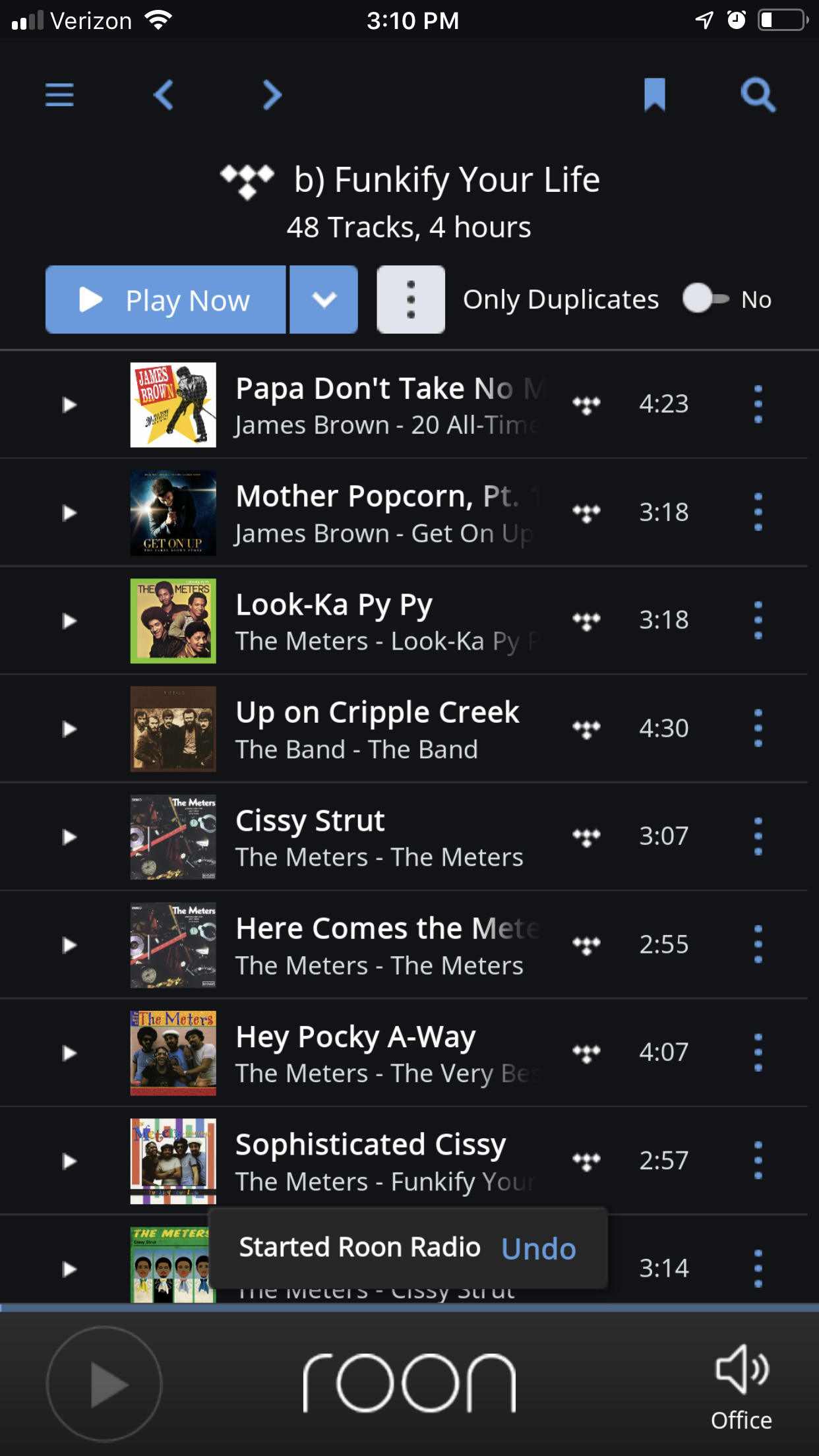
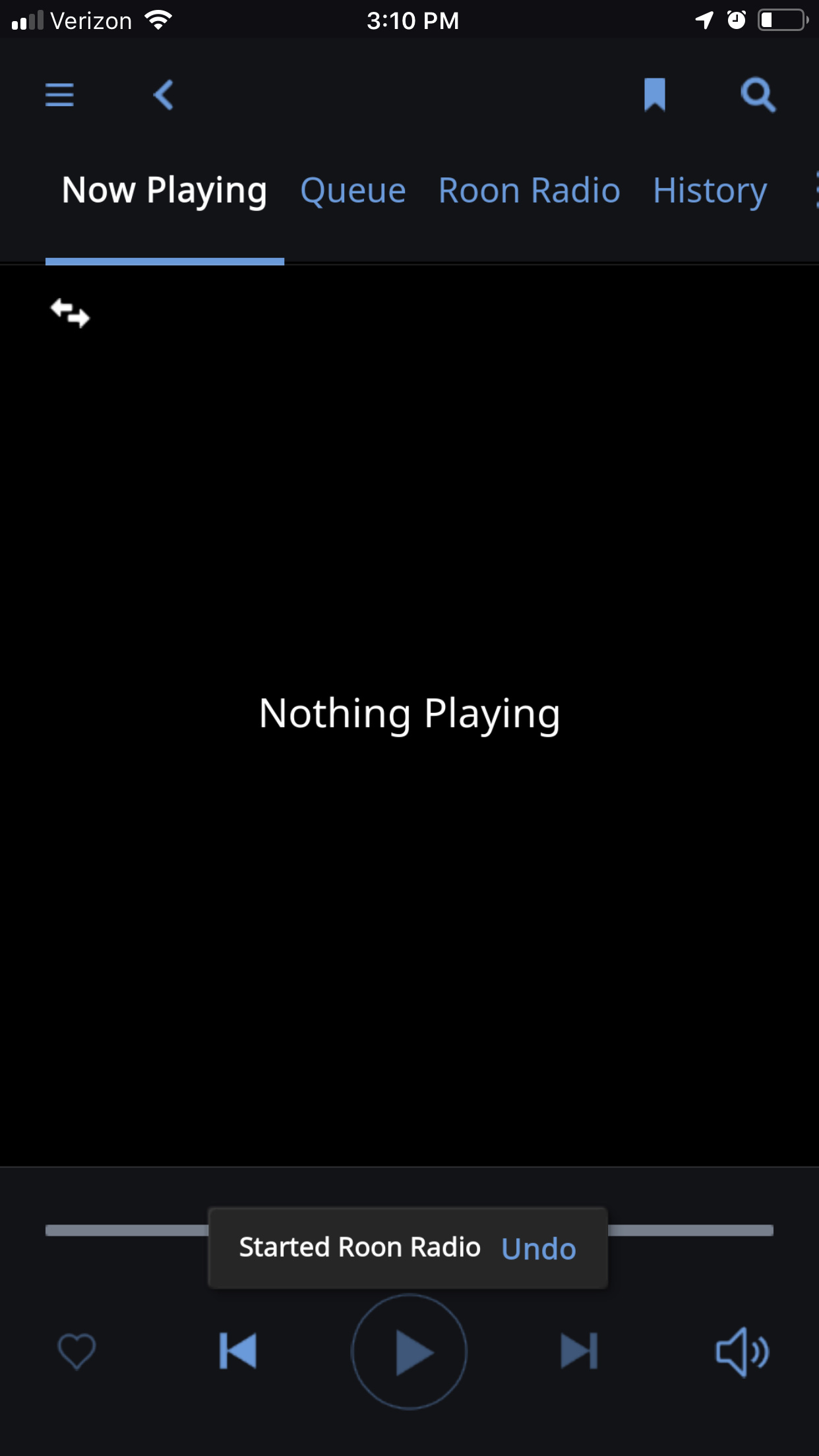
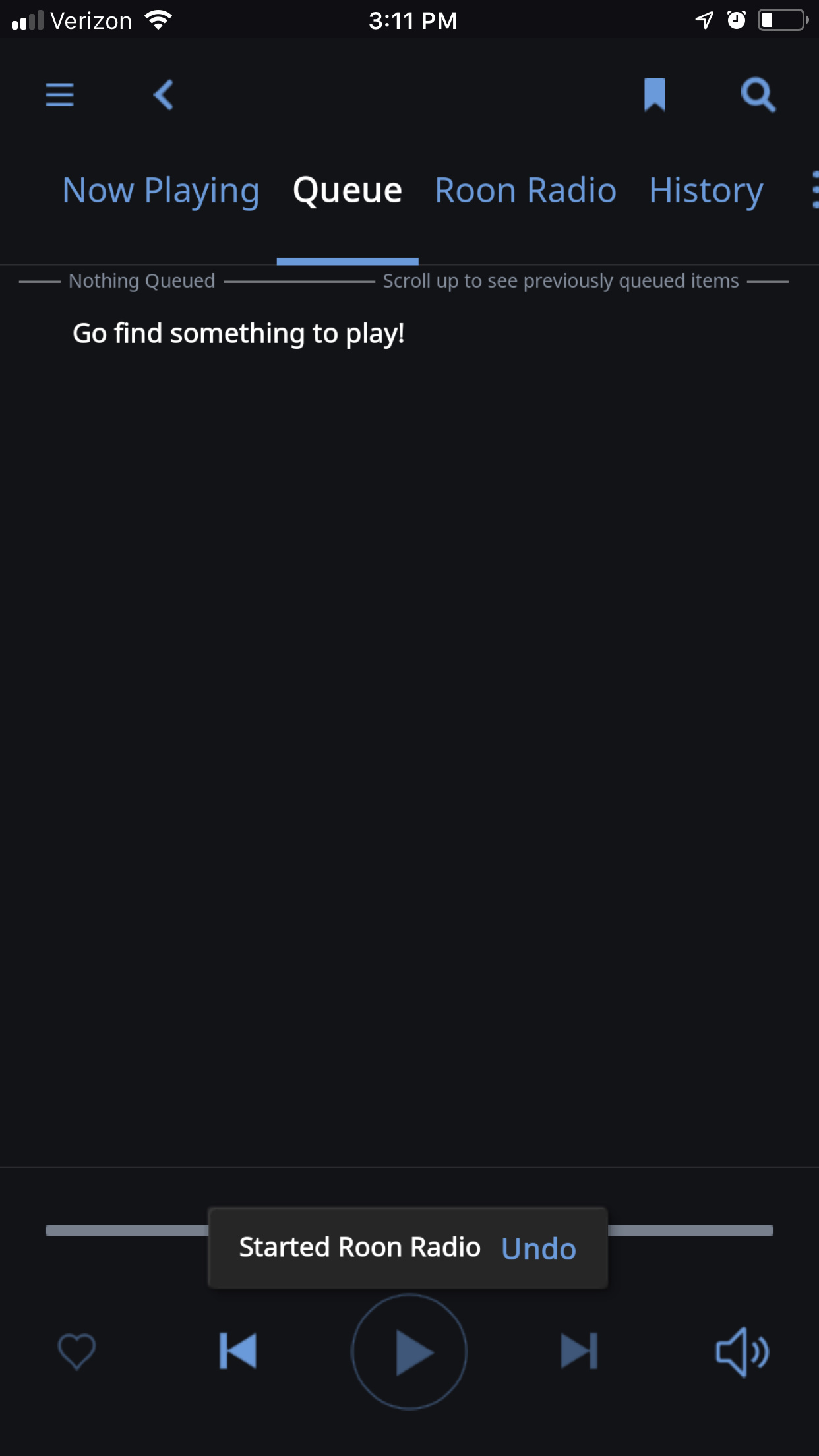
But the queue, with Radio or Shuffle, is a pretty useless page, OTHER than showing what is playing now (one entry in otherwise blank queue) or playing next. So going there to see what is up next is just a manual step because there is no reason to be on the Queue page unless you have an actual queue, which one doesn’t when one has shuffled or using Radio. But up next for shuffle or Radio is pretty critical.
Good to see this. I assume this only applies, though, to artist photos that are provided by Roon. Given the volume of artist photos I’ve had to import myself, I assume these are not covered? Any chance that any artist photo that doesn’t have this side channel metadata could then be cropped at the bottom rather than the top by default? Or some reasonable guess? Or let us add some info or determine how it is cropped?
Anyway, glad we have our next version. I am sorry to be critical about any of it. I just view the album art and up next as a step backward, concerned about how long it will take to roll out improvements in this area. Presently the only 10 foot interface has only a small album cover and still crops many artist photos strangely, with no “up next” indicator. Maybe it is just best to let people have their own configuration for this - I don’t see any design making everyone happy?