Which is ironic as one of the complaints about Tidal is that it is just hip hop…(not so obviously)
Great release. Very happy with qobuz!
2 Likes
Also I don’t like in iPhone app that I can’t clear upcoming in the cue and I don’t see total time left.
1 Like
roon is the audio-player i have dreamt of for all of my life. thank you for the hard work over the years.
having said that, the footer of the latest release ist a big disappointment for me.
i’m not talking about functions here, it just seems totally out of place.
the old footer had style, was visually appealing and, what is most, was consistent with the rest of the ui.
the new footer looks like a quick draft for technical preview, before the ui-designer takes over.
don’t get me wrong, i appreciate your work very much, don’t want to sound harsh. i’m sure that countless hours of discussion and programming were needed to implement the new functions.
so why not letting them shine?
I know that you can do much better, as you have proven many times in the past.
Please, give us back the old colours, at least as an optional „classic theme“
best, c.
9 Likes
Something sounds better with DSP specifically with Convolution.
I agree. Please bring back the iPhone Roon App’s Option to “clear all tracks” in queue with a single click.
1 Like
Absolutely love 1.6.
Awesome UI and very very happy to see Qobuz on-board.
However I do wonder in this day and age:
Why does the new search engine not find e.g. Kandice Springs if I search for Kandice Spring?
Why does radio only show one upcoming track???
1 Like
Agree, James. It looks a bit weird on a 4k screen especially.
Hopefully now Roon is focusing more on UX, and judging by Brian’s comprehensive responses herein, I’m optimistic we’re on the upward slope in this regard 
1 Like
@Kim_Kruse_Petersen , I would tend to agree with you that the NP screen needs a bit more refinement.
I think it’s also a very +ve step that the guys at Roon are making changes to the UX, trying to perfect things and seeking feedback. Good job!
agree that, certainly for streamed content, “deleting it” should be a painless process. It’s a many-stepped process at present, which is unnecessary.
I am finding the more diverse Roon Radio selections very much to my liking. Roon Radio is pulling up stuff that I haven’t heard before ——until now. Great feature improvement.
Edit: I have to say this might be the most useful feature upgrade yet. Incredible.
2 Likes
It doesn’t if you go to the queue and thumbs up some tracks they build into the queue.
2 Likes
Continuing the discussion from Roon 1.6 Feedback Thread:
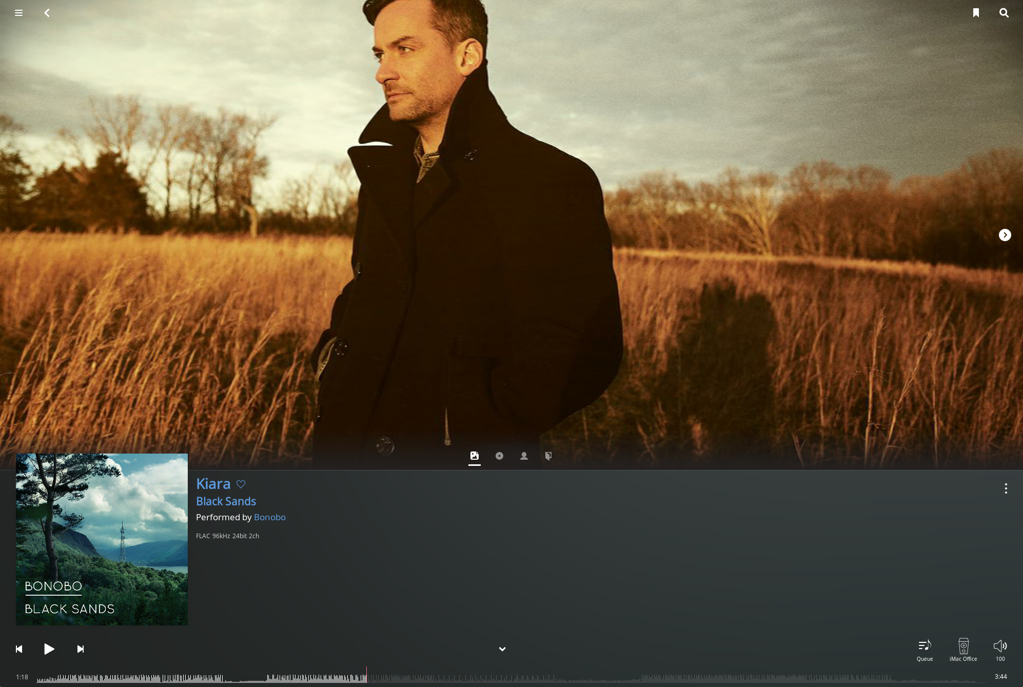
Thanks for the new release guys (lifetime subscriber here). I appreciate the new release and quickly updated to checkout the new UX - which unfortunately for me was a big let down. A few of my personal observations. I appreciate that not everyone shares these views of course.
-
As others mentioned the big grey bar on the bottom looks out of place in dark mode and from a UI/UX perspective is a massive waste of space - the bottom third of the screen is basically empty.
-
Fullscreen is gone! I read the rationale that “nobody used it” but I certainly did and it’s not like it’s taking away resources to keep the option, so really don’t see the value in removing this option. It was also the only view option to have large album art showing while also showing the playbar/counter and album info - and it was another reason for me to buy into Roon originally.
-
Things like “Overview” haven’t changed - this really could use an update on the UI/UX side - a bit of a lost opportunity.
-
The playbar (red line) - possibly it’s just me, but one of the only things that I found annoying about Roon was that the thin red line on the playbar never moves smoothly in “real-time” when playing a song like other players. It always jumps as the song plays, instead of moving across in one smooth motion. I provided this feedback a long time ago, but guess it’s not really a priority. Though it would be a nice improvement I think.
-
“Up Next”. I actually really liked the old UI screen with the “up next” showing. I gave a preview of where you’ll be and also sad to see this removed.
Would it be possible to simply provide the existing new UI/View without remove the old view or have it as an option? Is there a way I can “downgrade” to the previous version of Roon?
While I really appreciate the new release, the new UI/UX part was a bit of a step backwards for me in that it removed useful and functional views like large album art/fullscreen instead of simply adding a new “clean view” option which is what is there now.
5 Likes
Adding Qobuz to Roon with Tidal is amazing. It feels like bottomless music. So far there’s been a decent mix of choices and resolutions between the two. I am really looking forward to hearing what the “Radio” digs up.
1 Like
Thanks for the update!
Been playing with the new radio and the improvement is great. However I noticed a small bug. Roon doesn’t consider what has been tagged as primary version vs non primary in the library.
For example I have in my library 2 versions of “461 Ocean Boulevard”, one is my own CD rip, the other is the Tidal MQA version, the MQA version is tagged as primary. In the old Roon Radio the songs were chosen between the albums tagged as Primary, now it seems it ignore it and plays the lower resolution one.
Another thing I would like to see added in the Roon Radio is the option to dislike an artist. When I press thumb down for a song, the song is skipped and I can chose why I want it skipped, but there is no option of saying I don’t like the artist. This would be particularly useful as now Roon sources Tidal songs that are not in a user library so it could be that pick an artist that you don’t like out of Tidal.
Now waiting for Qobuz in New Zealand…
Must say, “Library Only” Radio has made a significant leap forward!
Where in the past a seed song will initiate radio that cycled thru songs from only 3 to 5 albums that it decided was similar to the seed song … I’ve now been going for hours and I dont think there have been two songs from the same album. I take that back. Now I see one time it was 9 songs before playing another from the same album. No problem there! And I think I skipped a song only once. I’m reminded how much I love my music library; hundreds of CD purchases I made over the decades are so very enjoyable when on mix. :D.
Thank you for making Radio much more pleasurable.
4 Likes
Having looked at some posts here, it seems roon Radio is picking some music of the same artists for lots of people.
1 Like
It was never there for streamed (TIDAL and Qobuz) tracks. Only for tracks in your local library. And it’s still there for these.
1 Like
IMO it should be available on every track. Its a really cool visual.
Go to the artist screen and press the heart button twice, so it becomes a circle with a line through it. This bans the artist and excludes them from radio (you can do this with albums and tracks as well - see info on favorites)
edit: if you don’t like the artist, you probably don’t have them in your library So I don’t think you can ban them until you add something, which is counter-intuitive.
3 Likes