Great to know. Less than intuitive but it works. Thanks for the info.
1 Like
So far, very much liking the latest version- nice job!.
Creates a dilemma for me though as I’ve been with Tidal since I started with Roon, and although I’d like to try Quobus, not looking forward to recreating all my lengthy playlists.
1 Like
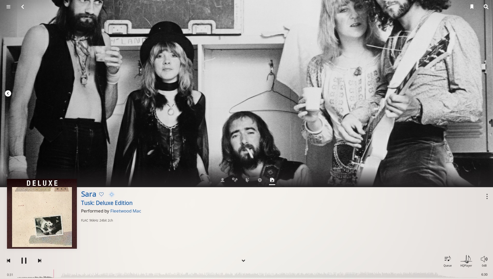
Oh, wow… I was reading this thread and thought: “my Now Playing screen doesn’t look like that… I want the artist photo to be the default…”. It never occurred to me that I could customize Now Playing and I didn’t notice the 3-dot menu, until I looked at others’ examples of Now Playing. Perfect! Now, I am all set.
Please stop changing the UI so I can get used to this one and get back to the music 
1 Like
After update to 1.6 the performance of Roon UI is much worse. With 1.5 everything was lightning fast. I run roon core on NUCi7/ROCK, music library is on Synology NAS.
Nothing changed except Roon update 1.5 > 1.6…
Similar experience for other users after update to Roon 1.6?
Performance degration happens mainly in selection and starting music from Tidal or Qobuz (not on local library from NAS).
2 Likes
Same here, UI is much slower with 1.6 compared to 1.5.
Further, many picture now missing which were formerly there. Strange
Liked the big text display before, now we‘ve gote smaller fonts. Hmmm
Any views by others.
Best Sven
1 Like
The new features in 1.6 are great to have and well done on all the hard work that went into building them!!
The BIG letdown for me though are some of the GUI changes, many of which are noted in the previous posts. For me, the new GUI on the iPhone app is a vast improvement in terms of look and feel and intuitive navigation. The iPad and MacBook GUI’s on the other hand are, IMHO, BIG backward steps compared to V1.5. It almost looks as though different developers worked on the iPhone, iPad and MacBook GUI versions…?? . The new GUI’s for the iPad and MacBook control points make it very difficult and frustrating to use these versions as Roon control points, and I find myself turning to the iPhone app instead, and then mirroring it to my large screen TV!
On the iPad and MacBook versions, as has already been said, there’s not enough contrast, fonts are way too small and too light. Lyric text seems to automatically be too large and I can’t find a way to reduce the font size (that was very intuitive on the previous version) Is there any way to reduce the size of the artist’s picture? In some cases you only get the lower half of a torso!  I find the ‘4 part screen’ that comes up with the overlay large picture of the artist, the discography text and two other items, much less useful and too intrusive compared to the way 1.5 handled this information.
Sorry to be a kill joy, but for me, the look and feel of the GUI in 1.5 on the iPad and MacBook was really good. 1.6 has (with the notable exception of the very good iPhone version) has taken the GUI several steps backwards.
i think this will never happen.
anyway, you can tag your files track by track. in that case, roon in general add the credits in the correct way.
i do this, as a long well established treatment since my first squeezebox.
on the other hand, what is really missing, and i’d like to see improved, is roon showing existing metadata.
i mean, roon metadata are not complete at all… but there are some. the point is that they are not shown.
let’s say, for example, that there’s no way at all to BROWSE PERFORMERS…
this, for me, is incomprehensible.
1 Like
I have to say, the new “skin” or colours, are too bright and bleak.
It is no longer possible to see the dynamic/amplitude of the track - it is grey on grey! How can I get back the old black background, please?
The colours should be customizeable.
I hate change in general, but when it’s change for the worse… it’s depressing.
Thanks,
Goran
Most people that hate change think any change is for the worse.
4 Likes
Loving it! what are the chances of integrating impulse correction software into roon to GENERATE the convolution files for use? if reasonable $ I would be happy to pay for it. Just a thought
Er, she’s dead. Thank fuck.
They both are.
Why don’t you comment on the actual enhancement? Like it, don’t like it, don’t care?
I actually use the track amplitude to find a specific spot in a track, but now that it is the same color as the background, it is very difficult to find.
Before: white amplitude against a black background. Now: grey amplitude against grey background. This is a step backward.
we will fix the contrast issue here in the next build.
2 Likes
The Random radio is too random and makes no sense. I don’t know how it is making these connections - I wish I remembered the couple of bizarre examples before I turned off the radio.
I think the concept is good, and if the radio was doing a good job of finding similar songs I would use it to find new artists / new music. But so far it does not seem to be.
1 Like
Feedback? Hang on, let me get my glasses…
…
Ah yes, here we go: My feedback is that the ophthalmologist told me I had “fighter pilot eyes” at age 18. Nearly three decades later, I do not have good close-up vision. I sincerely hope that the roon devs will stay forever young and eagle-eyed. When you get old, you start to tell meandering pointless stories, and your vision gets worse.
The player text is too damn small to read, and the buttons are laughably small. I use an iPhone 7, an iPad Mini 2, and 2 hi-dpi Windows laptops as my control devices. You know those clownishly large flip-phones they sell in the back of AARP magazines? That’s what I want in a roon remote UI. Volume up button on the far right, volume down on the far left, and a big ol’ dead space in between. Make the important control buttons wider than the finger that operates them, and separate them by more than one button-width.
As a feature request, I wish there was a permanently-defined group zone for “all zones together”. That would give me one click to whole-house music without… needing to find my glasses. Even better if it had persistent relative volume settings, so I can declare zone 1 is always n volume steps higher than zone 2 to achieve equal SPL, etc.
4 Likes
The Tidal app (desktop and even mobile) is significantly better in many cases.
I raised this a while ago here, as a feature request:
just to mirror many other posts, (was) happy 1.4/1.5 user for 12 months…
- about the grey progress oscilloscope presentation, yes butt ugly
- too easy to progress with the wrong way when handling an iPad
- search too much white/black space, to many clicks to view all albums
- search graphics are circular chopping off the artwork, yak! What are you thinking, the … fashion, guess the rest?
- Biggest complaint is the slow indexer. When an album was added with 1.5 it would appear in the library at the same the copy to disk finished, now it’s several minutes for the album to appear in its entirety.
- There’s also no choice to keep the older version without the NAG screen forcing the update.
- Qobuz <- don’t use it (nor Tidal), so a waste for me personally and far too late for those wanting.
- Where’s the remote access and streaming, WAN access, that’s important!
One plus is the parametric equalizer, however should be disabled in DSD native mode, since a conversion to PCM is required to carry out equalisation and other tricks.
Radio has also improved, for a pure classical library though, that’s kinda silly.
Probably too busy making gross generalisations, and pulling others up on their comments …