Roon 1.6 Feedback Thread

Please see my explanation above for how Roon can solve these problems, in part by more thoroughly testing their beta designs prior to release.

This problem occurs in both windows, and it would be a mistake to focus only on the “Now Playing” window. The regular window, with type, has even more problems. You need to focus your testing on BOTH types of windows. And do a major redesign that accounts for both windows.

My apologies for long posts, but you asked for examples. And your web page presents only one option to upload photos as far as I can tell.

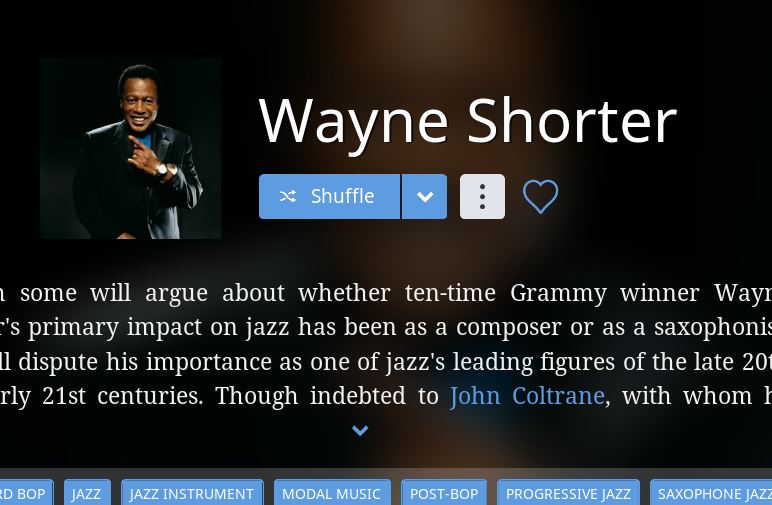
Here is original version of Wayne Shorter as downloaded only last night – an example of a more modern artist, and like all of them, he also has a square photo to start with:

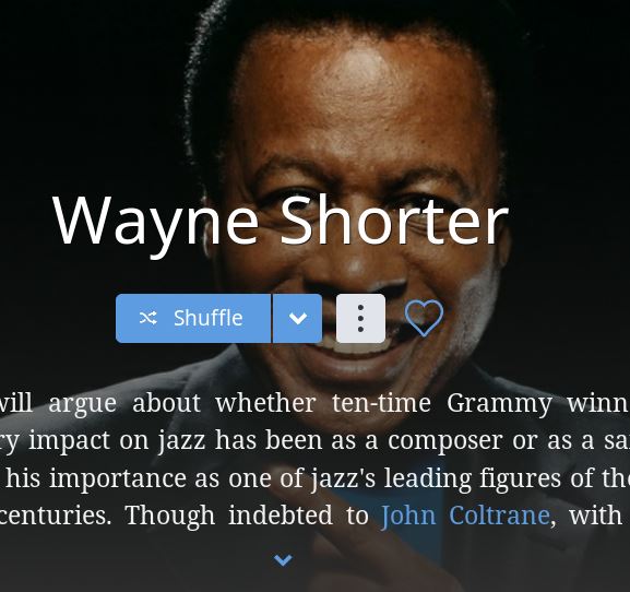
Here is what happens when the new design applies a hatchet crop to the photo, blow it up, and then buries Wayne Shorter behind type in the regular window.

This is just plain ugly by any definition:

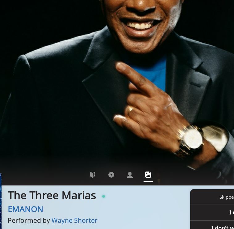
And here is the result when face recognition fails and the head is cut off in the Now Playing window:

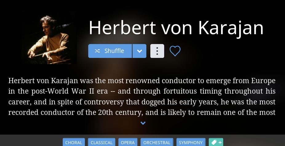
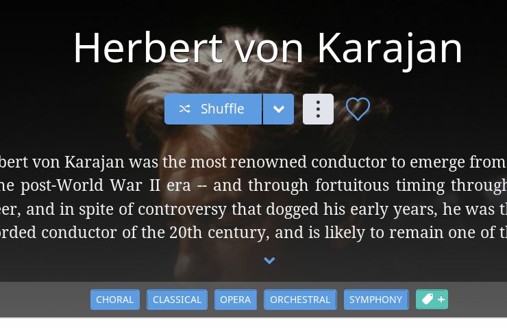
The original 1.5 version of Herbert von Karajan, one of the most important conductors of the last century, again as downloaded last night:

Von Karajan with the sledge hammer crop applied to the top of his face, then massively enlarged, and finally, butchered behind type in the “normal” window. This is beyond ugly. Words escape me. Again, downloaded last night.

Please see my explanation (2 posts above) for how Roon can solve these problems, in part by more thoroughly testing their beta designs prior to release.

As per your request, several final examples. This also includes a third type of window that you need to redesign, namely how photos are presented in the window for search results.

The original version, downloaded last night. By the way, I turned on Roon Radio after this artist, and was surprised to hit over 20 artists nearly simultaneously and one after another, without any photos at all. That really made the case for album covers in the Now Playing window, for in those cases we are left with nothing but a black screen for half of the window.

Here is the artist after the hatchet crop is applied, then enlarged, and finally buried behind type in an ugly result in the regular window:

And here is the result in the Now Playing window, again from only last night:

The original version of an older illustration of Bartok, one of the most important composers of the 20th century:

Here is the result after your brutal hatchet crop to fill a rectangular screen with gross enlargement:

Two final examples. The original photo now enlarged and butchered behind type in an ugly result:

The original photo off center in your itty bitty little circle. As others have commented, this page of search results is a dumb design with small circles and huge amounts of white space.

Please, can common sense prevail? Use squares for square photos and make the squares larger – you have huge amounts of wasted white space on those pages now. That type of page is a classic example of a designer doing something that he or she thought was creative, but completely flunks the test of practical functionality.

Stephane%20Grappelli

2 Likes

And that folks tells it how it is…brilliant post!!!

Independent of location (I believe the location is fine), I will echo comments elsewhere by saying the the thumbs up/down is unclear as an icon. For example, if you had not read a manual (of this forum), what would you presume this does?

  1. Tell Roon you don’t like the track and to mark it as bad and not play it in the future?
  2. Skip it just for now in this suggestion only?
  3. Influence how Roon is picking radio tracks for you?
  4. Something else?

I would vote for a replacement of the thumbs icons (which look out of place in the interface BTW) with something that is more indicative of the action being taken.

Unfortunately, I have to confirm this. Many artist photos (especially though not exclusively classical) have this issue. I see no improvement (yet) at all, just like with the suddenly changing album cover art, making 1.6 by no means an improvement in my experience so far.

My point is that it is a major step backwards. Just compare my examples above of the photos before cropping, to after the version 1.6 crop is applied. Version 1.5 was a practical and functional version of software to display photos that enhance music. And the text was easy to read. Now the photo, in too many cases, is butchered and buried behind the text, which detracts from BOTH the photo and the text.

Based on Brian’s comment, I fear that the next release is only trying to poke around the edges to solve the problem by providing more space for enlargements. That alone won’t solve the problems I posted above.

Can’t we just go back to 1.5, with Qobuz?

4 Likes

My first reaction to that request was to reject it. Version 1.6 does have important benefits. It includes Qobuz as you note. (Although because I live in the U.S. I have never tried it and still don’t know if it is an improvement over Tidal.) Version 1.6 makes it easier to access the artist bios and info on albums on the Now Playing page, and those are the features I utilize the most and why I subscribe. So I like the new icons and easy access to those features on the Now Playing page. Lyrics are a different matter. The new automatic scrolling lyrics are great, but are only available less than 30% of the time. The new ugly static lyrics don’t work but Roon reported that they will fix that. So the new and soon to be improved lyrics are a positive improvement.

But now I am reconsidering. The comments from Brian are ominous. Simply providing more room for greater coverage of the photos won’t come close to fixing the problems with photos. And the way photos are presented is probably the single most single important design element of Roon. We see photos of artists on every page.

When the new approach to photos works, it works well. When it fails, it is ugly and laughable. Roon needs a major redesign to address this problem, and not just tinker around the edges of version 1.6.

As I said in my first post of the day, the presentation of photos needs to work 97% of the time and not have failure rate of greater than 3%. Roon can easily test the beta to meet that standard.

I will continue to advocate for no cropping. Zoom photos maximally within the allotted space without cropping. This will often leave bars on either the sides or top/bottom, depending on the aspect ratio, that can then be colored with hints from the photo. None of these issues would then be at play except perhaps pixelation if the photo is very low resolution (but not as bad as it is now in those cases).

A second issue, that I don’t recall being mentioned, is the “accuracy” of the photos. Often times, I’m listening to an artist’s early album and looking a photo of the artist from 20+ years after the album release. Feels disorienting. Even worse is when a band has changed significantly. A good example is Blood, Sweat, and Tears. Their first album is a classic - Child is Father to the Man. The photo has a more recent BST that is really a different band altogether. I’m listening to Kooper, Katz, Brecker in the first album, but who are those guys in the photo? BST was Al Kooper’s band. The name remained but the band didn’t. I may be a music geek, but that puts a negative kink in listening to the album when I see the more recent band that produces music not even in the same sub-genre, and that I have never enjoyed! (rant off :no_mouth:)

3 Likes

That solution would work well for photos on the Now Playing page. Roon could develop it and thoroughly test it.

However, It would likely not work on the “regular” page. If those photos are placed behind the text, we will still have that problem. See Stan Getz, Wayne Shorter, and other examples above. Photos behind text just detracts from both the photos and the text and the result is often ugly and looks like mush. In the case of the “regular” page, Roon should return to photos in boxes as in version 1.5. It would be nice if have those photos are a bit larger, and a modest redesign could accomplish that without detracting from other design elements.

I agree: There shouldn’t be photos behind text (biographies, album reviews, credits) at all. To me, doing so is form over function. Just makes reading more difficult.

@brian I know this is a contentious issue and some voices are very loud in their condemnation and as long tern users you must of course listen to your existing customer base, but as a brand new user I really like the Now Playing screen exactly as it is.

It’s modern and attractive, I don’t need identifiable pictures of artists, just an attractive, sensibly cropped, non-pixelated backdrop to the album art and playing information. I’m happy with a blown-up mid face shot, a bit of a trumpet and an arm, a pair of hands on a piano, a music score and a violin up against a chin - that’s artistic and attractive and I like it. Its only a backdrop, I’m not using the damn image so I can identify the artist in the street should I ever come across them! For the artist screen maybe there should be some other solution, but for the Now Playing screen I say it is a handsome thing and needs but a little picture choosing intelligence behind it.

Just saying. The loud voice is not always the consensus, although it will should loudly that it is. Now I’m off to leave you to making Roon better and I won’t be answering every post in here with my strongly held opinion, but that doesn’t mean I don’t have one.

8 Likes

Nope, strongly disagree, cover art is fine the size and where it is - what is all this raving on about cover art in here! I don’t want to sit staring at the blasted cover art full screen thanks! A nice backdrop in some way related to what’s playing will be fine thanks, artist pics if there are any, or anything artistic and fitting the space - I think the now playing screen is a great step forward from clunky 90’s iTunes type design philosophy.

2 Likes

So do I! All this going on about large size cover art is getting to me now, its old fashioned and boring - this is a great design idea and I love it! :heart_eyes:

2 Likes

This approach could satisfy both sides of the argument :wink:

You could turn on or off any of the elements and choose which one would be the default view.

2 Likes

Yes that is the entire point. Cover art would be one option. If you like the photos, you can click on those.

As for the current presentation of photos, the examples posted in this thread speak for themselves. A photo – or how a photo is presented — is indeed worth a thousand words.

1 Like

Certainly that was true for me. But not in the way you’re implying. :wink:

I don’t think 1.6 is an improvement overall on the UI front (although it certainly has design aspects I like in isolation). Then there are specific areas I think are worse. I do think it will improve over time but don’t think that’s the best plan - I would have much preferred a polished, finished UI update all in one go.

What we have in 1.6 (in my opinion) is something much less ‘together’ than previous versions, and Roons aim of providing ‘the best user experience’ has really got a bit lost here (in the UI sense) I think.

But I have high expectations.

In general, all this back and forth is really brainstorming and productive. 1.6 stimulated lots of reactions and ideas. I am confident in the Roon team that they are paying attention and hopefully appreciate all the input. Probably got some ideas from these threads and will implement some of them while certainly not others. It remains to be seen, in the next release, what they take from all of this. I am also confident that 1.6.1 or 1.7 will turn out better than if they modified it without all this input.

@brian , with thanks :hugs:

I appreciate the examples. They are important because issues like this are easy to mis-communicate. Especially considering that I am not the whole team and will need to communicate with half a dozen other people to get this fixed. Without clear case studies end to end, we may fix the wrong thing. I’ve been here before…

There is another reason why examples are important (any why many of your criticisms are so off the mark)–you are experiencing a bug, and it is totally changing your experience.

These are your case studies on my system, running build 390 also–


Something is wrong here–your app is not running the right logic to decide which image view is appropriate. Until we get that fixed, your feedback isn’t really actionable because you’re not really evaluating the thing that we built/tested for 1.6.

I’ve got the QA team looking into it…

To follow up and be more specific. What we are discussing is how the “regular” pages are appearing, and not the Now Playing page. We both agree on that point.

My experience was that when I first clicked on some artists last night, I would get the result you posted above. That is the version from 1.5.

But when I clicked on the same artist two or three more times, the photos and cache were reloaded and refreshed, with the results that I posted. Version 1.6.

That is why I was able – only last night – to copy and paste the original version 1.5 photos, then followed by the version 1.6 version with your severe cropping.

In the vast majority of cases, once I reclicked on an artist, the version 1.5 is gone and I’m stuck with the cropped and enlarged photos of version 1.6 in the “regular” window.

Finally, you have reposted some examples of photos that were originally posted by tripleCrotchet orTony. Those photos did not come from me. (I copied his posts)

Tony was getting the same results that I was.

Many others have posted similar results.

So who has the bug – you or your users? Others have already agreed with my conclusions. I assume they have the same results and the same bug?

Brian, which version is correct? Are you telling all of us that photos should appear as you have posted, which is as in version 1.5 for the “regular” screen? If so, that is wonderful news.

Brian, have you tried to click on those same artists 2 or 3 times, on different links and albums, and from different pages, and see what happens? My experience is that version 1.5 then disappears and we are stuck permanently with the results I posted – version 1.6

So if this is all the fault of a bug, it is pretty widespread problem.

But I guess the good news is that you are telling all of us that the correct visual display on the “regular” pages is that of version 1.5, as you posted.

Correct? That is great news.