what exactly are you referring to here, I haven’t noticed any less capability from the mobile app?
.sjb
what exactly are you referring to here, I haven’t noticed any less capability from the mobile app?
.sjb
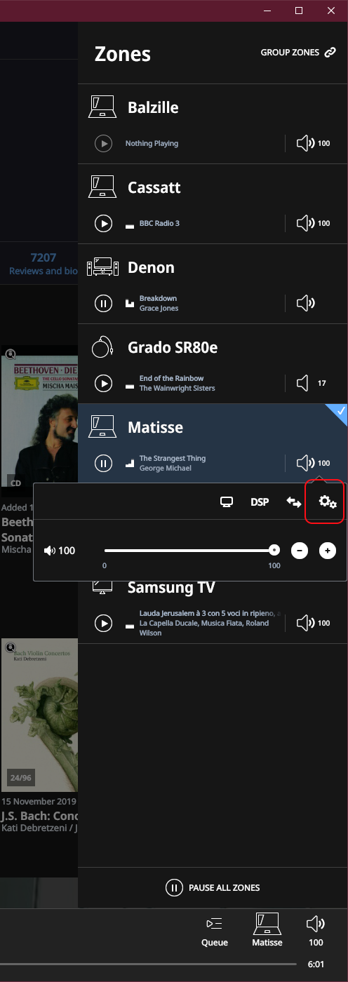
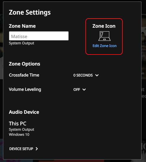
Yes - click on a speaker icon in the zone listings, then on the gearwheel icon that pops up to access the Zone Settings screen.
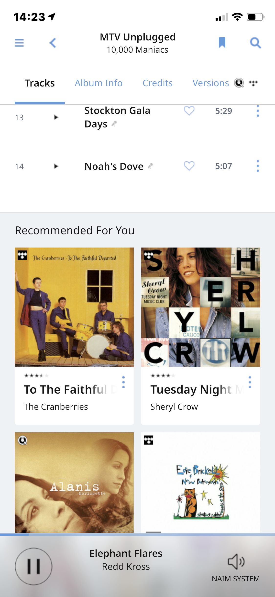
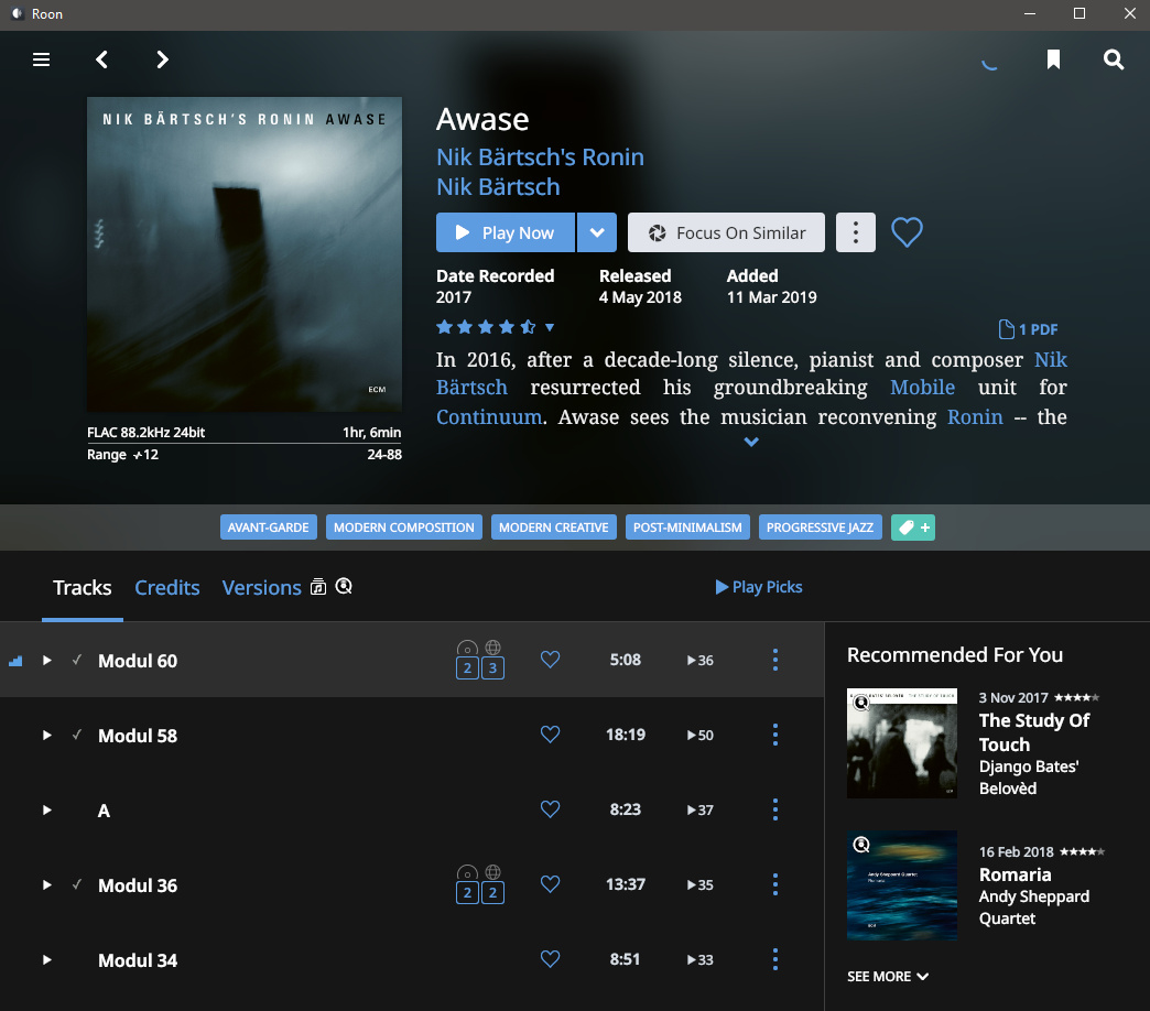
The new recommendation feature for new releases and recommendations for albums to listen to is absent from the mobile app. As it lives in Overview this is not on mobile at least for Android. Another feature that’s gimped on mobile.
If you scroll down on an album the recommendations are there on iOS anyway.
And new releases are in discover.
Admittedly I did have to refresh once or twice to see these in discover.
.sjb
nothing pop up when I chick on the speaker… would u plz show me urs? Thanks
I never thought to look in Discover as confusingly that’s only ever been whats already in you Library, so now they decide to mix it up. Some consistency would be good across the apps. Discovery seems the best place for this really.
thanks John.
by clicking on the “spinning wheel”, roon opened a new window: “indexing files again”
maybe, i find the new releases or recommondations in “overview” or “discover” after this (it took a few hours now)
I’m thankful my system(s) upgraded without apparent issue. While I’ve yet to explore the radio station directory, I’m not a fan of the treatment my existing stations received. The white border is not fitting with the dark theme.
Exactly. It looks amateurish. It’s something that web developers did in their first year of creating sites, and quickly learned through embarrassment that it was hard to read and appear as though someone was shouting all the time.
I don’t know, but it’s f***ing spamming my albums view at the moment.
Roon, get this spam out of my listening space. Give us an option to turn this distraction off. I neither need nor care about what some crowdsourced group-think or AI “recommends” for me. I know perfectly well what I like, and I discover music on my own in other ways that Roon can’t even tap into. Not only that, it is pushing down the “By This Artist” section which I used often if I’m ready to pick the next album to listen to. Thanks for hindering usability.
Look, Roon…I don’t care what’s popular, and I don’t give a crap what others are listening to. If I want to know, I’ll ask. Don’t shove it in my face. Don’t spam my interface.
This makes me glad I only paid for a year of Roon. This “update” is having me rethink all this and go back to looking at alternatives. I don’t need flash, I don’t need Internet radio, I don’t want recommendations…just give me a way to play my music without all this clutter and nonsense. I open up Roon, search for what I want to listen to, and I’m on my way.
I see the spam has also extended to the Overview. Thankfully I rarely even look at Overview as it never pertains to me. This update made it even more spammy.
I am not liking this update. I doubt you’ll see my renewal. I was already on the fence about renewing, now version 1.7 has pretty much made up my mind for me.
The search function seems to work much faster. That was a major annoyance. Thank you so much for fixing it.
The new Roon Remote for Android won’t install as my device is not compatible
I assume this is the Open GL change can I upgrade somehow it’s Samsung Tab A Android 5.1.1
I see we can now use different icons for Zones. How do we access the Zone menu?
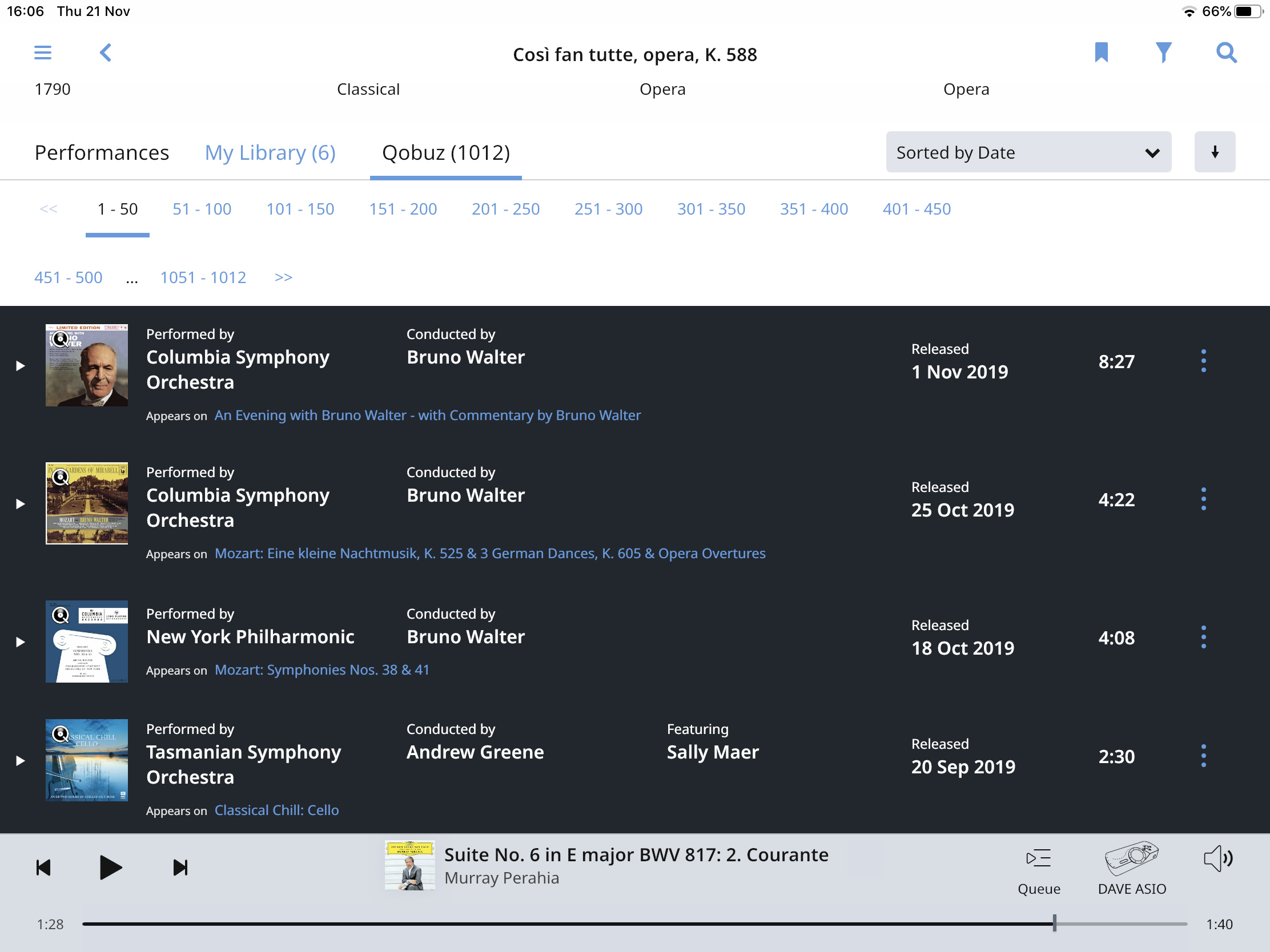
Still seems to be no way to discriminate usefully between a whole work and a part of a work. If I search for “Così Fan Tutte” Roon correctly returns the composition “Così Fan Tutte, opera K588”, but then also gives me 1022 possible Qobuz performances most of which are for individual arias. There must be a way to only get the whole opera. It’s the same with a search for “Mozart Piano Concerto 20”, Roon gets the right composition up but then offers dozens of performances of just one movement.
If I’m doing something wrong, please tell me. If not, this is not good enough.
Just wanted to chime in. I’m happy with the update and the new features as well and I appreciate how hard it is to get things right for everyone or even most of the users.
I did just notice that I can now select icons for endpoints like Hifiberry which I hadn’t seen earlier and also like the ability to changie icons for zones as this makes it easier to find the right one - this IMHO is worth much more to me than the change in fonts which I didn’t even notice that much.
Well, that was a hair puller of an update - finally did a database reset and then a backup restore and got everything working.
Internet Radio is nice, and optimizations under the hood, and that much closer to easy deletion (thanks, but would still prefer a standalone line item for deletion/hide vs having to go under ‘edits’) the UI changes just reinforce my opinion that Roon needs to hire an actual graphic designer(s) vs leaving it up to some engineer to bold some type and call it a UI upgrade.
Another classical search failure/anomaly/strangeness. I search for “Mozart Piano Concerto 20”. The first album Room returns is for Beethoven Piano Concerto 3 couple with Mozart Piano Concerto 24. As I explained in my previous post, there’s no point looking at the compositions returned because these will include a lot of noise in the form of single movements. So please tell me how I find Mozart Piano Concerto 20? Or please just let me have the possibility of passing my search through to Qobuz who do know how to find it. I have reported gross search failures like this before.
Overall I’m pretty pleased with 1.7. I havent had a huge amount of time to work through all the changes yet but I’m liking the new live radio stuff a lot, I appreciate the snappier performance both in the UI and when starting/skipping tracks. The recommended for you stuff and the smoothed font will take a bit of getting used to I guess, but I certainly dont have an apoplectic reaction like some seem to. Careful with the blood pressure there guys! 
So to summarise count me as a plus one in the ‘happy’ column.
I’m like the new suggestion features, for me they make sense, and they largely mirror my own internal mental list.
Like many others I don’t like the bold font everywhere, not nice on the eyes, change it back please.
I just installed the Android APK on my Fire Tablet – works OK (just OK, also not a fan of the new bold fonting).