Not sure if this has been asked before but what is number below the record display prefaced with a squiggle on the main album display
and can it be removed
Thanks
Could you please put access to Discover back in the main/browse menu?
As it stands now I have to click Home, scroll down, wait anywhere from 20 seconds to several minutes (!) for the recent listening data to populate, scroll down some more, and then click Discover.
This is a lot more work and time to access the feature I use the most.
I do have a large library but this is the first time I’ve had any waiting time using Roon.
9 Likes
Same for me.
So that feature is still available?
There seem to be multiple reports of it missing in 1.8 with no apparent way to get format to display on the album covers. 
1 Like
My update was flawless on Nucleus, iPhone, iPad and MacBook. And 1.8 is amazing. Obviously, there are bugs to work out, evidence by many of the comments here (and I have also experienced some), but the new interface is absolutely gorgeous. Congratulations to the team
2 Likes
I think you are referring to the dynamic range. In the general settings page there is an option to “Customize album display” where you can make it go away
Without a pic, I’ll guess, Dynamic Range, goto settings, General, Customize Album Display and turn off Album Dynamic Range
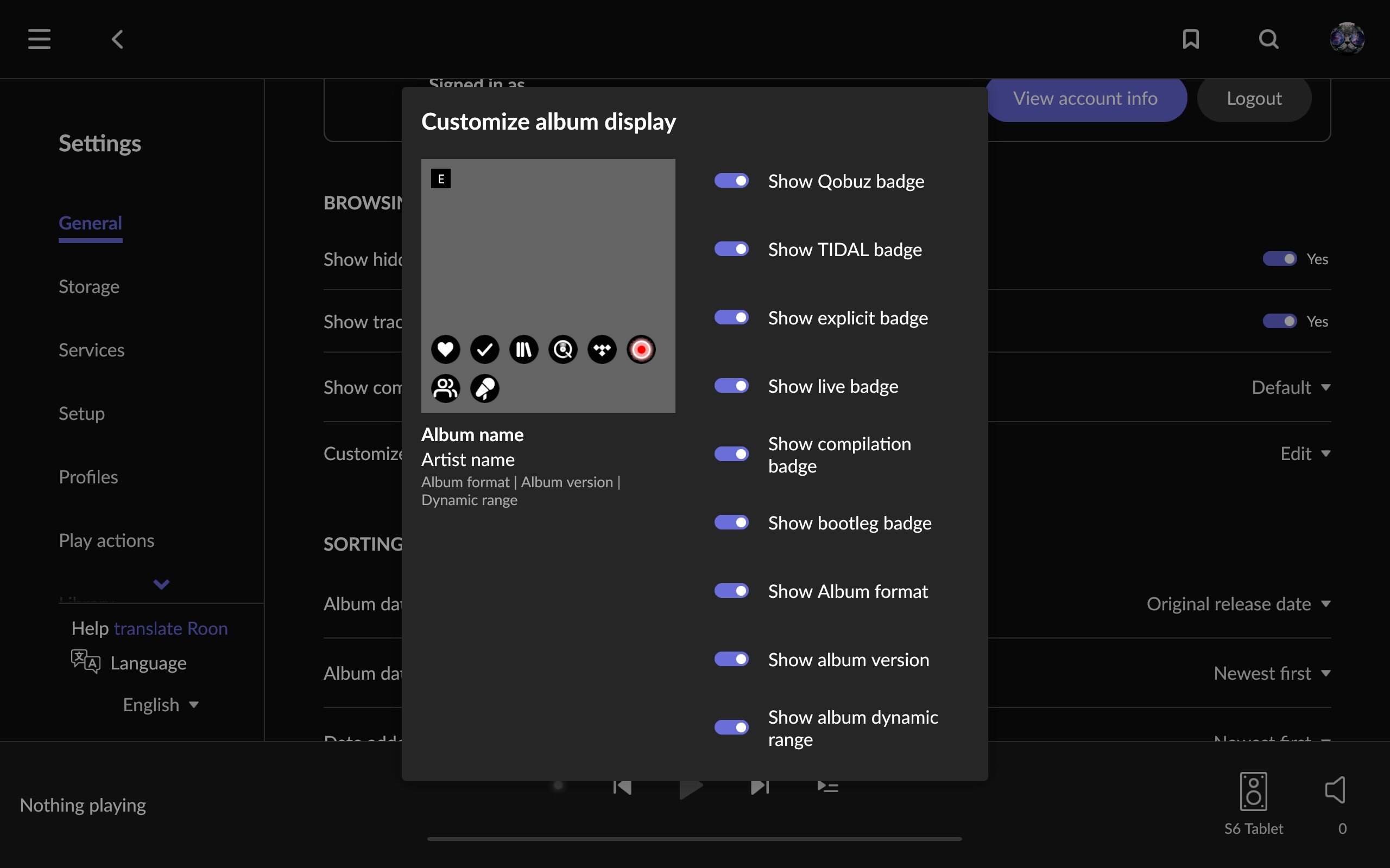
It’s the dynamic range of the album.
Well, I guess the new version is ok, but I really had no issues with the last version. That been said, there are some issues that I really don’t like in this new version.
1: I don’t like the vertical scrolling of the albums. I found the horizontal scrolling easier. Give us options.
2: There is no alphabetical target point (I don’t know what to call it), where you could click on and quickly go to a point in the alphabetical order of the albums.
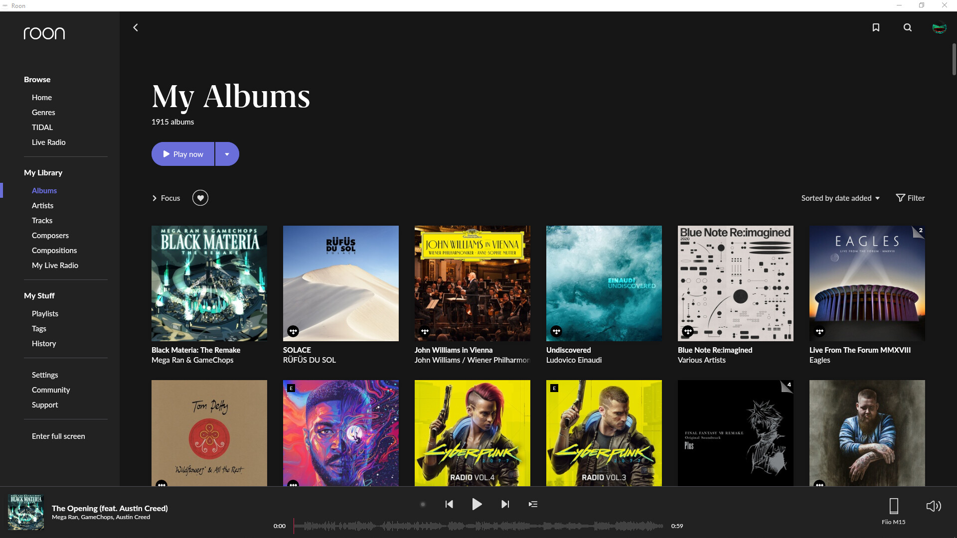
3: The album covers are too big.
7 Likes
Bravo so far on the 1.8 UI/UX enhancements. I especially like…
No more huge margins wasting space.
Rotation when using an Amazon HD10 tablet (the previous gen at that).
Can finally edit a DSP EQ on the same tablet.
… But that is only touching on things.
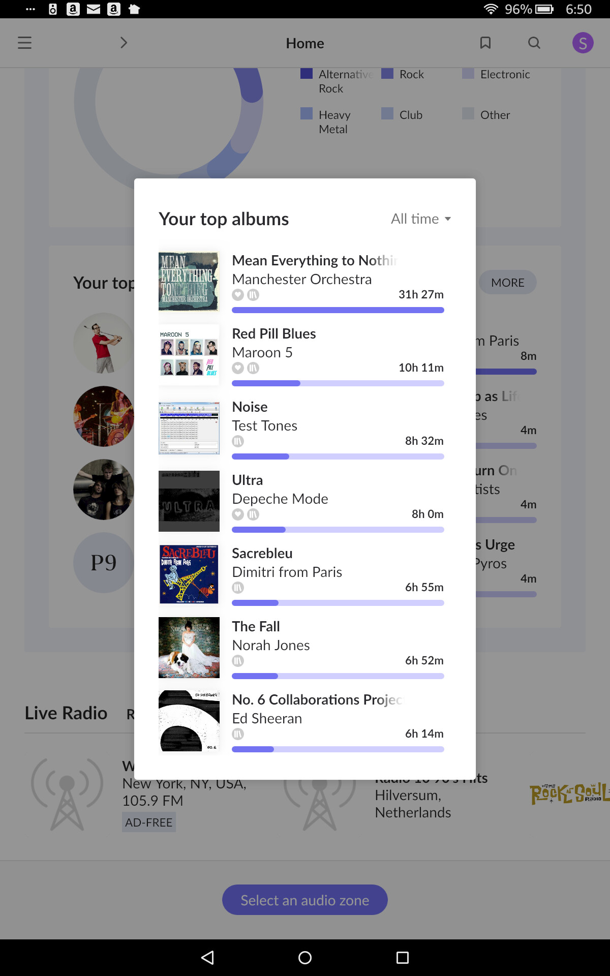
@support something came to light with a new feature. At some point I must have turned play on of an album with loop, and left it playing. Is there any way to edit the metrics the “most played” album and artists is based on? I’ve actually only listened to this Manchester Orchestra album a few times. I’d like to remove this top album and artists so that the remainder of the stats fills out the graph more accurately.
1 Like
Snap you just beat me to it.
Wow this topic is flowing faster than I can read it, you get the next one 
1 Like
It’s the Album Dynamic Range. Yes, it can be removed in Settings > General > Customize Album Display > Show Album Dynamic Range. It can’t be removed in the individual album view though.
I’m seeing the same jellyfishing repeatedly under Recent Activity. Even after it loads (30s-2m) and I navigate to other screens and come back to home, jellyfishing starts all over again.
I think I’ll just go back to album listening in Foobar for a while.
1 Like
Me too. Seeing the same. Also, pressing “Start Radio” or “Play Now” on an artist page, results in nothing & then eventually says “limiting to Roon library”. Lots of little bugs all over, but still pretty nice.
Where exactly in Settings is this? What group?
I really love the new update, but I do have one issue/opinion when using my laptop to browse my library. The Header of that page, which includes the ‘My Albums’ text and ‘Play Now’ button takes up a ton of real estate unnecessarily. There’s just a ton of empty space which looks quite awkward compared to the rest of the frame.
I’d prefer it if this area was significantly downsized. Perhaps moving the Play Now button off to the right would help. As it is, it just looks unbalanced.
That said, this has been a fantastic update.
7 Likes
Fonts, images, buttons. i.e. all UI elements look kind of small on 4K hires display.
4 Likes
I like it. Love the linking to radio stations etc. Make so much better use of screen real estate and actually is quite an example to other apps. Well done guys.
1 Like