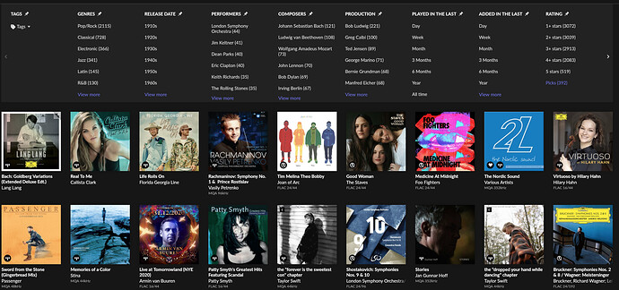
I agree, that’s a crucial view, but I think they did it so you use it within Focus more. You can now pin the ones you use the most.
Nobody seams to remember, but somebody at roon played with the wave form in the past (1.6 or 1.7, when they cut it in half). Those that fail to learn from the past…
iOS app on current iPad Pro: seems to crash when focussing in on classical composer.
Really like the new functionality!
It occurs only for some artists, but there is too many of them for me to believe that this is a duplicate artist issue. I think it may be some interaction with Qobuz problem, as all my library is there.
I am strongly convinced that this is a bug, but unfortunately this forum is not a perfect place to sumbit and track such issues.
I’d love to see a good tracker for actual bugs, to keep them separated from
- ux / design improvement ideas (adaptive layout, better scrolling)
- matter of taste ui issues (purple color theme)
- rant
Nobody seams to remember, but somebody at roon played with the wave form in the past (1.6 or 1.7, when they cut it in half). Those that fail to learn from the past…
hahaha, yes, I did not notice the waveform size changes. Does that mean that maybe it is not a big deal? But the current track info new location is really bothersome, unless that changed position in previous versions of Roon 
I’d love to see a good tracker for actual bugs,
There are some (more to the point than a forum) solutions for this that other companies are using (JIRA just an example), but it requires some transparency, opening and maturity that roon doesn’t want (or whatever) to approach.
I have the same problem.
The library stretches from the seventies to today, so the “View more” button doesn’t show up.
I would call this a bug, not a feature.
Regards,
Roland
We have one already:
Core Machine (Operating system/System info/Roon build number) Core on Ubuntu 18.04.05, normally in docker container but have same problem running native. Machine runs all the way on ZFS including the root FS. Description Of Issue I have a server running Ubuntu 18 for years on ZFS filesystems (also root file system is ZFS). On this machine I have running docker containers all the time. I never had a problem running Roon server. After the 1.8 update all runs fine but I do not have access to an…
Would be great if you’d share your comment in that post so others can see it’s not a universal issue!
What do people use the wave bar for?
Yes, it is a track progress bar, but in reality, what else?
I never understood the hype about it. Wether I got that waveform or I dont makes absolutely no difference to me. It provides absolutely zero insight other then telling you where its loud and where its soft 
There are so many more imprtant thinks to worry about.
When I was in the mood to do such things, I would use it to advance to a loud bit of the track (indulging in silly audiophile business rather than proper listening).
More usefully the wave bar helps me set volume on classical pieces, as it gives you an idea of where it’s going compared to where it starts - and the wider version was easier to read for these purposes.
On another note, small thing, but the new white Roon icon is unreadable (the Roon text)
@Tony_Casey. Yes, You’re right about this. I hadn’t realized that Search would work this way. This would be most annoying. Definitely needs to be fixed.
I never understood the hype about it.
But then again, as a whole, 90% of the hype here doesn’t make real sense (application wise), yet we are so passionate about it. The small things are the ones that summed are giving us the whatever experience ones enjoy (or not)…
Its a bit like „dynamic range“. Doesnt add much for me. Usually there are other (artistic) criteria that determine whether an album is good or not.
And dynamic range tells you nothing bout sound quality. imho.
That only works with local library and you can still do this with the shortened wave bar so it’s no big deal for me. Aesthetically I prefer it bigger also but I won’t be losing sleep on it.
The “Only complete recordings” doesn’t seem to work well. I still get tons of albums with only a track or two from the work I’m searching, just like I did before 1.8. 
One thing I noticed that before we could see the volume levels of all zones when we click on the zone icon, now there is only names without volume levels. I mostly listen to music with zone groups and I would like to see volume levels under the names separately like before on there.
No I don’t think you did. It just appears that way at first. Look more closely at the number of entries you get as you further focus (which is further narrowing, not adding as it once did in 1.7).
When you focus on more than one genre now it FURTHER limits the choices. When I select Jazz and classical I only get albums that are for some reason tagged as both. I don’t get bot genres overall. Each choice further narrows your results. It’s no longer “AND” as it was ion 1.7. It’s now “OR”. And it sucks IMO.
Totally agree. On all my computers it looks like a white icon with some barely discernible writing. Looking at my entire taskbar it is the only icon that isn’t instantly recognizable.
