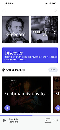
Do you confirm that “Discover” option has been removed or is there a way to get it back?
Yes, The new look is awesome!!
Me too! A couple other places where I’m fairly sure that I see spinning longer than I used to.
Wait, what?! Absolutely horrible! That’s ruined half of my bookmarks! 

Yeah it’s horrific, expecting a dark screen but boom have a bright white light in your eyes.
I’m getting this but it’s worse under the artist overview beyond the description of the artist.
You have to set up system language of ios to english
Roon language also english
Than it works - has to be the same language
I totally agree, Discover is what I use the most, this should be in the navigation menu
the same on my iphone and ipad. but when I click on settings on the ipad Roon1.8 crashes immediately
Yep, agree its very bad. Candle light listening, reach for the iPad, and FLASH! Ouch!
It is still there, but hidden under “Home” menu, you need to click the Home menu and scroll down
Geeeez you folks all very brave, reading above I’m staying on 1.7 until ver 1.81 at least hehe 
It looks really good. The updates went pretty smoothly. Even the core update didn’t take that long. I’ve played with it only a little bit but look forward to trying some of the new features. My only quibble is the decision to move the Discover feature away from the side menu and hide it way down the Home page. That’s an important feature for me and I don’t really understand the point of moving it. I would prefer to see it moved back for easy access. Other than that, really like what I’m seeing and experiencing.
Day 2 update. I’m really liking 1.8. I think the look and feel is really top notch. Also, I’m seeing a marked improvement in performance. Much snappier response times. My core runs on a sonictransporter i5 and the before and after comparison is pretty significant so far. Much better. Congratulations Roon Labs! You’ve done a great job with this release.
Why should i ? I already had direct links which i liked
I posted earlier with two feedback items, I am adding a third and keeping them all together for continuity:
Feedback on Day 1:
- I’d like to see “Add to tag” added in-line with the current Tags. There’s no need to go up to the three dots and select “Add to tag”
- Is it me or is the Font a bit small? Especially when viewing Tracks and data associated with a Track such as “Performed by”, “Composed by”, “Lyrics by”, etc…
- Recent listening: It would be great to see the date ranges to the left of the bar graphs vs the need to hover over the bars to see the date ranges. There seems to be room to do this on a Windows PC display, perhaps it will be a challenge on smaller displays.
Once again, Thanks Team Roon! You are killing it!!!
Yeah don’t do it, I’ve no idea what they were thinking when they decided to release this.
Everything went fine with the update…love roon since 5 years!
1st BIG ISSUE now:
Albums displayed way too big! Before i could see 24 albums on my macbook-pro-screen now i see only 12.The continuous scrolling down instead of the page-per-page scrolling makes the whole experience confusing. That’s really annoying.
On the latest iPad Pro and iphone, scrolling isn’t exactly what I’d call smooth. The home page after it’s blinded me by flashing white loads in 3 parts.


