Roon 1.8 (Build 748/756/763/764) Feedback

Bring the waveform back! Even bigger! I love the waveform.

Make Discover easier to find (I haven’t found it yet, though I haven’t tried much).

…otherwise: it’s fantastic, congratulations on an excellent upgrade (just to prove I am not a habitual moaner

Shaun

6 Likes

Scroll down for discover and various other versions of it… plenty to explore once you get stuck in…

On the 11th Feb I had these ‘new releases for you’

On the 20th I have these.

That’s not a lot of change over this period

3 Likes

So I tell Roon to play ‘upperplay’ next, and it says it’s playing and my LUMIN display says it’s playing, but it’s actually playing the next track on the Alanis CD.

And now it says it can’t play it from tidal, but I can play it directly from tidal.

So glad I only have a months plan to try 1.8, things are going to have to change in the month or I’m just going to use the Tidal and LUMIN apps.

I have been vocally critical of the changes to the UI and general aesthetic of Roon with version 1.8 and had held off on ‘upgrading’ up until yesterday. However, with the possibility of a more subtle range of colours, fonts and themes promised by posts on the “Tinkering” threads I decided to bite the bullet and update to version 1.8. Here are my thoughts after the update as a user wit an 8i5 Intel Nuc running Roon Rock and Win 10 Desktop/32" monitor as principle control device, and alternative 15" Win 10 Touchscreen Laptop and iPad Air control devices.

Roon ran very speedily and flawlessly for me on version 1.7 with the exception of a single missing metadata issue associated with Roon Radio. So here goes:

The good:

  1. The update from 1.7 to 1.8 completed very quickly with no installation problems whatsoever, and Roon appears to run more or less bug free on my network and systems. All functionality that I have so far tested appears to run every bit as quickly as version 1.7.

  2. The new UI and even the default fonts are a bit less of an issue for me than I thought they would be. The reality appears to be better than that of the screenshots I had based my views on. Nonetheless, I would still far prefer the subtle aesthetics of version 1.7 over 1.8, but more on that later.

  3. The very annoying issue for me with frequently missing metadata in Roon Radio appears to have been completely resolved - a huge thank you to Roon developers for this - this was a big plus for me. I have been using Roon Radio pretty constantly since the update, and the selections offered to me have been first rate!

So congratulations to Roon for an easy and flawless update, and for resolving my Roon Radio metadata issue.

The not quite so good:

  1. I agree with others about wasted space when using desktop/large monitors. Qobuz, Tidal and Live Radio are examples of pages where there was more use of space in version 1.7.

  2. A BIG one! There should be an option to reduce the size of album covers to allow more to be displayed on the “My Albums” page, and for more tracks per page to be displayed when viewing Playlists and Tracks.
    Win 10 Desktop/32" monitor: reduced from 90 to 40 per page
    Win 10 15" Laptop: reduced from 27 to 10 per page
    iPad Air: reduced to 10 per page
    This is very restrictive when browsing through thousands of albums.
    Similarly, Playlist tracks reduced from 20 to 12 (Desktop), 10 to 5 on Laptop and iPad.

  3. On “Albums Playing” page (and others), all text which incorporates links should be in a colour other than white. This appears to be inconsistent from page to page within “Albums Playing” as well as throughout the application.

and now another big one that could constitute a pretty easy win for Roon:

  1. I, and I am sure a lot of others find the default themes offered by Roon in version 1.8 to be far too stark and restrictive. I have managed to tone down the colours and replace artist circles with more agreeable rectangles using information gleaned from the “Theme” threads in the “Tinkering” section of the forum. This has made a huge improvement for me, and although I prefer the older style aesthetic, I am now much more comfortable with 1.8. It’s a relatively easy set of changes to make, but I am sure there are many who would be reluctant to tinker in this way.

Roon should offer a much wider range of themes by default for version 1.8, including the option to have artists displayed in less restrictive rectangles rather than circles (I have done this manually), and possibly offer a number of alternative font types. An easy enhancement that I feel sure would go some way to allaying the objections of many of those who are reluctant to switch to 1.8. This should be offered in both Desktop and iPad/Tablet apps - at the moment we can make changes manually on Desktop platforms, but not iPads or phones.

  1. I personally much prefer the (to me) more natural horizontal scrolling one page at a time rather than vertical scrolling. I appreciate that vertical scrolling is required for phone apps. However, could horizontal scrolling be offered for desktop/widescreen users?

Possible bugs:

  1. I have a strange issue that whilst the Roon sidebar on the left of the screen can be minimised to offer more screen room on my Win 10 Desktop and iPad apps, it strangely cant be minimised on my 15" HP Touchscreen laptop (also running Win 10).

  2. Others have pointed out that tracks on the “Album playing” page should display whether or not they have been included in Playlists in order to avoid duplication.

Still not completely happy, but less unhappy than before! :innocent:

1 Like

For what it’s worth (I’m sure there are some folks here who don’t want to hear what I have to say, and would call me a fanboy or a pollyanna or… maybe worse; I admittedly don’t have the thickest skin for the interwebs). However, I’ve tried to be balanced.

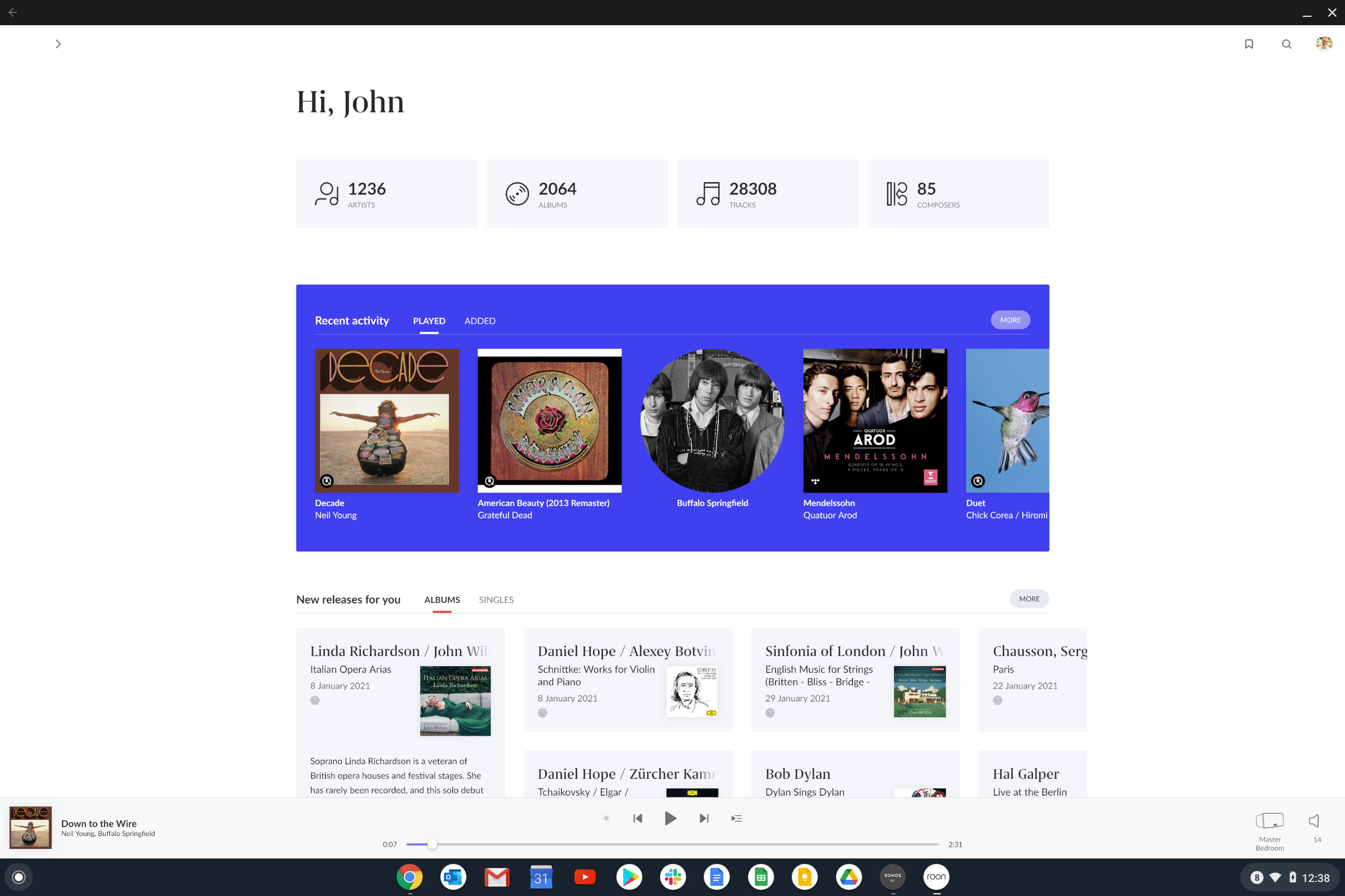
And so in the name of trying to understand what it’s like for folks who are using different interfaces, I dug out an old pixelbook I got for free at a conference a few years ago that’s been collecting dust. It’s a chromeOS device with 1920x1080. Downloaded roon remote from the play store. Now I can see the white panels on either side. Totally get it now - feels like this interface has been “left behind” for other interfaces. Forgetting the purple, the fonts, whether you like discovery features, whether you have issues connecting to endpoints (I’m at a second home currently, where my internet connection is spotty enough that I have dropouts every day even for native Tidal, let alone with Roon), and whether you think that Valence is up to snuff (I am a strong proponent of all these things, and think they’re good and getting better) and leaving aside whether your endpoints are showing up and etc etc…


…it still feels like if you use a laptop or higher def, that the interface was designed for someone else with a different device with those big white bars and small fonts. I now concur… it does looks way less “right” or “baked” in 1920x1080 than it does on an iPad or iPhone. And, I’m guessing/interpreting that that might not be wrong, perhaps (I don’t know) it kind of was designed “mobile first” and not pulled all the way through. Maybe - this is all inference. But I can see how you might think so, and I kind of think so. And if I had my remote of choice as a laptop/desktop, and my workflow, I would probably be miffed. Maybe I’d express it in a way that isn’t as extreme as some have, but I get the root of the sentiment.

However, here’s I think the good thing: the fixes to make the white bars go away, and to make these more responsive design elements (meaning: “so they use the full width of the screen”) in many places are not CRAZY HARD. They’re totally doable. That’s a project. Doesn’t break anything, at least not in my experience. It’s not trivial at all, but it’s an exercise that can be done. And I hope and imagine that unless Roon were leaving behind desktop/laptop remote usage, they’d fix this - somewhere on the priority list. And when that’s done, it won’t feel like such a regression. Now I’m not promising Roon will do this. I’m not omniscient. But it seems sensible for a core part of the functionality that a bunch of the install base clearly uses.

So, I guess, for all the folks like me who have been wondering what the fuss is about in the interface, if you’re just using phone/tablet, and you have the time, install remote on a laptop/desktop and see what you think. I bet you’ll get a bit more of the POV of the group of folks who are annoyed by the interface usability in that setting. I personally still think for me that the tablet / phone remote is a WAY better experience than laptop/desktop even if design were fully responsive - I’d already migrated there during 1.7. But it’s a worthwhile exercise.

Now, if I was on Roon leadership, I would be trying to converge the remote platforms as much as possible over time to a smaller number… so that I didn’t have all these permutations to manage - it slows down development inordinately to have all these things to look at, especially for a small and focused team. But I’m not on the leadership team, I don’t know what the split looks like, and where the growth is. But I realize now that part of my “I love it, it’s great, no worries” is that it is great (for me, on my remote platform of choice), and I might feel differently about other elements if it wasn’t as great for me on my remote platform of choice.

8 Likes

I’m two weeks in using Roon 1.8. For my simple use case streaming Tidal and Qobuz, it’s been almost flawless. I did have to restart my Nucleus this morning for Roon to see my RPi4 connected Meridian Prime, but I know Roon is now testing a solution to this bug.

I use Roon 1.8 on a Roon Nucleus. Roon control devices are a Dell XPS 15 (4K), iPad Mini 4, iPhone 11 Pro Max, and Nexus 7 (2015).

This is very well said.

What is worth emphasizing is that the functionality of the desktop version has been diminished. Roon has said that now they feel the phone is the primary interface. I wish they had just improved the phone experience without deteriorating (removing the sidebar, hiding recommendations, shortening the waveform, etc) the desktop version.

While phones are obviously the most convenient devices I don’t understand why they would be the preferred devices for Roon. There’s too much great information in Roon for me to prefer to consume it on a small screen. That necessitates lots and lots of scrolling and eliminates the ability to have a “dashboard” view where many important things can be seen at the same time.

On the desktop, without needing to scroll, we used to get:

  • Album name
  • Artist
  • The focus button
  • The album edit button
  • Album dates
  • Album rating
  • Album encoding format and resolution
  • Album length
  • Album dynamic range
  • The beginning of the album review
  • Album genres
  • Direct disc buttons (for multiple disc albums)
  • Access to credits
  • Access to versions
  • The first few songs from the album
  • Album recommendations
  • The full waveform
  • Bigger transport buttons
  • Larger font for the currently playing song and artist

Plus and it was elegant and uncluttered. It was a fantastic UI. Now were all getting the phone experience whether we’re on a phone or not.

8 Likes

I think this isn’t quite right, though I agree with the spirit of what you’re saying… I think laptop is getting something close to the tablet experience (Not the phone experience).

What I’m hopeful about is that you can “grow” the tablet experience to “fill the space” and it will be nearly as good as out as good as it was. Because if I’m wrong, and they need to fork the experience, all of us users could be in for a world of pain in terms of slow updates/feature additions. We’ve heard that this release had a lot to do with architecture - and that is true both at a data structure level but also at a front end level. Now i think that Roon has a much simpler front end architecture to use to push forward… but if it becomes very heavy again with conditional statements about format (eg, vs being properly responsive) then oh boy, be careful what you ask for.

I use a Surface Pro 4 and Roon 1.8 crashes when I select the settings option. Maybe it has to to with the language settings to Dutch, but I cannot change this anymore. On other windows 10 computers here in home I don’t have this experience but these use the default language settings. This is by the way to only annoying part. I love the large peaces of white space.

I just don’t understand this!

A phone is fine if all you want to do is play albums, album tracks or playlists. But then you don’t really need Roon for this - just use the Tidal or Qobuz apps for this and save yourselves some money.

Roon provides so much more, but a lot of what Roon offers can’t be properly experienced to its full on a phone
or small tablet.

6 Likes

Fwiw, phone is my primary interface (probably 60% phone, 40 iPad), and I’m using tagging, reading editorial content, engaging in discovery via all the new features. Couldn’t imagine using Tidal or Qobuz.

I get that some folks reasonably think I’m not getting out of Roon all I could… but I’m getting all I need / want. The form factor of a larger device would kill it for me. Scrolling is a non-issue for me. It’s just natural. I’m not a spring chicken, and I don’t think I’m alone.

I do wish Roon would publish some stats on usage - it would mostly answer my curiosity. I don’t want it to be a self-fulfilling prophecy, as I said above I think 1.8 shifted the ‘center of gravity’ to optimizing for my usage pattern.

I also hope that some of the folks who “can’t imagine” (my words) why I would use my trusty phone/iPad would try it, as I’m trying my laptop. Maybe you’ll like it.

I use a Dell XPS 15 (4k touchscreen), iPad Mini 4, iPhone 11 Pro Max, and Nexus 7 (2015). The Dell laptop is by far the best user experience for me. iPhone is the worst.

3 Likes

I have, and it probably is a little bit better using portrait mode on version 1.8 - but still no substitute for a larger form device. I use a 15" touchscreen Win 10 laptop and an iPad air, but by far my favourite device is my Win 10 desktop with a 32" (relatively) hi-res monitor.

It does this all day, this is 3rd day its done it
I had to download a trial for Audirvana in order to listen to some.

Roon is essentially broken for me
I tried installing, reinstalling.
Even refragged my drive.

What now?

Have you raised a support post in the appropriate section?

I’ve done that just now. Hoepfuly I get some help. Idk why it started doing this. Especially after reinstall, and defrag

1 Like

Funny, I would say I’m the exact opposite - probably 70% on MacBook Air or 27" NEC and Mac Pro; 20% Pixel 3XL and 10% iPad Pro (mostly used for Netflix etc). The phone and iPad is really for ‘emergency’ use mostly, or I couldn’t be bothered to go back downstairs for the laptop. Using a laptop makes it much easier for me to type comments like these while listening to music. :slight_smile:

Do you have access to the server page? And if so deleted the database?