Absolutely agree!
1 Like
It pins that focus category on the left side so it’s first in order when scrolling sideways.
2 Likes
From the release notes:
- Denoted user’s stars rating vs editorial
Have waited for this one. But checking the settings, I can’t see how I can change the behaviour here. Also can’t see how to differentiate this when focusing. Has anyone discovered how to make use of this?
Just by colour.
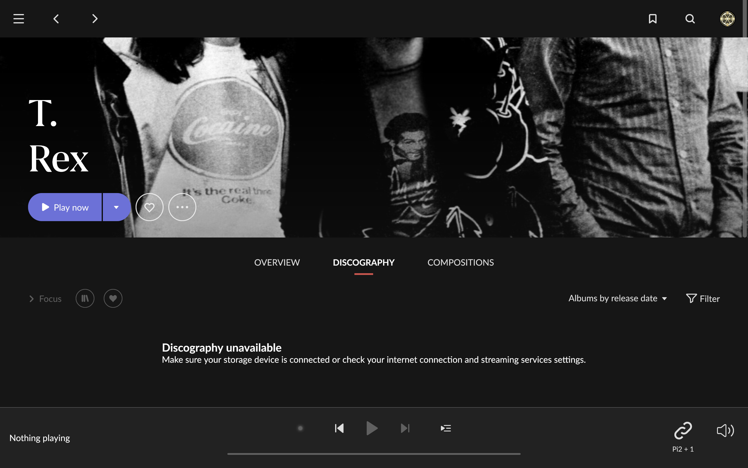
Though I can see and play albums in my library and Recommended albums, but Discography button from Recommended albums also leads me to an empty page.

I really must lead a charmed life or my needs/wants are much simpler and less demanding than some souls here.
For me at least on my Win10 desktop it looks good and just simply works…
1 Like
Not sure what is happening but I just tried that exact action on three different recommended albums/artists and got full discography ( when available)
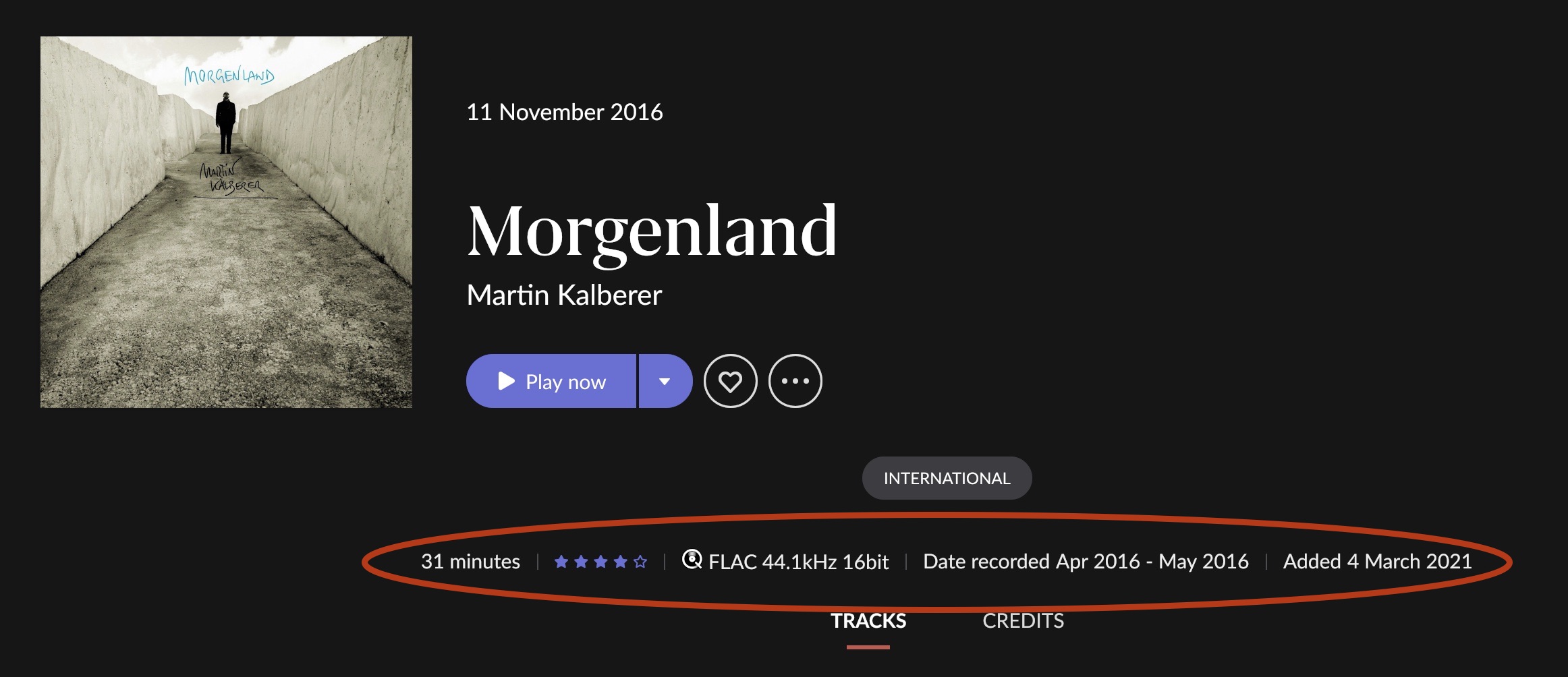
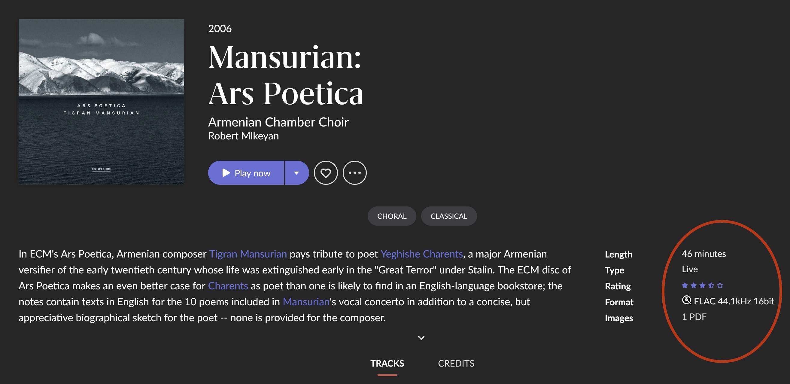
so… looks I’m the only one unhappy about this inconsistency, still there in 778, forcing (me) to search for the very same set of infos each time I open an album:

13 Likes
You’re not the only one!
And this is not the only inconsistenty, it happens in the ‘headers’ of artists pages too: the ‘play now’ button (and all related navigation items) appear in different places, depending on the fact if the artist has a large profile picture, a small one, or none at all.
6 Likes
For some artists it works, for others it doesn’t. Also there are not all albums showing on the album page in the Selected Discography and My Library sections. I created a topic for these issues: Discography unavailable.
1 Like
Hmm, wasn’t that how it was already before? Greyed out was editorial and a fuller mark (or colour, can’t remember which now) my own rating. 
1 Like
Great that Roon fixed a lot of stuff and listened to user feedback.
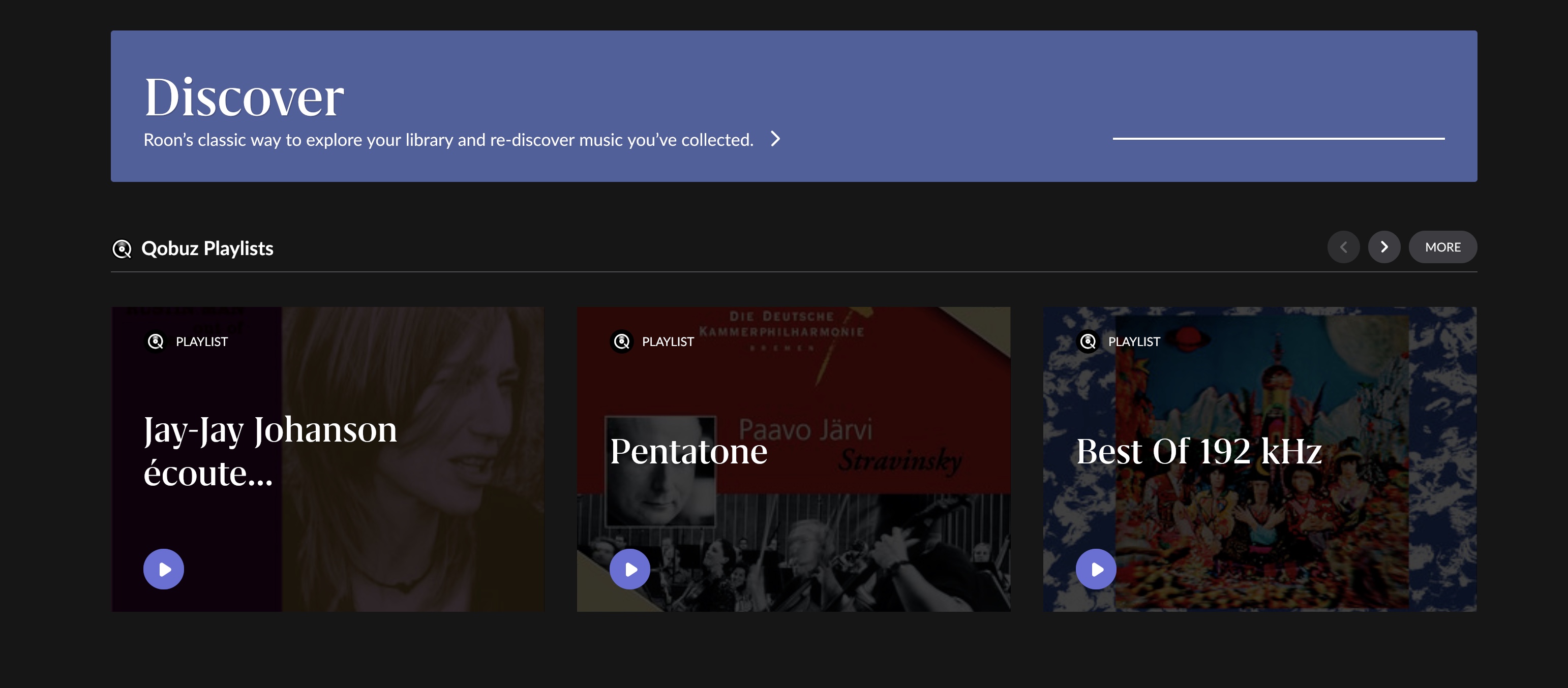
Still sad to see that it seems the be a design choice to leave ultra wide screen users with so much unused space to the left and right. 1.7 had the better UI and design choices IMHO.
7 Likes
Still plenty of wasted empty space, still “Hi, paolo” and still “Discover” at bottom of “Home” page, after all those useless (to me) stats:
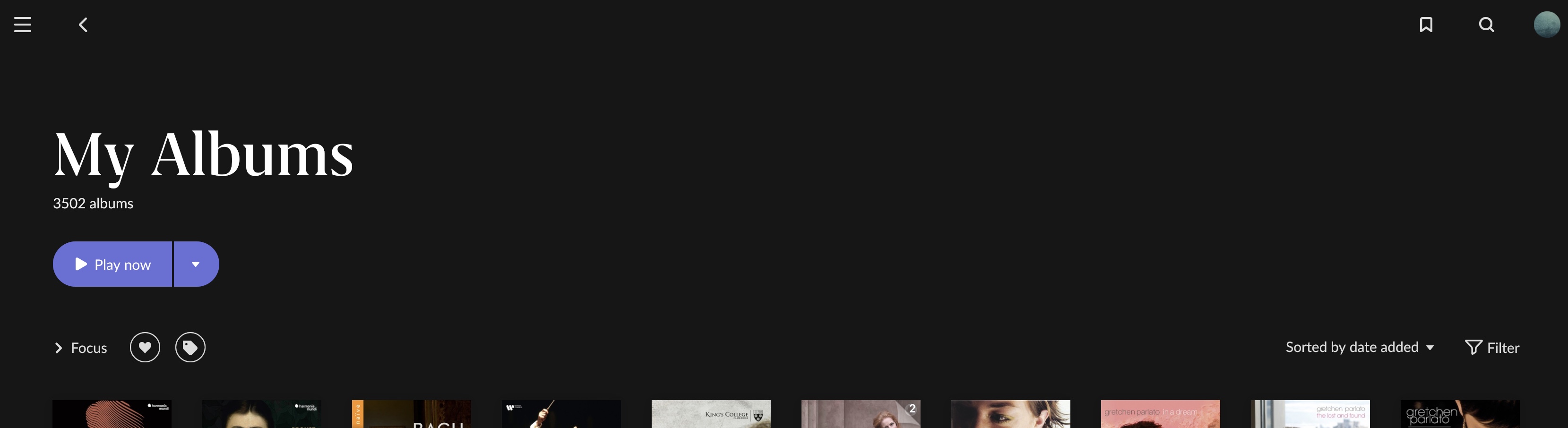
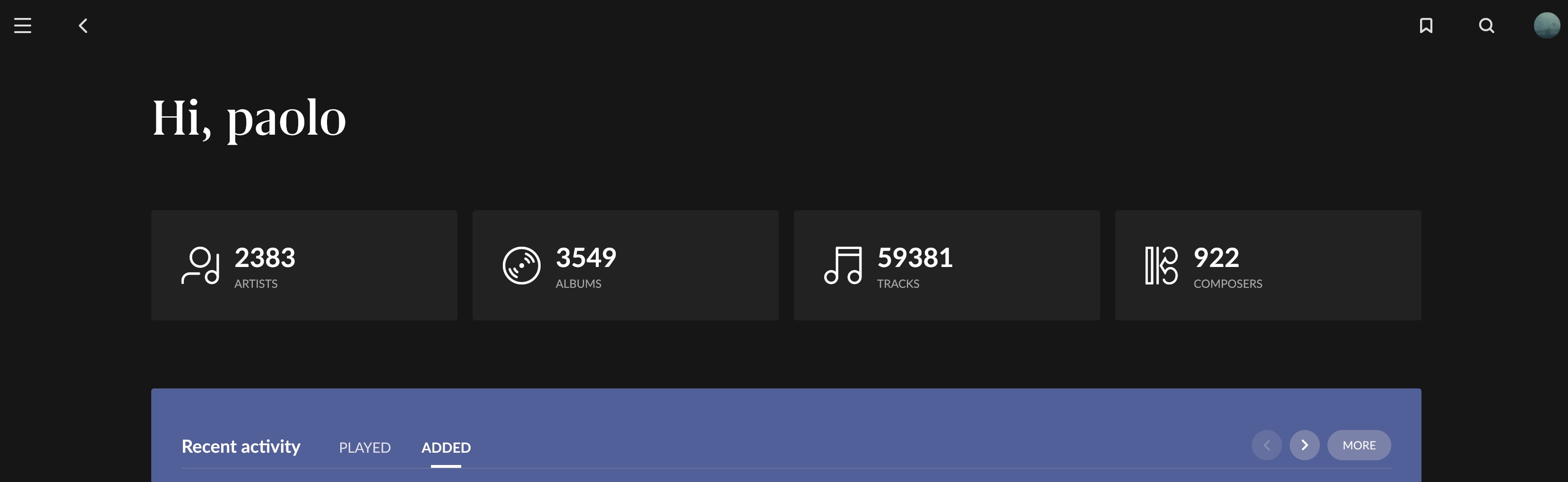
oh, and… only options for text are Default, Large and Ultra Large? … serious? 
my setting is “Default” and… honestly I find text to be TOO LARGE (60+ yo here and wearing glasses)
8 Likes
Yes, your own ratings are blue. Like here for “The Slider”. And it was the same in 1.7, but not in 1.8 before 778.  This is just the so-called “restored functionality”.
Where did the search icon go? Ipad 14.4
Strange
No you are not the only one! this one should not fall through the cracks but be followed up for the next update.
4 Likes
I would only really check iPad functionality once the App update shows up in the store. It hasnt over here (Germany) yet.
1 Like
Huge dot release!
Thank you
1 Like
