Hi to all Roon users and Roon staff. After using Roon for some time now I was wondering if other users might be on the same page as myself when it comes to the slider bar volume function within the application.
I have experienced once or twice accidentally moving the slider volume control which in turn has sent the volume through the roof. Not only is this dangerous but highly inconvenient. Before anyone suggests it, I have set the minimum and max volume function as well, but I still feel that this is not ideal and in some ways not a natural intuitive way of controlling volume.
Lastly, the volume window - when you have pressed this it stays open until you press elsewhere on the screen before it collapses.
My two suggestions are as follows:
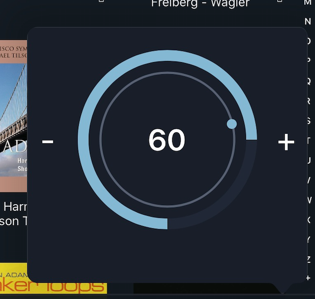
Could we not have a round volume button function, (like the Linn app) which is more intuitive and natural plus it will be safer with less chance of sliding it accidentally.
Lastly, when you press the volume icon and the volume window is displayed, could it not collapse again after a certain timeframe (which you could adjust the time displayed accordingly before collapsing).
These are suggestions and no way a criticism of Roon - Roon is a god send and first class and these suggestions are made to hopefully improve upon for the user to make Roon even better.
I had a few issues with device volume in the beginning, a couple of full volume blasts, and using the slider is not the easiest way to control it. Most of my zones are fixed volume now but I do have one device volume zone in the kitchen. The + and - buttons are small but easier to use and work well for me. Guess I’ve gotten used to it now. I think the volume window going away after a period of time is a good idea for some folks. Maybe an option in the setup to select how you want it to work.
Your min and max should be set to what your system and ears can tolerate. The “safety limit” is a soft limit that helps to to a value easily. I set mine to a slightly higher than normal listening value.
I hate round volume controls in UIs. Making me contort to do a common operation is offensive.
There is a UI joke that basically boils down to volume control being an “impossible problem” to solve…
I agree 100% with Sean’s suggestions. Unfortunately, if the COO says “I hate round volume controls”, we won’t probably have any chance, Sean. Or we go back and use Linn software again…
One aspect of the volume control problem that can be solved:
For me, volume control is open most of the time. I navigate, eg, press the search icon or the queue icon. All that happens is the volume control closes and I have to press again. If one touches a “command” with the volume control open, how about executing that command immediately? One can easily touch a non live portion of the screen, or press “back” to close the volume control only (if anyone occasionally needs to do that).