USABILITY is a key element of software design (see ISO and other software engineering design standards). i.e. the extent to which a product can be used by specified users to achieve specified goals with effectiveness, efficiency and satisfaction in a specified context of use
While Roon hyperlinks make connecting to music very satisfying - it has faults in basic navigation. Examples:
- Can only move 1 song at a time in reorganization of playlists (Man I wish they would fix this).
- For the longest time did not provide crumbs to allow a user to back track to previous click point (e.g. new releases) Fixed now thankfully.
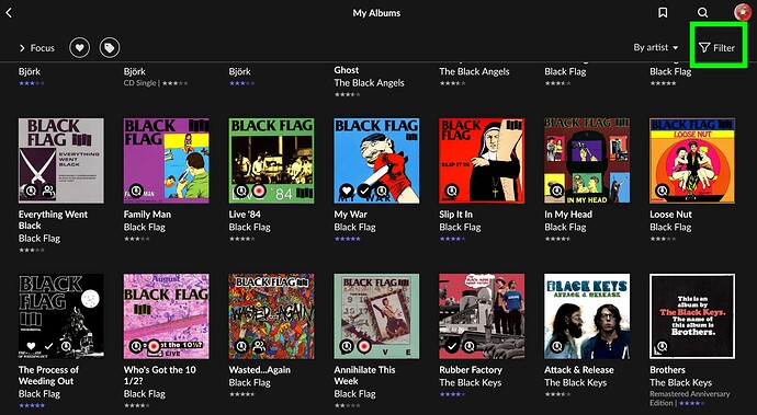
- Filters - available at the top of the screen only; but don’t freeze so always visible, so if a user wants to change filters, have to scroll back to the top and change it
I’m not going to list “99 things” that are usability issues, but more to encourage Roon to include usability as a key design criterion. There are usability standards on the internet; and they are an important part of the overall quality management system.
