I use Roon with a personal library only (no streaming). I love how Roon organizes classical compositions, with individual recordings as instances of the composition.
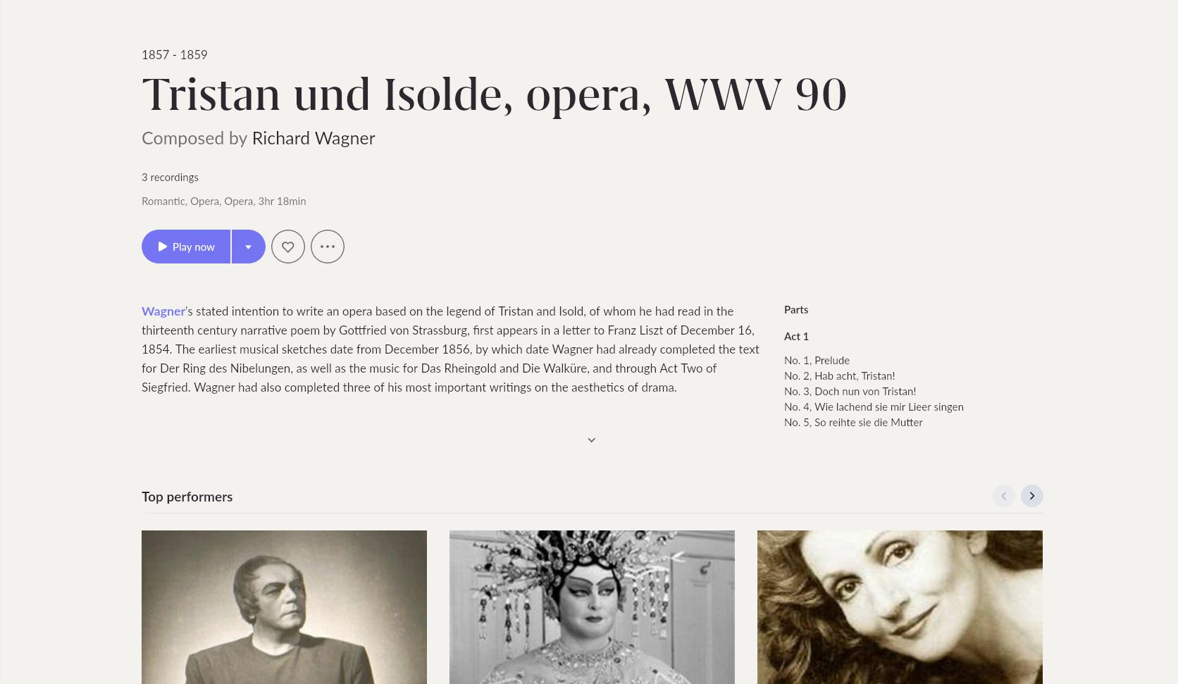
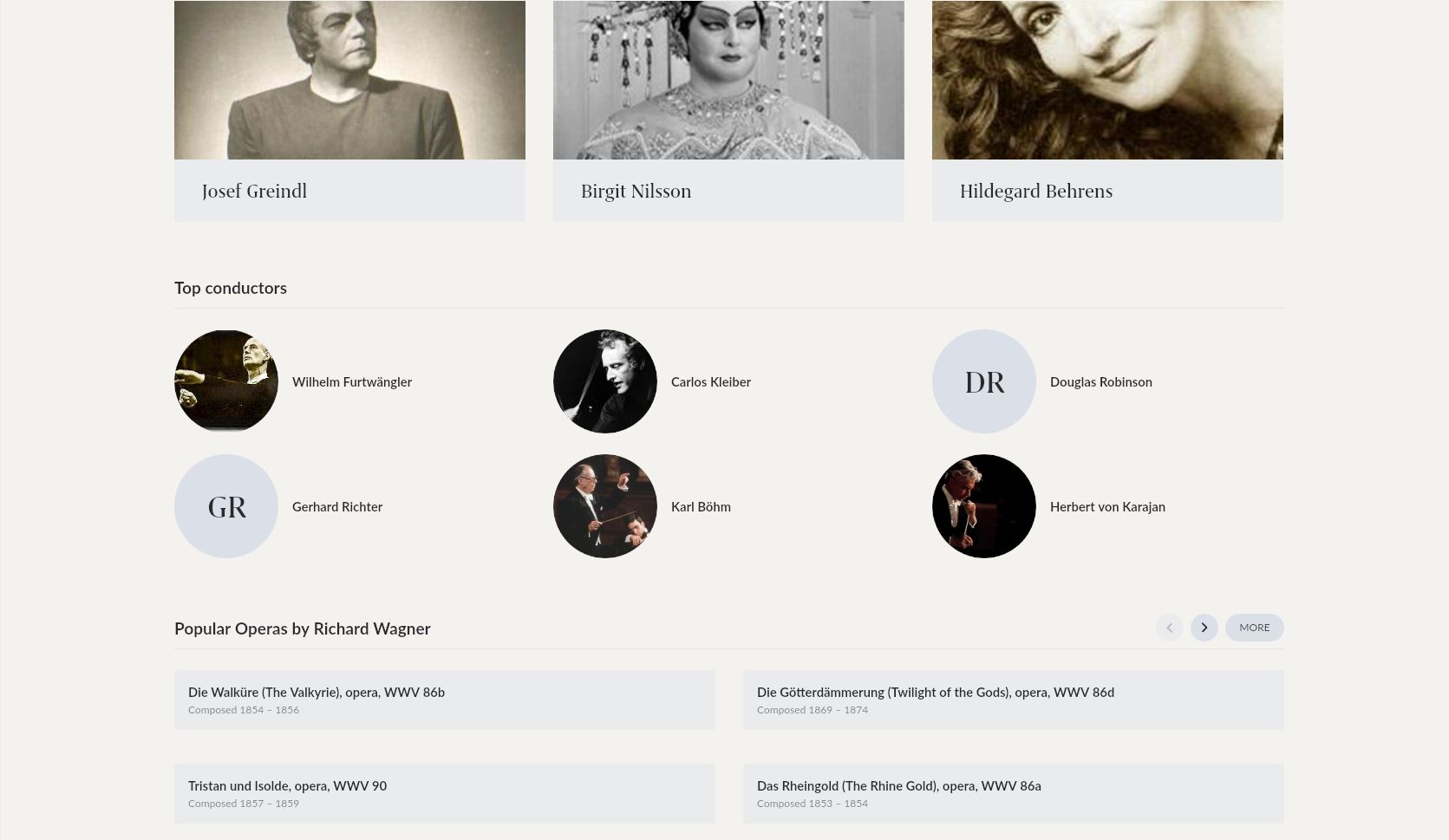
However, in Roon 1.8, there is a lot of information I don’t need and don’t want to see, that takes up way too much space on screen. I want to remove “Top performers”, “Top conductors” and “Popular X by Y”. I never agree with these designations, it is a big distraction from what I want to see on this screen (composition information and recordings in my library).
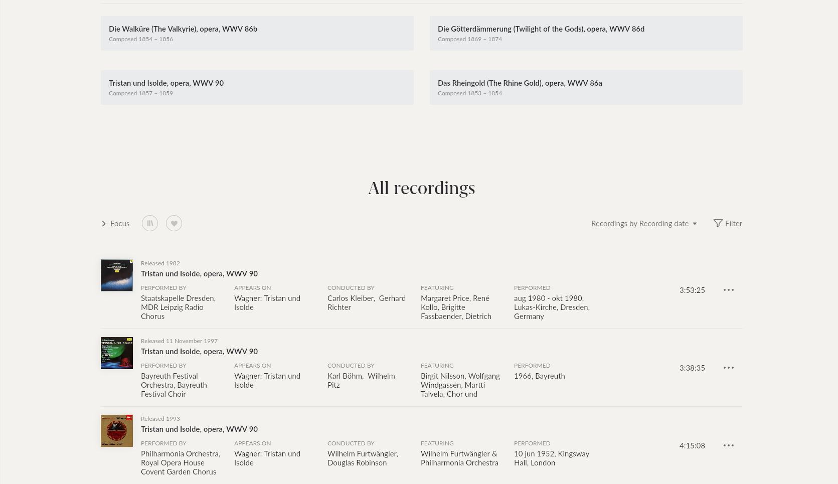
I really hope there is a way to hide it. For illustration, I want to hide all the stuff in the middle in the three screenshots below. The fact that I needed all of 3 screenshots to capture the whole page is indeed a wonderful illustration of the issue.
Yes. A strange omission by roon. Having a verbose/non-verbose switch was one of the earliest design features in the earliest text based UI’s.
There is a precedent in roon. There are 4 settings for the composer display. Default / Less / More / Always. I have it set to “always” as I am interested in the way roon can link your local content to on-line content at a composition level. From comments and screen shots I have seem others have little interest in using roon that way and prefer to switch off information they don’t use and view as clutter.
I would also like to see this precedent extended to other parts of the UI. Perhaps on a profile, device or listening habits basis. Most of the time I prefer the default “verbose” mode. But I can imagine why others would want something much less cluttered. TBH in many scenarios I would prefer that as well. For example, when lock-down is over and we can have people over again. But in that case my use case would be the exact 180 degree opposite to yours. I only want to see the “popular”, “recommended”, “in their prime” banners and I do not want to see any of the album and tracks view clutter. A sort of “party” mode for dummies where I don’t have to think very much and cannot possibly muck it up.
@dylan or someone else from the support team, is it just that I am not finding these settings in the settings menu? I have been surprised before from settings and options hiding in places I had not suspected.
Edit:
I also wanted to say that I really like the looks of this page in Roon 1.8. Good job with fonts and color schemes!
If I could avoid scrolling through all of this unnecessary information every time I want to listen to some music, it would be perfect.