Sometimes I have some spare songs of a single artist that are not an album.
Roon collects them correctly into an unique “fake” album, with a grey cover, with that artist and the tracks are correctly sorted in alphabetical order. That’s a very excellent job.
What I don’t like it’s that “grey cover”, that is very ugly.
Could you think about another cover for that occasions?
Or could Roon use the artist artwork in such case? Or just allow us to choose a standard cover for that “non album” folders?
Sorry, no, not at the moment. When editing multiple albums at once, the Album Editor does not have an edit field for adding your own album cover to all the selected albums. I’m afraid that field is only available when editing a single album.
Then my feature request is to change or allow us to change the “empty artwork” albums default image.
I simply don’t like to browse my albums and see those ugly squares grey artwork in my non albums collections.
To be clear, I ask if possibile not to change multiple albums together but I ask to change the default artwork when an album is without artwork into one that is less ugly.
And I think it would be nice if the generic images set would be stored at and distributed by the Core machine instead of the client or at least “overrule” client side generic images if the Core provides alternate versions.
@RiseFall123 - btw those parquet floor style images are also used on other occasions when no actual picture is available (genres, artists and the like). And - if you can access the application directory which is usually not possible for mobile devices (iOS, Android) - you could theoretically change the generic images even now. But those changes will not stick after an application update.
I asked them about the grey square…it also appears with Tidal artists. No answer, guess they are working on it. The thing is its totally unnecessary, there are multiple ways this can be avoided. To me the grey square = a failure. $500 is a high cost to pay for so many failures…imo
A pointer: the jpg files providing the art follow a Generic naming pattern. If you can find 'em you may then get an idea what to do. If not, it’s probably better to keep things as they are. I suppose it’s generally not helpful to discuss this kind of alterations in detail here. My bad that I mentioned it.
I just hope that a better looking icon will be used in the near feature, those ugly grey squares are very bad, and ruin the elegant Roon interface because I have many artist collection tracks that aren’t album, just collection.
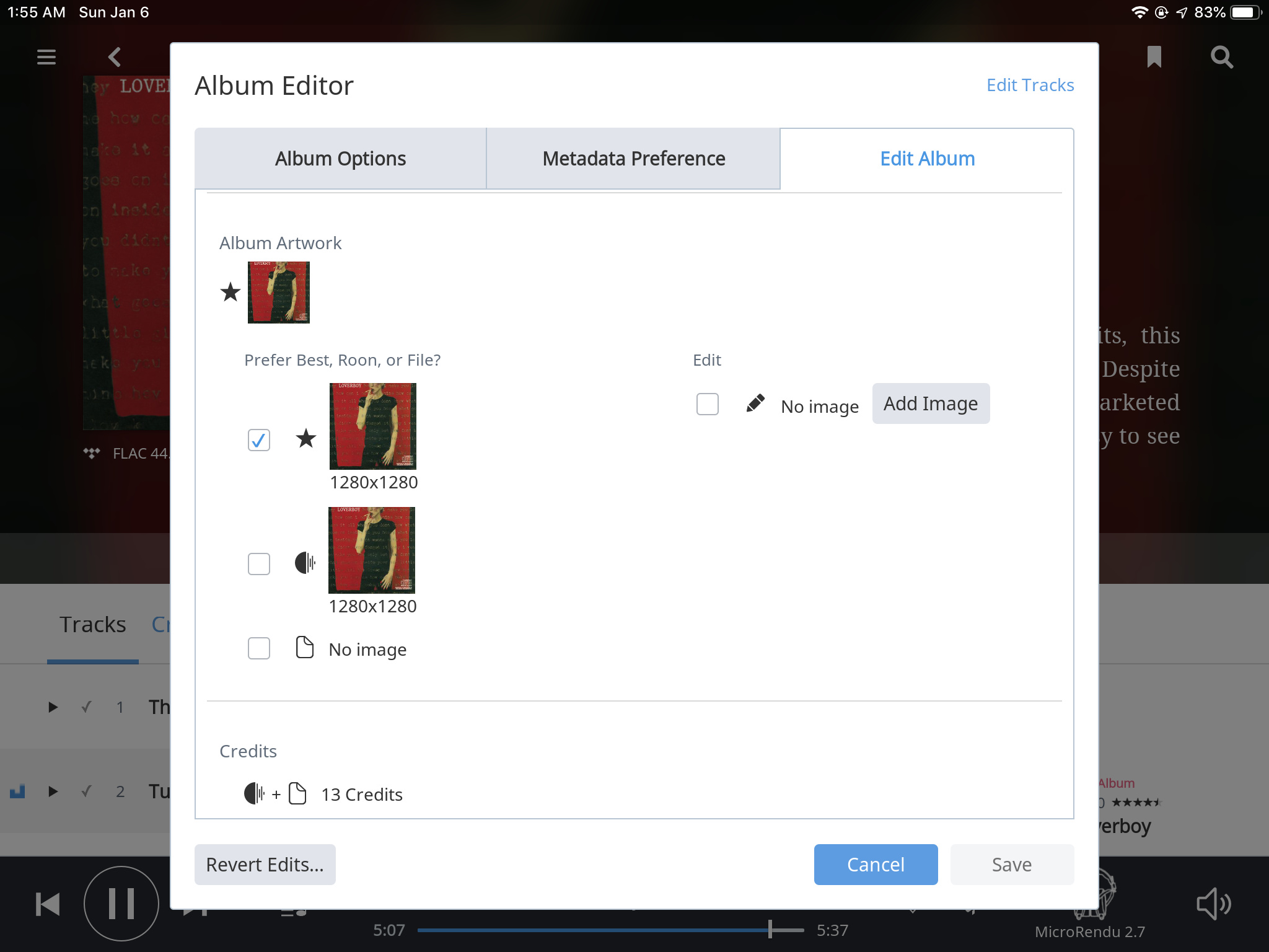
 You can edit that cover and insert that you might like better.
