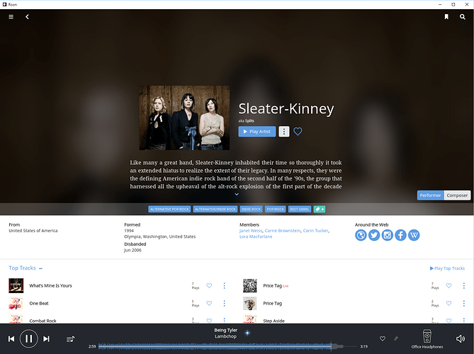
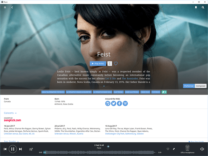
On the desktop clients, there’s a whole lot of empty and poorly utilized space “above the fold” on artist pages, pushing a lot of the things you actually want to interact with down to where you have to scroll to see it:
Something like 80% of the vertical space here is taken up by things other than music and there’s a whole lot of empty layout space above and to the sides of the artist bio, which could be easily combined with the “from/formed/members/etc” data below (not to mention concert data) into a two-column layout, making valuable vertical space available for the actual music.

