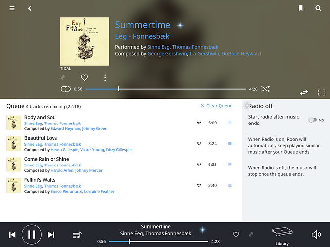
Why does Radio get such a large amount of space on the Now Playing screen, including an explanation?
There are other very useful functions that get only a button, with an icon, no text.
And it can’t be that Radio is difficult and needs an explanation, there are other hard-to-understand functions, like Transfer.
And we generally explain things with the hover circle.
And Radio is not difficult to understand, once it has been explained.
1 Like
Might be addressed in the planned UI update Danny mentioned?
No I don’t know when it’s coming!
