Achim
December 1, 2019, 10:12am
1
Hi,
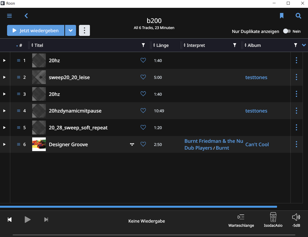
the latest release shows playlists rows in alternating colours, for better reading I suppose.
This is unnecessary, as all rows are sufficiently marked by the many graphical elements that are there already like play arrow, album cover etc.
Additionally, it puts undue importance on the differently coloured rows.
So I ask:
Please remove this new look.
Or make it optional.
Kind regards,
I don’t believe this was introduced in 1.7, so perhaps you could share a screenshot? Take a look at the screenshot in the following post (2017.)
Hi @j_c ----- Thank you for the report and sharing your feedback with us, very appreciated!
In order to add content to or edit, a TIDAL generated playlist you must “save a local copy” and then add it to Roon (example below).
[image]
[image]
FYI: More information about playlist in Roon can be found here in our knowledge base.
-Eric
Edit: Unless you have a specific issue, this thread should come under feature requests not support.
AE67
December 1, 2019, 10:38am
3
I don’t agree. The color altering makes playlists easier readable.
Achim
December 1, 2019, 10:55am
4
So perhaps we can agree on making it optional?
Can’t see roon adding a switch for that.
Alas, every time you make something optional, testing grows exponentially. Every further change would have to check if it works with the option on and the option off, and the more options, the more combinations. As a result, most software won’t give you the choice for small things like these, keeping that for the most critical features.
Achim
December 1, 2019, 12:08pm
7
I just found out that it seems to be some kind of strange interaction with my tablet.
First screenshot is from Roon on 64bit-Windows 10 PC, I could live with this kind of alternating colors:
Second is from 32bit Windows 10 on tablet:
I compared the color file in the theme folder of the different installations, these match 100%.
If support could give me a hint which color definition is relevant here, I would be glad to help myself.
Thanks,
system
November 30, 2020, 12:08pm
8
This topic was automatically closed 365 days after the last reply. New replies are no longer allowed.