Here are two user interface improvements that would make Roon much more appealing to me:
-
Menu Bar controls. Many (most?) music players under MacOS put icons in the menu bar for basic transport functions — play/pause, previous/next, etc. — so a user doesn’t have to switch to the Roon app just to pause something. I assume Windows offers something similar.
-
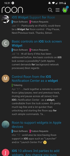
Widget for iOS. Example: I cook a lot, and always blast music. If the phone rings or somebody hollers at me, I’d like to be able to pause music right away instead of unlocking the phone, navigating to the app, waiting for the current song to come up, and then pressing pause. Bluesound has a Widget that takes only one swipe to activate. I assume Android has a similar option.
Some of what makes an app good involves the features it offers. Some of what makes it good is how a user interacts with it. These two suggestions would vastly improve the UX for me.

